Burton Kramer
New York City, New York, 1932
Who’s Who
Burton Kramer is a worldwide acclaimed graphic designer and a pioneer of Canadian graphic design.
In 195-51 he attended the Industrial Arts Program of the New York State University. The same year he enrolled at the Institute of Design (New Bauhaus) in Chicago. In 1954 attended the Yale School of Arts and Architecture studying under Alexey Brodovitch, Bradbury Thompson, Herbert Matter, Josef Albers, and Paul Rand. He interrupted Yale for one year and moved to the Royal College of Art in London as a Fulbright Scholar. He finally graduated from Yale in 1957 with MFA degree in graphic design.
The same year he started to work at Will Burton Office in New York City, and then became assistant art director of Architectural Record magazine and New York Life Insurance Company. In 1960 he began working at the American headquarters of the worldwide famous swiss company Geigy Chemical Corp. After two years, he moved to Zurich to work as chief designer at Erwin Halpern Advertising and the work he did there received the Swiss Poster Award and the Swiss Packaging Award. He also became the first foreign-member invited to join the VSG—Verbande Schweizer Grafiker (Swiss Professional Graphic Design Society).
In 1965 he moved to Toronto, Canada to work as art director for Paul Arthur & Associates—then one of Canada’s best-known design agencies—on the map and signage for Expo 67. He then worked as Director of Corporate Design for Clairtone, a Canadian manufacturer of stereo and color tv. Two years later he established Burton Kramer & Associated Ltd., focusing on corporate identity design. He served major institutions such as the OECA (Ontario Educational Communications Authority), Radio Canada International, and the ROM (Royal Ontario Museum).
In 1974, after became a Canadian citizen, he designed the wonderful corporate identity for CBC (Canadian Broadcasting Corporation) that included mark, printed matter, signage, stationery, uniforms, and graphic standards manual. The same year he was accepted as one of the first Canadian members of AGI (Alliance Graphique Internationale), the world’s most prestigious graphic design association.
From 1980 to 2001 he taught corporate design and typography at the Ontario College of Art & Design, and also lectured in Mexico and the U.S.A. During his career he also wrote numerous essays that have been published in important design books and magazines such as “Top Trademarks & Symbols of the World” (Deco Press, 1973), and Idea magazine.
Member of GDC (Graphic Designers of Canada) since 1971, he acted on its board for nine years, then as president and vice-president. In 2002 he received the Order of Ontario for his contributions to the cultural life of the province, followed by a Honorary Doctorate in Design from the Ontario College of Art & Design. In 2015 he received a Lifetime Achievement Award from the Canadian Art Directors & Designers Club, while in 2018 he was awarded the Order of Canada, the country’s highest civilian honour.
Since 2010 the Kramer Design Archive is part of the Modernist Designers Section at the Vignelli Center for Design Studies in Rochester, while a complete archive of his graphic design career is housed in the permanent collection of the ROM (Royal Ontario Museum), Toronto.
Kramer has been able to develop a clear, consistent, and dynamic communication through the use of rigorous geometry, meaningful expressiveness, and colorful energy. He retired from graphic design in 1993 to dedicate himself to abstract painting. Kramer Design Associates is now run by his son, Jeremy Kramer.
I truly wish to thank Mr. Kramer for his incredible kindness and his interest in Designculture.
Enjoy your reading,
 TO THE TOP ↑
Quotations
“An effective mark must appear to fit. It must clearly project the corporate persona, its attitude, culture, and aspirations. […] This goal requires the distillation of research and corporate objectives in order to design a condensed, appropriate, and rememberable image […] assuring that it will stand out in the crowd, now and in the future.”
“Before your start designing, figure out what you are doing and whom you are doing it to. Most designers start doing it first and if it looks good they feel they have solved the problem. In fact, they have only made themselves feel good.”
“Designers, real designers, are always generalists,” not specialists.
“I regard the design of marks to be very much like the creation of sculptures, where the implied meaning is pared down visually to the minimum required. It is truly a work where not only less is more, but where less must be more.”
“It always seemed clear that the real challenge for the designer was to help make our world a better place than it would be without our efforts.”
“Kramer was one of Canada’s first graphic designers to courageously promote integrated design at a time when such an approach was virtually unknown in Canada. He contributed to introduce the use of Helvetica, typographic grid, and abstract symbols,” Roger R. Remington, 2008.
“Modernism is an expression of human positivism in the best sense.”
“To look at the work of Burton Kramer is to observe the graphic designer as a social historian,” Marjorie Harris on Applied Arts Magazine, 1988.
TO THE TOP ↑
Q&A
Published Oct 19, 2014
Recorded May 7, 2014
What is your definition of design?
Graphic design is the conscious, intelligent, visible result of addressing and solving a visual problem.
What is the purpose of design?
The purpose may be informative, educational, promotional, commercial. In graphic design, always to clarify and strengthen communication.
Do you think design is a discipline common to different subjects—architecture, graphics, furniture, etc.—or that each subject has its own specific design discipline?
The same design principles apply to all subjects of design.
What designers were important early influences for you?
They were Franco Grignani, Yusaku Kamakura, and Rudolph de Harak.
What are the qualities of good design?
What constitutes good design has been and remains a subject of discussion, and inevitably must be based on what the problem to be solved is. The meaning of good design to most clients will be quite different from the meaning of good design to most designers, and will have to reflect the area of communication. In any case, it should uplift, challenge, and inform, not pander to the average.
Should design produce things which are necessarily useful?
Most design requires a client, expecting that the result will be useful to inform, convince, sell or educate.
Should the products of design be beautiful?
“Even the orchestra is beautiful.” Even ugly, in the right context, may be considered beautiful.
What do you think are the aspects to consider to understand if a project is of high quality?
Honesty, restraint, formal organization, functionality, sensitivity, and humour.
What are the key features of your design?
Clear typographic messaging, a sense of constrained energy, a lively use of color, and a conscious musicality.
What is the necessary condition to practice design?
Insatiable curiosity, leading to acquiring a fund of knowledge about many things. Unending learning.
What difference did you find in working in the U.S.A., Switzerland, and Canada?
When I worked at Geigy in the U.S., I was doing a kind of fusion, I hoped, between american and swiss design. There were very few places I would have liked to work. In Switzerland being a ‘grafiker’ was quite normal and the government supported design. In Canada I became, like it or not, a pioneer and had to fight battles won long before in Switzerland. Modernism and Helvetica were far from the norm. I was told that sans serif, flush left, rag right, was unreadable. Things changed, over time.
What are the difference between art and design?
Art most often conveys a primarily visual or tactile message. Design most often conveys a primarily functional or communicative message and purpose.
Could design be art?
There are instances where design and art become interchangeable. “Art is Design. Design is Art,” (Paul Rand).
Does design require a handcraft or an industrial production?
Unless the designer is creating one-off products for an elite audience or an exhibition, graphic design requires mass production.
To whom is design addressed? Is it for the masses?
Most graphic design is addressed to a clearly defined audience. It may be unlimited, though that would be unusual.
Should the products of design be cheap or expensive?
We would all like the best, finest design, and production results for the lowest possible cost, unless the primary purpose is to demonstrate wealth, power, and sophistication.
Should design be ephemeral?
Most designed products, objects, and messaging are ephemeral, like it or not. Even architecture has most often a relatively short ‘shelf life.’
Are there still schools and orientations in design?
There have always been designers who support expressionism, surrealism, or even Dada as opposed to supporters of clarity and organization. There have always been those who jump on whatever the latest—most often short lived—bandwagon is. The influence of pop culture is very strong. Designers have to communicate clearly to clients what their orientation is, and why their approach will best respond to the client needs.
What is the future of design?
Design is nurtured by client needs. The ability to create great design requires great clients who will settle for nothing less.
What was your favorite game as a child?
Chinese checkers.
What job would you have liked to do in the future, when you were a child?
Musician, but I did not pass the music entrance exam for the School of Music and Art. Now I practice the five string banjo daily and make paintings that I call “visual music.”
Thank you very much.
Thank you.
© 2014-16 Burton Kramer, Nicola-Matteo Munari. All rights reserved.
TO THE TOP ↑
Q&A
Published Mar 30, 2016
Recorded Jun 25, 2015
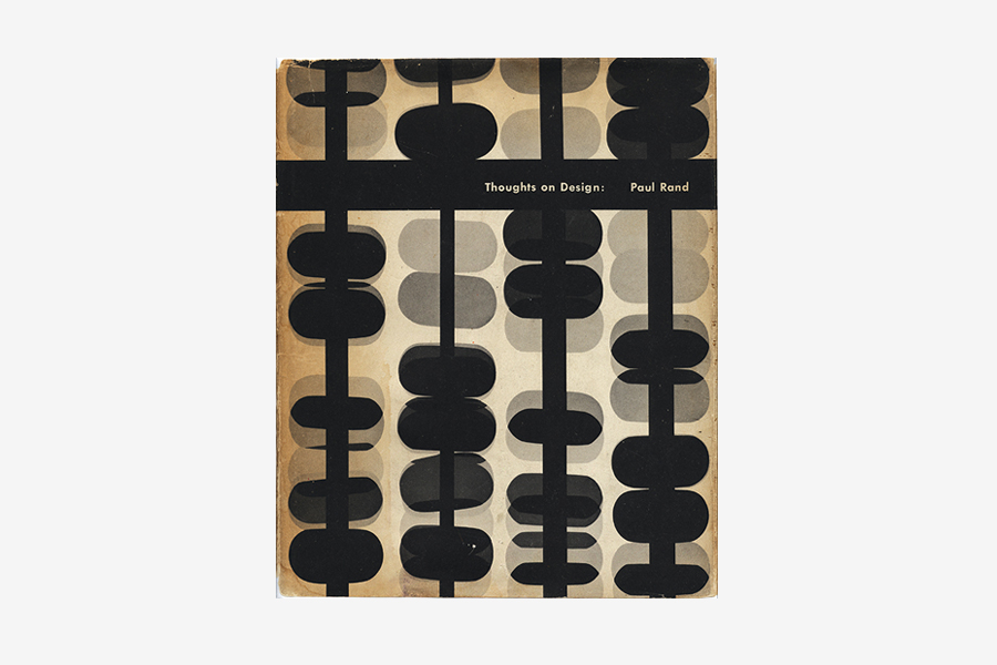 Paul Rand, Thoughts on Design, 1951, 26.5×21.5 cm. Published by Wittenborn.
What has been the most important book to you as a designer?
Paul Rand, Thoughts on Design, 1951, 26.5×21.5 cm. Published by Wittenborn.
What has been the most important book to you as a designer?
When I was a student in the early 1950s there were no design books available, as we have today. The available books that influenced me at that time were “Vision in Motion” and “The New Vision” by Moholy-Nagy, and “Thoughts on Design” by Paul Rand. Magazines, if available, like Graphis and Gebrauchsgrafik were the best source of information and stimulus. By the late 1950s there were many books available. “Die neue Graphik” by Karl Gerstner was important for me.
What was your strongest skill as a designer?
The design of symbols, logotypes, and integrated I.D. programs. The design of geometry based graphics. The integration of form and color.
What is the thing that you have enjoyed the most of being a designer?
Each client and project offered an interesting, unique learning experience.
What is the importance of experience? How it can contribute to better address a project?
There can be no substitute for experience. It is the equivalent of practicing an instrument daily, for years. It helps get to the essence of a solution or possible solutions rapidly.
What is the most effective way of presenting a project?
Presenting each element as it would be seen, in use, and the relationships of all.
What did you enjoy the most of working in Canada?
The opportunity to work on many public and cultural projects.
What are the qualities of a good font?
About five are more than enough. More important is how they are applied.
What is the importance of typography in graphic design?
Typography is the backbone of most graphic design.
What positive contribution design can give to society?
To aid in communication. To bring order and beauty to communications.
What was your aim when designing a corporate identity?
To provide a distinctive visual identity that would stand out in the crowd. To help the client be a leader, not a follower.
Thank you very much again.
Thank you too.
© 2015-16 Burton Kramer, Nicola-Matteo Munari. All rights reserved.
TO THE TOP ↑
Portfolio
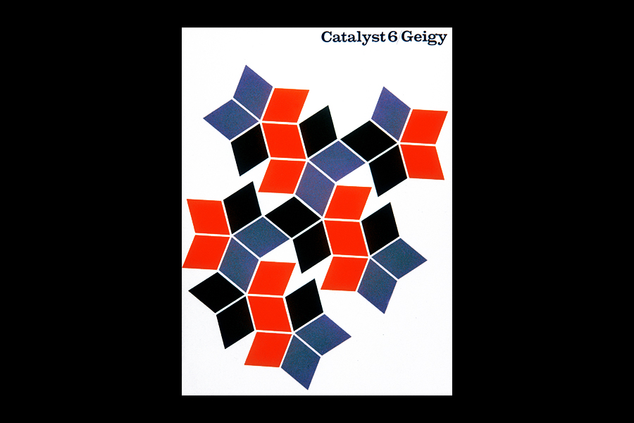
Catalyst, n.6
Magazine, 28.5×21.5 cm
1959
House magazine published by Geigy Chemical Corporation.
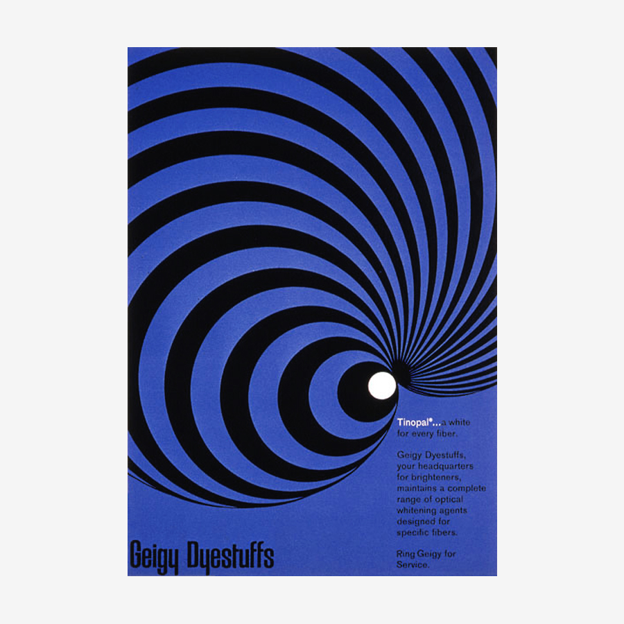
Tinopal
Advertisement, 28.5×21.5 cm
1960
Medicine advertisement for Geigy. The text reads: “Geigy Dyestuffs, your headquarters for brighteners, maintains a complete range of optical whitening agents designed for specific fibers.”
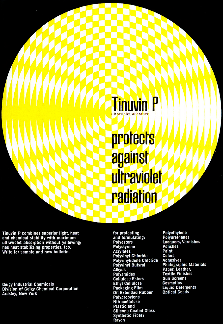
Tinuvin P
Advertisement, 28.5×21.5 cm
1960
A beautiful ,edicine advertisement for Geigy that clearly communicates the idea of light radiation.
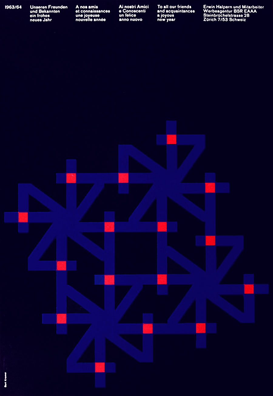
1963/64
New Year Poster
1963
A beautiful new year’s greetings poster designed at Erwin Halpern Advertising, Zurich. By rotating number 4—the last figure of the new year—Kramer forms a beautiful firework, but also a series of geometric snowflakes. The black of the background suggests the night, the dark blue the cold of the winter, and the red squares seem to be many sparkles of warm light.
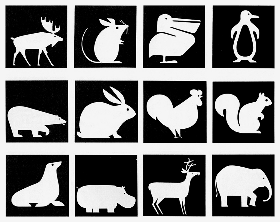
Expo 67
Parking Pictograms
1966
Parking pictograms for Expo 67. Designed with Ken Kaplan at Paul Arthur & Associates, Toronto. This beautiful illustrations feature the perfect balance of simplification and natural details to be easily remembered by the viewers.
Clairtone Sound Corporation
Logotype
1967
Kramer designed the whole corporate identity program for the company. He designed circular letters to produce a consistent logotype.
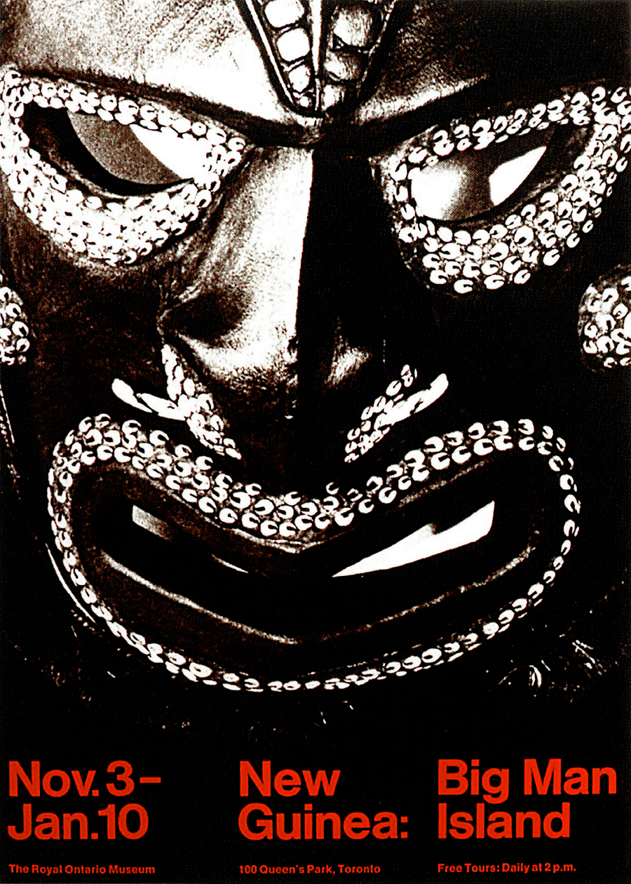
New Guinea
Poster, c.85×60 cm
1968
A beautiful poster for the ROM (Royal Ontario Museum), Toronto. As in all the best posters, we have only two main elements: a background image—in this case a photographic image—and a foreground text—a grotesk typeface with excellent legibility (Helvetica). The image has been magnified and contrasted as much as possible to emphasize expressiveness and to visually hit the audience. The mask becomes a threatening presence that inspires fear and demands attention. The whole picture is supported by the red text that, in contrast with black, increases the emotional power.
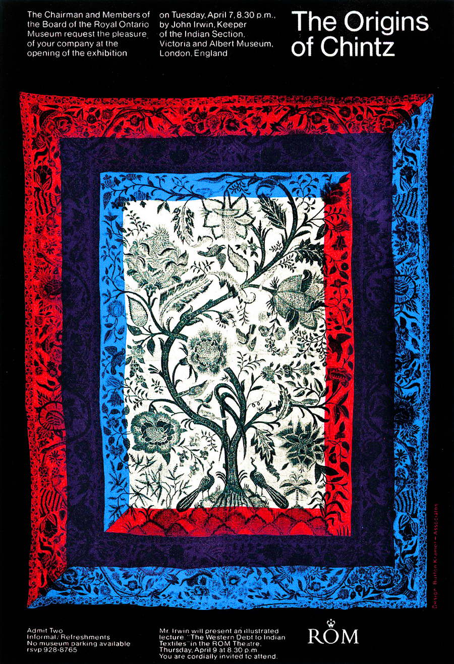
The Origins of Chintz
Exhibition Invitation, 29.7×21 cm
1968
Another excellent poster for the ROM, where a structured layout emphasizes the geometry of the chintz. Look at the elegant relation between the top text on the left and the title on the right: the five lines of the text blocks are exacly the same height of the two lines of the title.
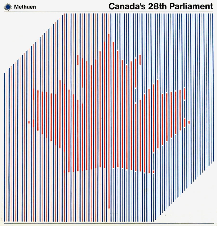
Canada’s 28th Parliament
Book, c.23×22.5 cm
1970
OECA
Mark
1967
An interesting mark for the OECA (Ontario Educational Communication Authority). It effectively produces the optical suggestions of vertigo, and the dynamic movement of going deep, and broadcasting.
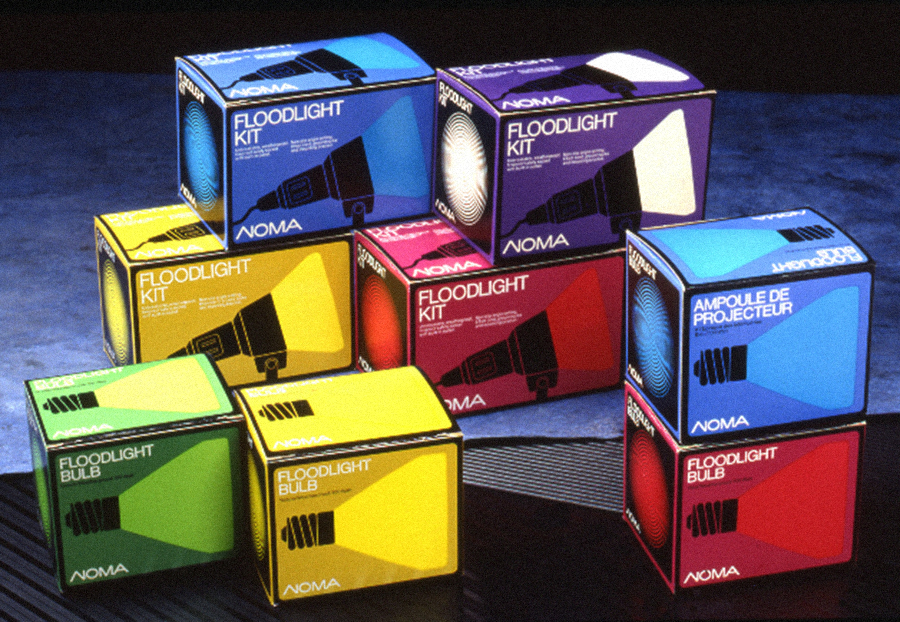
Floodlight Kit
Packaging, c.19×12.5 cm each
1971
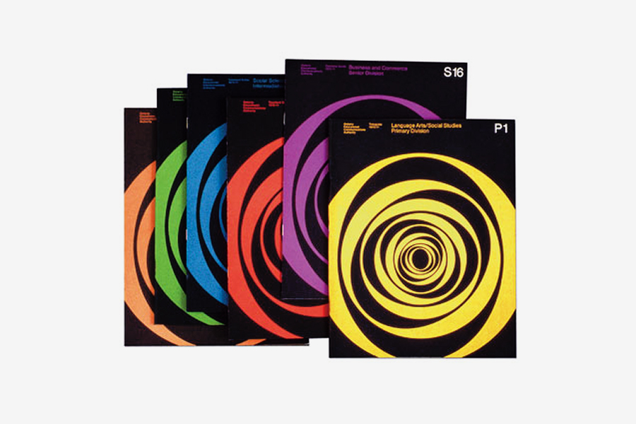
OECA
Brochures, c.29.7×21 cm
1971
Brochure covers featuring a colored version of the institution’s mark.
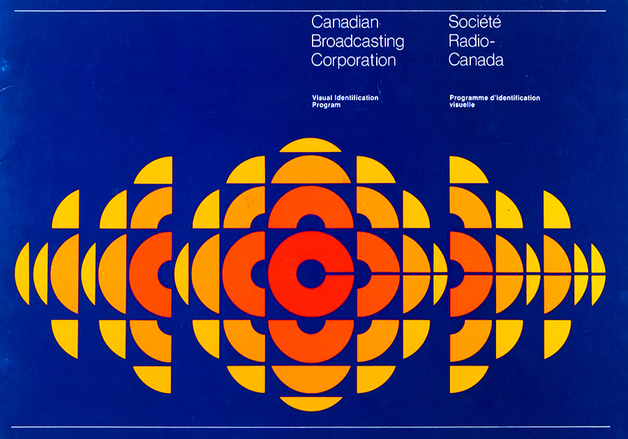
Visual Identification Program
Brochure, 20×29 cm
1974
Presentation of the corporate identity program that Kramer designed for the CBC (Canadian Broadcasting Corporation). It features one of the best mark in the history of graphic design, that perfectly communicates the idea of broadcasting.
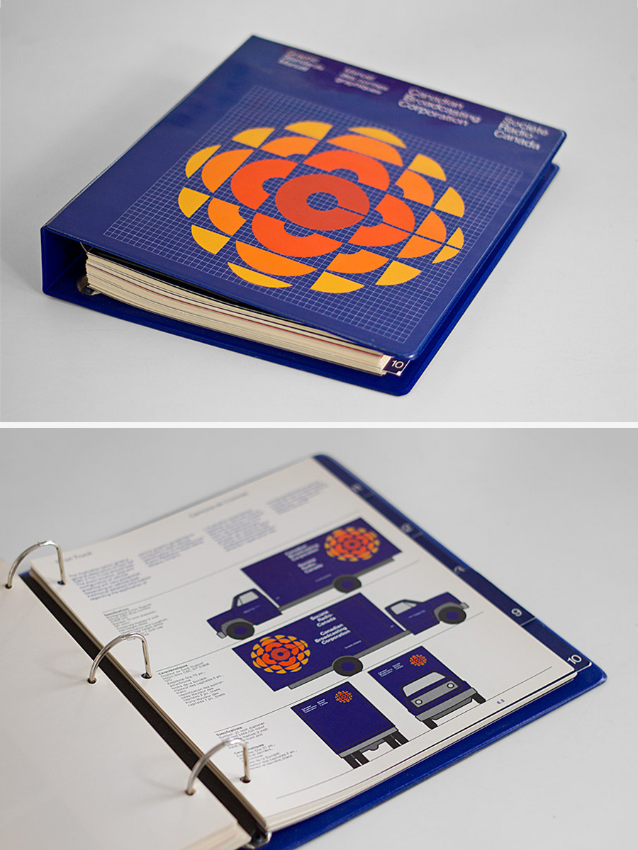
Graphic Standards Manual
Ring Binder, 30×28 cm
1974
Corporate identity manual for the CBC (Canadian Broadcasting Corporation).
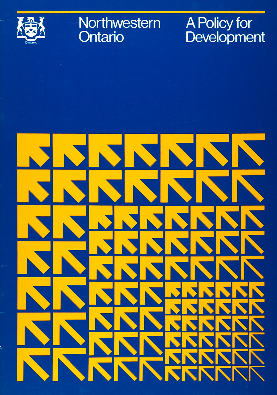
A Policy for Development
Brochure, 30×21 cm
1967
Cover for a brochure issued by the Northwestern Ontario that communicates the idea of development by repeating the arrow.
Reed Paper
Trademark
1967
Designed for a canadian paper manufacturing company.
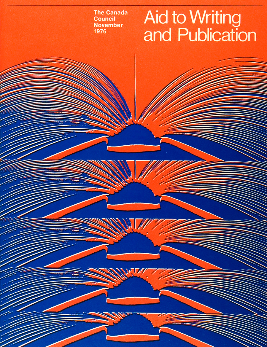
Aid to Writing and Publication
Brochure, 28×21.5 cm
1976
Designed for The Canada Council.
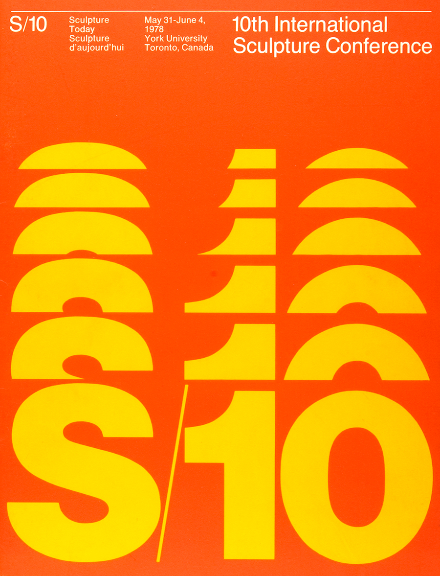
10th International Sculpture Conference
Brochure, 28×22 cm
1978
North American Life
Mark-Sculpture, 9.15×4.5 m
1985
Links & Docs
Articles
Actually We Create Iconic Identities
Fortport Op Art Modernist
Huffington Post Canadian Style Icons
Kihada Kreative Design Luminary Illuminated
Mason Journal Burton Kramer Identities
Royal Ontario Museum Canada Impact Remport
SEGD Remembering Expo 67
Paintings
1st Dibs Burton Kramer
CCCA Burton Kramer
Geoform Burton Kramer
Oeno Gallery Burton Kramer
Profiles
Burton Kramer Official Website
Burton Kramer Identities Monograph
Graphic Designers Canada Burton Kramer
RIT Library Burton Kramer
Wikipedia Burton Kramer
Projects
AIGA Design Archives Burton Kramer Associates Ltd.
Canadian Design Resource CBC
CBC Logo History
CCCA Burton Kramer
Designkultur CBC 75th Anniversary
The Canadian Encyclopedia CBC
Video & Audio
A Brief History Of Burton Kramer Film
Monocle Audio Interview with Burton Kramer
TO THE TOP ↑
Comments
If you wish to add a comment please feel free to write at
info@designculture.it
TO THE TOP ↑
Follow on Facebook
Partnerships

Archivio Grafica Italiana is the first digital resource to the Italian graphic design heritage. Founded by Nicola Munari in 2015.

Design consultancy based in Piacenza, Italy. Founded by Nicola Munari in 2015, it operates in the whole field of design.
TO THE TOP ↑
© 2013-16 Nicola-Matteo Munari. All rights reserved.