Kenya Hara is an internationally acclaimed Japanese designer, one of the most interesting protagonists on the international scene.
He graduated in design from the Musashino Art University of Kodaira in 1983, and immediately joined the NDC (Nippon Design Center).
In 1992 he founded Hara Design Institute working in the whole field of design from advertising to branding, exhibit design, sign systems, packaging, products, and books. His design communicates the essence through the essential: The profound meaning of each reality through symbolic visual solutions that have their origin in Japanese traditional culture.
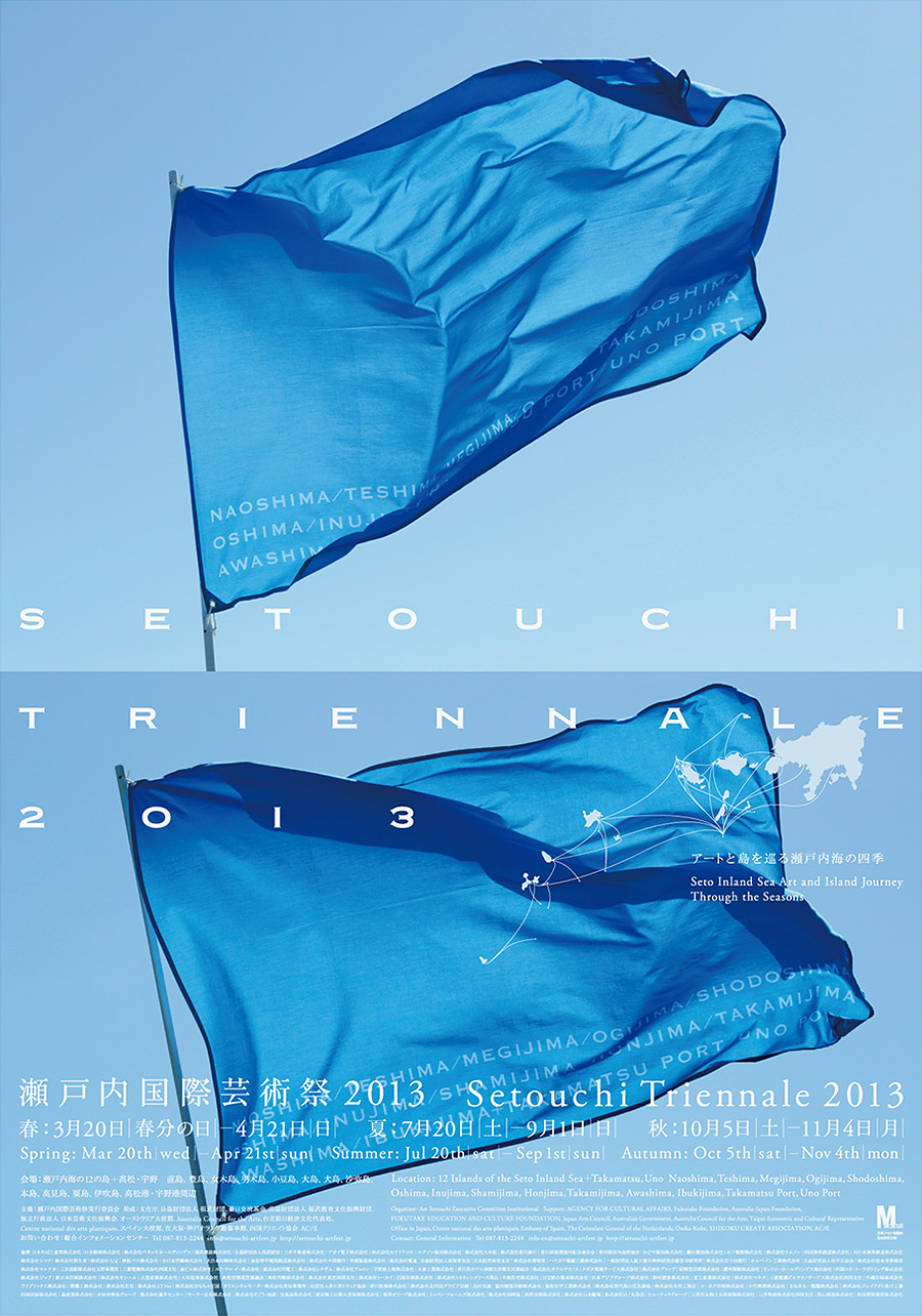
Over the years, he has worked for major Japanese clients including Art Setouchi Triennale, Kenzo, Matsuya department stores, the Nagasaki Prefectural Art Museum, Tsutaya Books, and the Umeda Hospital. In 1998 he also designed the opening and closing ceremonies of Nagano 1998 Winter Olympics.
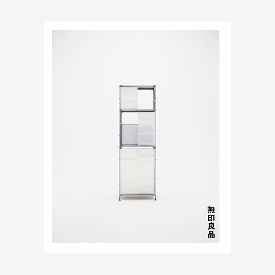
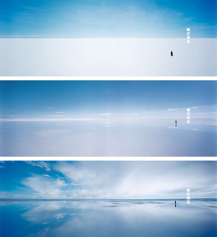
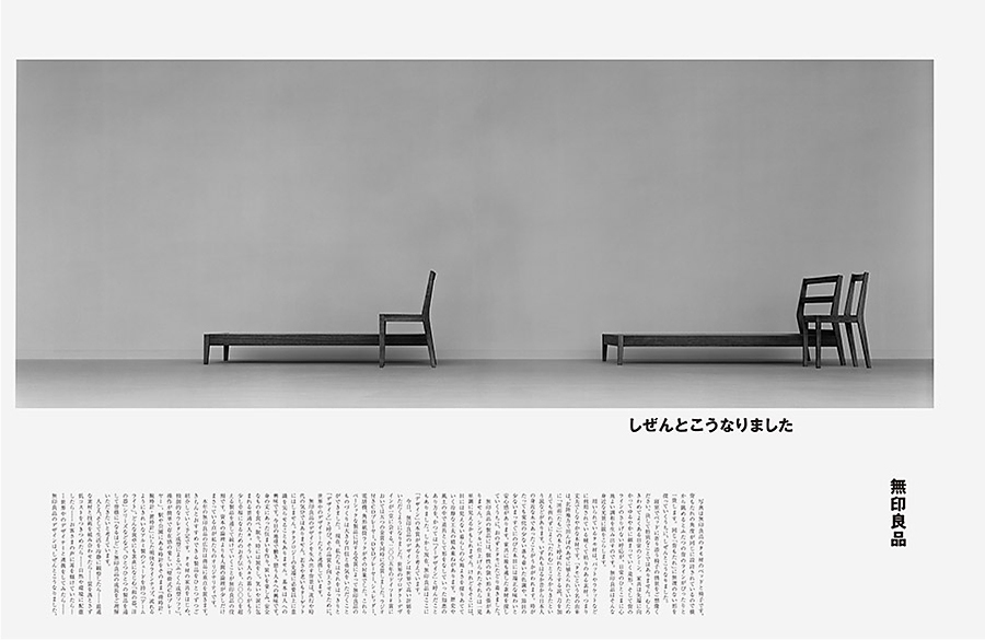
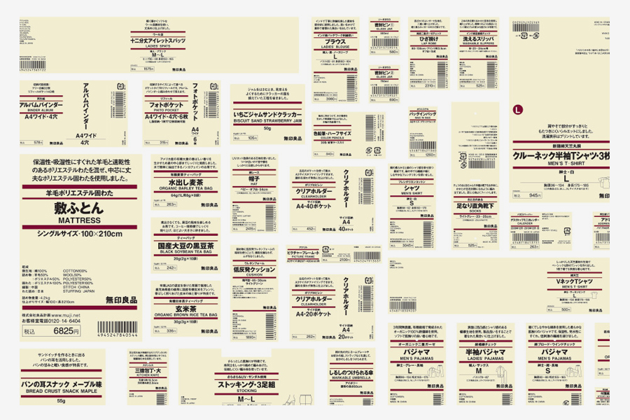
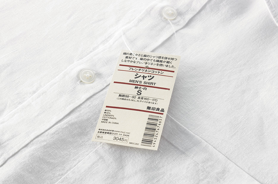
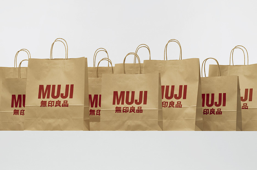
In 2001 he was appointed Muji’s art director by Ikko Tanaka, a master of Japanese graphic design who was its former art director. Since then, he both develops communication design and helps the company to formulate an integrated vision. He curates Muji’s advertising, apps, commercials, exhibitions, magazine, and packaging following the original concept that “sometimes simplicity surpasses splendor.” Under his art direction, Muji has became an international symbol of aesthetic and conceptual quality.
During his career, he also produced numerous successful exhibitions aimed to widen people’s perception by proposing experimental objects that arouse senses. The list of exhibitions includes Re-Design in 2000, Haptic in 2004, Senseware in 2007-09, Architecture for Dogs in 2012, House of Vision in 2013, and Subtle in 2014.
In these exhibitions he often collaborated with some of world best artisans and designers such as Kazuyo Sejima, Kengo Kuma, Naoto Fukasawa, Jasper Morrison, Shigeru Ban, and Toyo Ito as well as major Japanese companies such as Honda, Panasonic, Sony, and Takeo.
Professor at Musashino Art University in Kodaira. Member of the NDC (Nippon Design Center) since 1983, he became its President in 2014. Vice-President of JAGDA (Japan Graphic Design Association) since 2012. Chairman of the Japan Design Committee. Member of the scientific committee of the 21th Triennale exhibition in 2016.
He received prestigious awards including the JAGDA New Designer Award in 1990, the Mainichi Design Award in 2000, the Icograda Excellence Award and the ICSID Design Excellence Award at the 17th Biennale of Industrial Design also in 2000, the Yusaku Kamekura Design Award in 2001, the Tokyo ADC (Art Directors Club) Grand Prize in 2003, and three JAGDA Awards in 2013, 2014, and 2015.
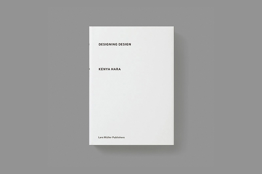
He published numerous critically acclaimed books, focusing on the concept of emptiness in relation to both Japanese design and philosophy. His best-known books are “Designing Design” (Lars Müller Publishing, 2007) and “White” (Lars Müller Publishing, 2008). His texts have been translated in Chinese, English, German, Korean, and Taiwanese.
Enjoy your reading,
 TO THE TOP ↑
What did you want to do when you were growing up?
I didn’t have any image of becoming an adult.
What was your favourite game as a child?
I rember getting excited about measuring things and drawing graphs: things like changes in the weather or sunrises and sunsets.
What was your favorite subject at school?
Arts & Crafts and Japanese.
A project you would like to realize.
I developed a plan that I want to realize for a resort hotel on a very large site.
A designer that you admire.
He is rather an artist, but Isamu Noguchi.
A typeface that you like.
Garamond and Univers. And for Japanese alphabet, I’m currently designing my own typeface.
As a profane, I consider ideograms more illustrative and latin letters more symbolic. Ideograms seem more versatile: You can set them both vertically or horizontally without compromising legibility. (Probably because ecah ideogram seems to be independent from the others.)
In my opinion it seems that ideograms are used like constellations, whereas other alphabets are used like patterns.
A piece of design.
Isamu Noguchi’s sculptures and playground models.
A piece of architecture.
Peter Zumthor’s chapel in the Swiss village of Sumvitg. And the Dojinsai, which was shogun Ashikaga Yoshimasa’s studio at Jisho-ji Temple (Ginkakuji) in Tokyo.
I read that you believe that the value of design is to enhance a spiritual awakening. Why and how design can enhance spirituality? Is this idea related to Japanese culture?
Pride is important to me and since design is an accumulation of tradition and wisdom I am pride to share all of this through my work.
In Japanese aesthetics there is often a coexistence of tradition and innovation. The traditional component seems to be related to sobriety and nature. Can you apply this to your design?
Probably—without my noticing—tradition is embedded in the very foundation of my sensory perception. Tradition is something that we want both to avoid and to protect, even as we rebel against it.
I always like Takeo’s paper boy. Why does a Japanese paper manufacturing company founded in 1899 have a mark reproducing a xilography from a German book published in 1568?
Takeo is a specialized paper trading company focusing on Western paper rather Japanese paper. A former member of the board, Mr. Hiraku Kido, found the illustration at the British Museum in the “Panoplia Omnium Liberalium Mechanicarum et Sedentariarum Artium Genera Contines” by Jost Amman; He decided to use the paper boy as the icon of Takeo. I would like to make this point clear: I am not the designer nor the proposer of that icon. What I did was to make it as a signature by brushing up the illustration and combining it together with the company’s logotype.
A definition of good design.
Good design has the power to rouse people, not as an answer but as a question.
How would you describe your design?
Something in the process of becoming. It is a subject I keep thinking about, a thought I continue to hold on to.
Thank you very much.
Thank you.
 © 2013-16 Kenya Hara, Nicola-Matteo Munari. All rights reserved.
TO THE TOP ↑

Archivio Grafica Italiana is the first digital resource to the Italian graphic design heritage. Founded by Nicola Munari in 2015.

Design consultancy based in Piacenza, Italy. Founded by Nicola Munari in 2015, it operates in the whole field of design.
TO THE TOP ↑