Robert Massin
Bourdinière-Saint-Loup, France, 1925
Who’s Who
Massin—he stopped using his first name in the 1950s—is a renowned French book artist and book designer.
At the end of World War II, he failed to become a theatre reviewer and started traveling abroad. In 1948, once back in Paris, he found a job as editor at the CFL (French Book Club), and shortly after he became their book artist and had to learn typesetting from scratch.
Since 1952, he worked at Le Club du Meilleur Livre producing several books each month. He was responsible for every aspect of book production, not just typography. He made what he called book-objects, art books where aesthetics has an independent life from the textual content—as himself stated—prevailing over legibility.
Massin followed the theory of Pierre Faucheux—another French book artist—who first promoted this attitude to book production according to which every aspect of the book should express its content: size, binding, layout, paper, typeface, etc. In this way the text is no longer text, and the book is not a book: The text becomes a sort of painting and the book becomes a sculptural object. It was the work of a book artist, not a designer.
In 1958 he joined the famous Éditions Gallimard becoming its Art Director two years later, an appointment he held for twenty years. Initially, he contributed with minor corrections: slightly redrawing the logotype of NRF (Nouvelle Revue Française), and fine tuning the white covers of Gallimard novels. Later, he gave a major contribution by designing the graphic standards of Folio (1972) and other book series. Folio featured white covers with Fry’s Baskerville types, effectively separating text and image. For the launch of the series, in less than six months Massin designed 300 hundreds books.
At that time, he became conscious of industrial production and the way this books required to be designed. “There is no real difference between a poster and a book cover: They both have to be seen as you move past them, and they have to impress you quickly and convincingly.”
At the same time, he continued experimenting with typography. For “Exercices du Style” (Gallimard, 1963) by Raymond Queneau—that repeats the same short story in 100 different ways—“Massin displayed his skill with eccentric type forms, supplying each variation of the tale with a heading which suggests the narrative form that follows. Derived from the content, the type style becomes part of the expression of the text’s meaning. The letters are not decoration, but unified text and illustration” (Richard Hollis in “Eye” n.16 vol.4, 1995).
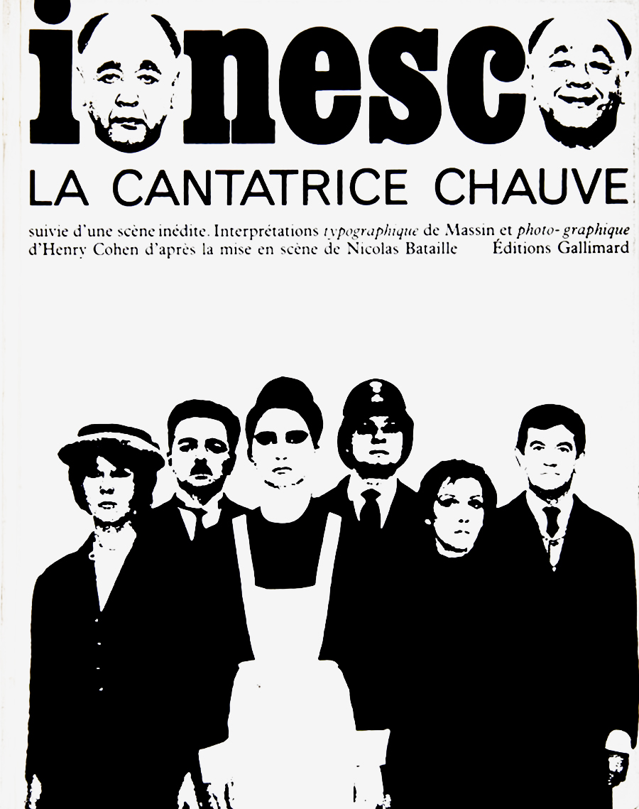
The year later he produced “La Cantatrice Chauve” (Gallimard, 1964)—the Bald Soprano—one of his most-known book that he tried to transform into a theatre play, where every character has his/her own voice represented by a specific typeface. He adopted changes of scale, zoom effects, long shot, and close-up from the cinema and the comic strip.
In 1984 he stopped his collaboration with Gallimard, and start working again as a freelancer for Albin Michel, Éditions Fixot, Éditions Hoebeke, Hachette, and Robert Laffont. One of his most recent works is the logotype for the National Theatre in Strasbourg (1994).
During his career he also wrote numerous books, historical studies, autobiographical writings, an account of Zola as a photographer, and a documentary biography of Dostoevsky.
A fruit of the French tradition, Massin can be considered more a “graphiste” or graphic artist, a sort of stylist rather a designer, but he always based his style on a specific content and a specific context, not on trends. Indeed, he tried to distinguish style from fashion, quoting Jean Cocteau: “Fashion is what goes out of fashion.”
Member of AGI (Alliance Graphique Internationale) since 2001. In 1997 he received the International Book Award from the UNESCO. His work has been exhibited in Boston, Istanbul, Los Angeles, Montreal, Paris, and Strasbourg.
Enjoy your reading,
 TO THE TOP ↑
Q&A
Published Oct 28, 2013
Recorded Jul 11, 2013
What did you want to do when you were growing up?
I wanted to make books, like my father. He was a sculptor-engraver and made books of marble. I wanted to make books of paper. Looking him working with letters, from the age of 6, I started to make my own small booklets, as many children do. Eighty years later I still do books (sometimes concept projects) working from ten to twelve hours a day.
What was your educational path?
I have never attended a school. I am self taught.
When and how did your career start?
I began my graphic design business when I was 23. Previously I worked as a journlist, interviewing Céline, Malcolm Lowry, Steinbeck, Dos Passos, and others.
How has your design evolved since that time?
Towards simplicity. A good book cover should be read by at a first glance, like in a blink. Without unnecessary ornaments. As the architect Auguste Perret said, all that is decorative is not needed.
What is the project you remember with more pleasure and interest?
The Bald Soprano, Grove Press, 1965. Written by Eugene Ionesco, with Henry Cohen’s pictures. It is the transposition of a tridimensional theatre pieces in the bidimensional space of the book. And also Letter and Image, done in fifteen years of work, being sold in the bookshops for more than fourty years.
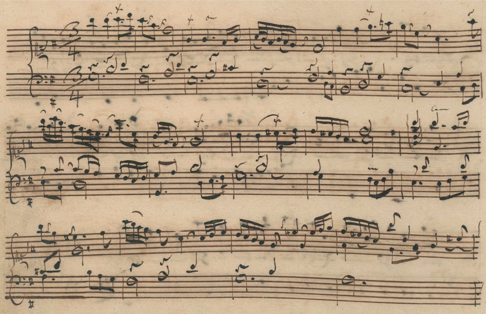 A handwritten copy of the Goldberg Variations aria, from the notebook of Anna Magdalena Bach, 1725.
A project you would like to design.
A handwritten copy of the Goldberg Variations aria, from the notebook of Anna Magdalena Bach, 1725.
A project you would like to design.
The Goldberg Variations by Johann Sebastian Bach, using an expressive typography, with the notes as colour images (as I did for ‘Pierrot Lunair’ by Arnold Schönberg, a project started in 1966 and ended in 2006, with the compliments of Pierre Boulez).
A designer you admire.
Ahn Sang-Soo from South-Korea.
A piece of architecture.
The Palais Idéal by Ferdinand Cheval.
A piece of design (graphic or industrial).
The book ‘Jazz’ by Henri Matisse. He was responsible for the entire project: the idea, calligraphy, drawings, and layout, as the German Rococo architects used to do.
A typeface.
None. There are no ugly typefaces, you just have to know how to use them.
Without considering technology, what are the differences between the design from the past and the current one?
Technically, the speed of execution. The computer is a wonderful tool. Sometimes I design a book cover in 5 or 10 minutes (of course thanks also to experience); but beware, there are stereotypes to avoid, and also all the people do the same thing, from Seoul to San Francisco, thanks to the overthrow of distance. In my early days, I discovered what the Americans were doing only through magazines (Esquire, Holiday, etc.) only after six months or even two years later.
Has the way people perceive the design changed?
In front of a tv commercial, people watching and sitting on their armchairs are first captured by the way the product is presented and later by the product itself. This is where the problem of advertising starts. It happens also in literature: after reading Proust (I read seven times ‘A la recherche du temps perdu’) you are more sensitive to the way the story is told than to the story itself.
What would you recommend to a young designer?
Look around you, graphic design is everywhere: in the street, in the television, in movies, not only in the academic teaching, even when exercised by qualified professionists.
How would you define a good design?
Simple, original, clear and legible. You should have the impression that there aren’t other possibilities to do it in addition to the one you are looking to.
How would you describe your design?
I don’t know. It’s up to you to define it.
Which was your favourite game when you were a child?
I didn’t have enough time to play.
Thank you.
Thanks.
 © 2013-16 Robert Massin, Nicola-Matteo Munari. All rights reserved.
TO THE TOP ↑
Portfolio
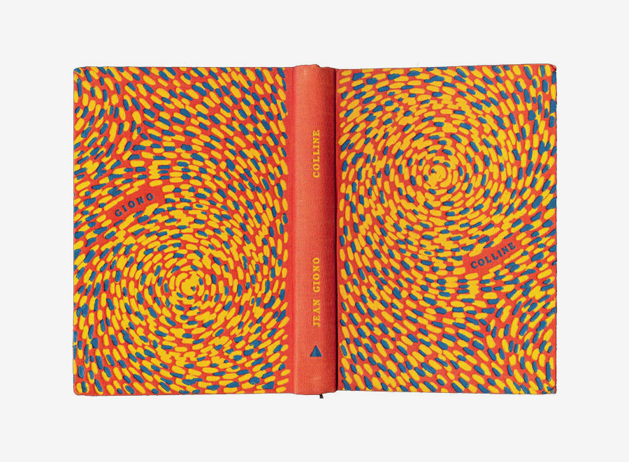
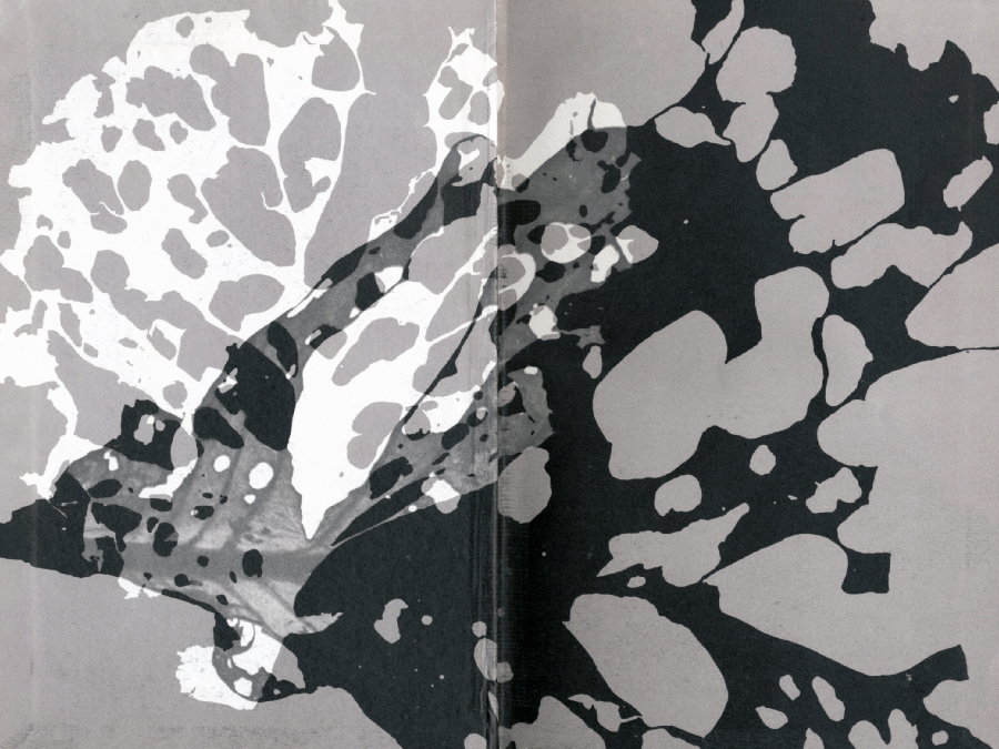
Colline
Hardcover Book, 20×13 cm
1953
Book by Jean Giono. Published by the Club du Meilleur Livre, Paris. The image portrays the cover spread.
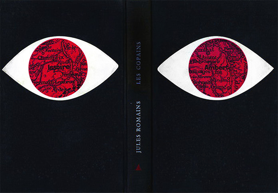
Les Copains
Hardcover Book, 20×13 cm
1953
Book by Jules Romains. Published by the Club du Meilleur Livre, Paris. The image portrays the cover spread.
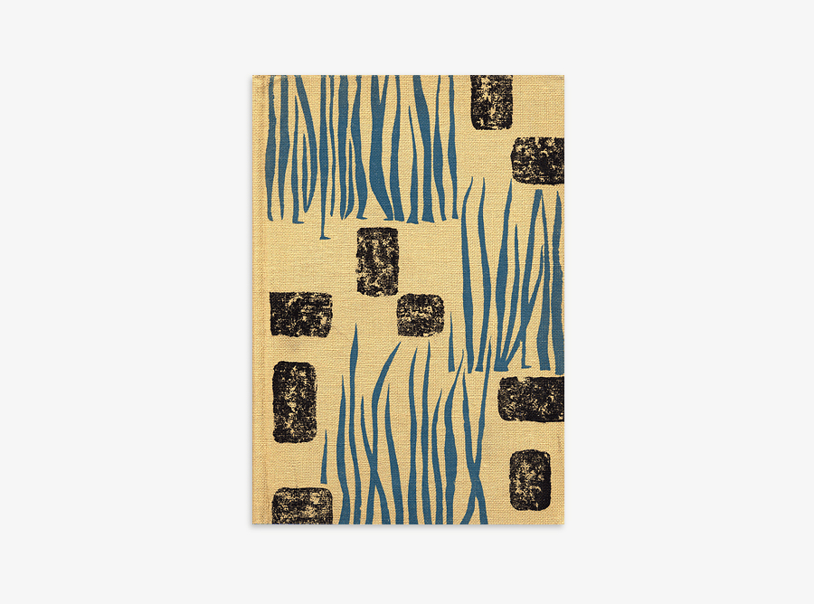
La Brière
Hardcover Book, 20×13.5 cm
1954
Book by Alphonse de Chateaubriant. Published by the Club du Meilleur Livre, Paris.
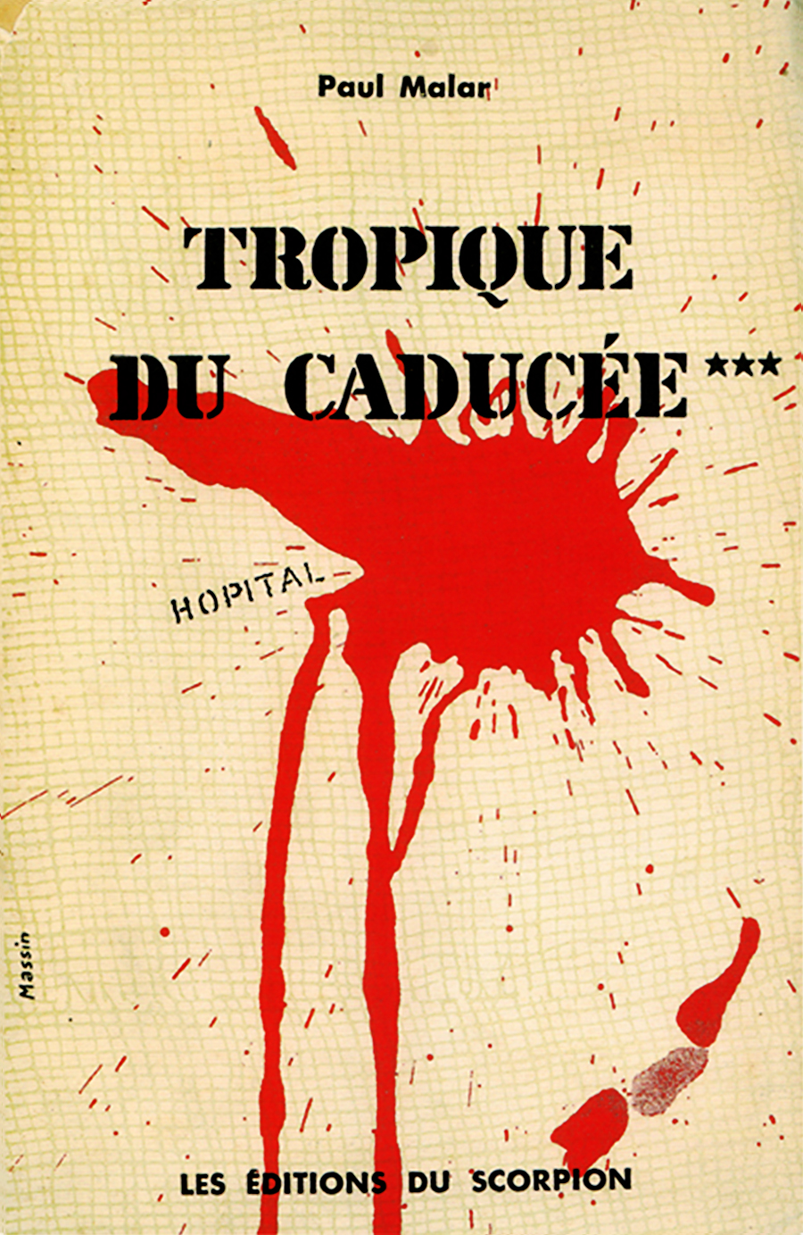
Tropique du Caducée
Hardcover Book
1954
Published by Les Éditions du Scorpion.
Voyage au but de la nuit
Hardcover Book, 20×13 cm
1954
Book by L.F. Céline. Published by the Club du Meilleur Livre, Paris. Detail of the endpapers.
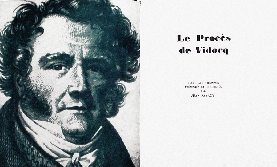
Le Proces de Vidocq
Hardcover Book, 20×17 cm
1956
Book by Jean Savant. Published by the Club du Meilleur Livre, Paris. The image portrays the frontispiece.
La Jumente Verte
Hardcover Book, 20×13.5 cm
1957
Book by Marcel Aymé. Published by the Club du Meilleur Livre, Paris.
Les Bijoutiers du clair de lune
Hardcover Book, 20×13.5 cm
1957
Book by Albert Vidalie. Published by the Club du Meilleur Livre, Paris.
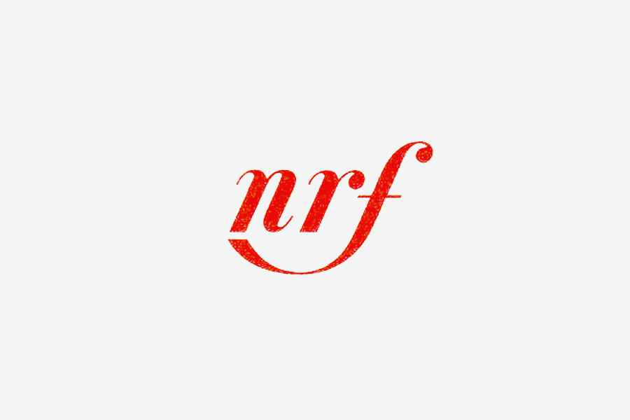
NRF
Logotype
c.1960
Logotype redesign for the NRF (Nouvelle Revue Française) published by Gallimard. Also credited to have been designed with Peter Knapp.
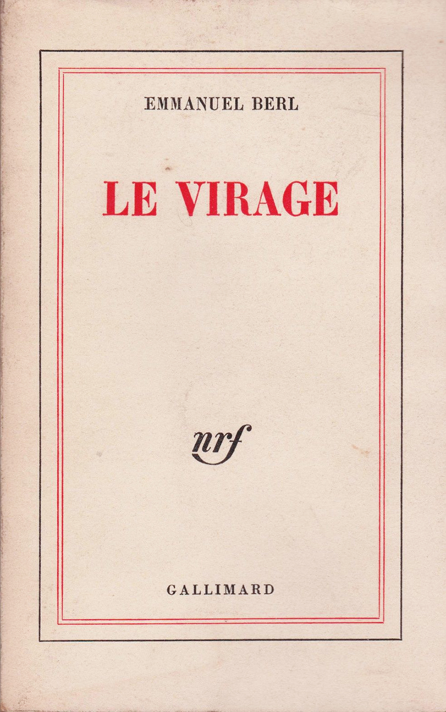
NRF
Book Series
c.1960
Cover redesign of the NRF (Nouvelle Revue Française) book series. (This cover dates 1972.) Published by Gallimard.
Rhum
Hardcover Book, 20×13.5 cm
1960
Book by Blaise Cendrars. Published by the Club du Meilleur Livre, Paris.
La Cantatrice Chauve
Book, 21×18 cm
1964
Cover of “The Bald Soprano” by Eugène Ionesco. Published by Gallimard.
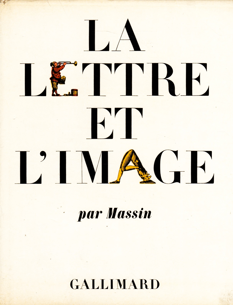
La Lettre et l’Image
Book by Massin
1970
Autobiographical book. Published by Gallimard.
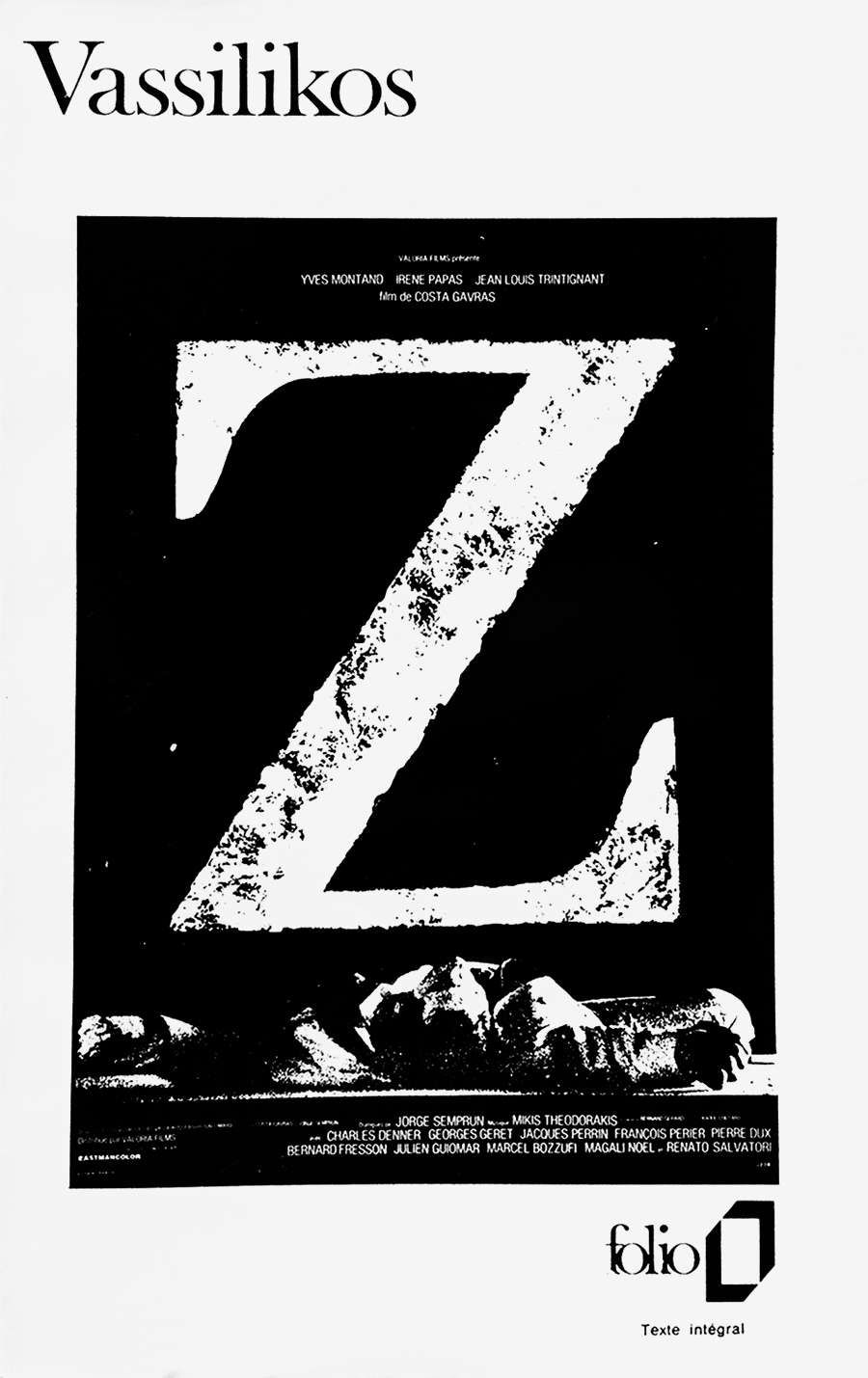
Folio
Book Series, 18×10 cm
1972
A cover from the Folio book series. Published by Gallimard since 1972.
Links & Docs
Articles
Eye Magazine Language Unleashed
Interviews
Persée Interview
Profiles
AGI Robert Massin
Index Grafik Massin
Projects
AIAP Club du Meilleur Livre
TO THE TOP ↑
Comments
If you wish to add a comment please feel free to write at
info@designculture.it
TO THE TOP ↑
Follow on Facebook
Partnerships

Archivio Grafica Italiana is the first digital resource to the Italian graphic design heritage. Founded by Nicola Munari in 2015.

Design consultancy based in Piacenza, Italy. Founded by Nicola Munari in 2015, it operates in the whole field of design.
TO THE TOP ↑
© 2013-16 Nicola-Matteo Munari. All rights reserved.