Jean Widmer is an acclaimed Swiss graphic designer based in France.
From 1946 to 1950 he studied at the Kunstgewerbeschule (School of Arts and Crafts) of Zurich, then directed by the former Bauhaus master Johannes Itten (1888-1967). In 1953 he moved to Paris, where attended lithography courses at the École des Beaux-Arts (School of Fine Arts).
After one-year internship at the Atelier Tolmer, located on the Île Saint-Louis, he was appointed Art Director of SNIP—Société Nouvelle d’Information et de Publicité (New Society of Information and Advertising), holding this charge from 1956 to 1959. He later moved to Galeries Lafayettes, a major department store, substituting Peter Knapp as its Art Director, from 1959 to 1961. At the same time he also worked at Jardin des Modes magazine as art director and photographer, holding the position until 1969. During the 1960s he also travelled in Japan to study ‘shodo,’ Japanese calligraphy, and ‘mon,’ Japanese traditional crests.
In 1969 he opened Visuel Design, focusing on coordinated graphic communication for cultural and public institutions. The same year he was the first designer to develop a corporate identity system for a French cultural institution, developing the graphic communication of the CCI—Centre de Création Industrielle (Center of Industrial Creation).
It was during this period that Widmer developed his own original graphic language, based on synthesis, rigorous geometry, and schematic typography that to this day represents the first and one of the few examples of Modern graphic design in France.
In 1972 he took charge of the first design for the French Highways signage, drawing a beautiful and effective pictogram system. From 1974 to 1977, and again in 1985, he designed the coordinated identity for the Centre Georges Pompidou, formed from the merging of the CCI with other cultural institutions, for which he designed a beautiful and iconic mark that portrays the famous façade of the building.
In 1979 he designed an acclaimed poster for Kieler Woche, the major sailing event in the world that is famous in the world of graphic design for its striking communication. From 1983 to 1987 he worked on the corporate identity design for the prestigious Musée d’Orsay, in collaboration with the prominent graphic designer Bruno Monguzzi.
He continued to focus on corporate graphics for cultural institutions, developing the identity for the Théâtre National de la Colline, and the IMA—Institut du Monde Arab, both in 1987, and the Bibliothèque Nationale de France in 1994. In 1989 he also designed a typefaces, Bi-89, on the occasion of the French Revolution’s bicentennial.
In 1960 he joined the faculty of the ENSAD—École Nationale Supérieure des Arts Décoratifs (School of Decorative Arts), Paris, where he taught until 2000 remodeling the graphic design curriculum, stressing mastery of typography and color as fundamental skills. Since the early 1990s, he also taught at the Atelier National de Recherché Typographique (National Bureau for Typographic Research).
During his career he received important recognitions, including the Toulouse-Lautrec Prize in 1980, the Grand Prix National des Arts Graphiques from the French Ministry of Culture in 1994, and the Distinctive Merit Award from the ADC (Art Directors Club), New York. He was appointed Chevalier of the Ordre des Arts et des Lettres in 1983, Officer of the same order in 1991, and Commandeur in 2001.
I truly wish to thank him for his great kindness.
Enjoy your reading,
 TO THE TOP ↑
What did you want to do when you were growing up?
Since I was young, I have always had a gift for drawing. My sister—who is 15 years younger than me—attended the same school of mine, and she told me that for many years the drawings I made were proposed to students as examples of great quality.
What was your educational path?
When I was a teenager, Mr. Fred Scheckenbourgers, a colleague of my father, gave me a job in his wireless marionettes cabaret-theater. He introduced me to a lively cultural scene, and this experience was fundamental for my future. My parents were worried about seeing me pursue an artistic profession, but Fred convinced them to enrolled me in the art school. I worked as an apprentice decorator by day, and was immersed in the theater’s creative atmosphere by night. The multidisciplinary universe that I have known through the personality of Fred has represented a cultural and artistic heritage from which I drew energy and self-confidence. After graduating as a decorator, I joined again the Kunstgewerbeschule (School of Arts and Crafts) for a master in mural art, color, texture, and type design. In 1949 I visited Paris thanks to a study-tour organized by the school. I was impressed by the magic and richness of its museums and I decided that I would be back as soon as possible. I did it four years later, doing an internship at Atelier Tolmer on the Île Saint-Louis. I wanted to express myself with more freedom, stimulated by the drawings of Picasso, Braque, and Chagall that I saw in the art galleries. I had an irresistible desire to ‘scribble’ on the stone, so in 1955 I joined the atelier of lithography at the École des Beaux-Arts (School of Fine Arts), Paris.
What was your favorite subject at school?
At that time, considering the social context in which we lived, the prospect of an artistic profession didn’t reassure my father, but during my last year at the high school the drawing teacher told me: “Widmer, you have a nice tie and you draw well. You would be a good decorator!” So I took courage, I talked to my parents, and I enrolled in the famous Kunstgewerbeschule (School of Arts and Crafts) of Zurich, at that time directed by Johannes Itten, the former professor at Bauhaus in Weimar.
When and how did your career start?
At the end of the 1950s the Galeries Lafayette and Printemps department stores were the two main advertising competitors in Paris. The director of Galeries Lafayette called me: “What is the latest department store’s advertisement that impressed you most?” And I answered him: “I visited Globus, La Rinascente, Bloomingdale’s, Saks, and Ohrbach’s in New York City. I found Ohrbach’s advertisement showing a mooing cow to be most interesting. It is suprising that they chose an image aimed at capturing the attention instead of one of the usual products.” “Well said Widmer! I’ve noticed it too!” he replied. So I understood that we would find the way to work together. He was interested in my ideas and intrigued by their innovative force of attraction. Soon my advertising pages started to appear on the Paris newspapers. They didn’t capture only the attention of the public but also the one of the director of the École Nationale Supérieure des Arts Décoratifs (School of Decortive Arts), who invited me to a give a short course of lectures in graphic design. A short course which has then lasted for 35 years!
How has your design evolved since that time?
In 1972 the Ministry of Ecology was looking for a way to prevent the invasion of advertising on the French highways. Then I was appointed to design a sign and pictogram system of cultural and practical value. The idea was to give the drivers information about the region’s artistical and architectural heritage. We developed a complex system of pictograms starting from photoreportage did in situ. We conceived a series of panels of the form answer-question: drivers found a first panel with a question and after 200 m another one providing the answer. This idea was pioneering and was later adopted by some other surrounding countries.
What is the project you remember with more pleasure and interest?
The posters for the CCI (Centre de Création Industrielle), Paris. In 1969 I was appointed to design the whole corporate identity. I designed more or less twenty posters for the opening exhibitions, promoting French industrial design. All the posters were based on the same concept: a system of forms and colors matched to Helvetica, without reproducing the corresponding objects. Thanks to this strong identity the CCI could be recognized at a first glance, even before understanding the content of the poster. After fourty years this approach still characterizes my design criteria. This experience turned out be of fundamental importance when in 1976 I was appointed to design the corporate identity of the Centre Pompidou, in which the CCI had merged.
A project you would like to design.
I would like to design a coordinated sign system for all the highways and roads in the European Union countries.
One or more designers that you admire.
Ikko Tanaka, Josef Müller-Brockmann, Max Bill,
Philippe Apeloig, Armin Hofmann, Uwe Loesch, and Debora Sussmann.
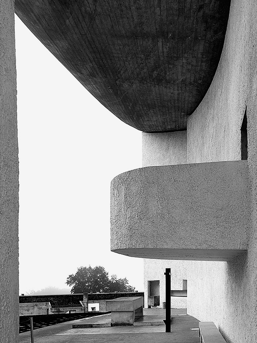 Le Corbusier, Notre Dame du Haut, Ronchamp (1953-55). Photo: Cemal Emden.
A piece of architecture.
Le Corbusier, Notre Dame du Haut, Ronchamp (1953-55). Photo: Cemal Emden.
A piece of architecture.
The Chapel of Notre Dame du Haut (1953-55), Rochamp, by Le Corbusier. It is renowned for its eccentric and authentic character. It is an interplay of volumes, light and shadow, colors, and materials. It illustrates a series of smart solutions to given problems. A real example of savoir-faire.
A piece of design
One of the twentyone posters that I designed for the Centre de Création Industrielle in 1972.
A typeface.
Hellenis, designed by myself. When I went to Paris, I brought with me a photographic matrix of Helvetica from which I took it letter by letter to set titles. Fortunately, Adrian Frutiger—a colleague of the Kunstgewerbeschule (Shool of Arts and Crafts) in Zurich—came to Paris and designed the twentyone weights of Univers (1952-56), released by Deberny-Peignot Type Foundry.
Without considering technology, what are the differences between the design from the past and the current one?
Today, design requires an ethic of contents and meanings, so that utility becomes beauty. The world has became modern and functional, while the past was rather a decorative era.
Has the way people perceive the design changed?
Considering interior design, the difference is clear. If the bourgeois kitch and the french styles influenced more than one generation, the functional furniture of the 21st century’s popular world reversed this logic. Ikea is the main symbol and protagonist of this revolution. Between the two wars we had some designers that anticipated the “less is more” attitude towards architecture moves. Thanks to this logic, design has reached everyone and at the end of the 20th century this aesthetic experience became a mass phenomenon.
What would you recommend to a young designer?
Students should think before act to identify the subject, the project, and the graphic solution. The work grows through a continuous exercise of criticism and self-criticism. A warning: as a principle I ban computers from the concept and research stage. Sketching allows to make your own ideas even more original, and to sharp them. There is a direct, unfiltered flow from the concept to their material representation.
How would you define a good design?
Shortly after the opening of the Centre Pompidou, the director called me to design a mark for the center. “I will design the building façade with the sliding scale,” I proposed him. “That’s an excellent idea,” he replied. Sitting in front of him, I immediately sketched the mark. Unfortunately, I didn’t manage to convince him that it would have been better to draw it with five instead of six floors, and I am still unhappy about it. In a mark is not important that the object portrayed—in this case the building—is faithfully reproduced, but are its essential qualities that define its symbolic stature and the fact that it can be easily memorizable.
How would you describe your design?
I feel close to minimalist design. I entitled my monograph for the exhibition at the Centre Pompidou “Jean Widmer. Un écologist de l’image” (Centre Pompidou, 1995). I adopted
Mies van der Rohe “less is more” principle
[Note: It become a known dictum thanks to Mies, but was actually a statement from Peter Behrens.] as a purification formula also in my private life.
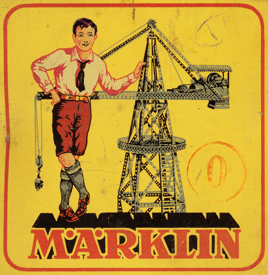 A tin box of Märklin Toys, 1930s. Source: Wikipedia.
What was your favorite game when you were a child?
A tin box of Märklin Toys, 1930s. Source: Wikipedia.
What was your favorite game when you were a child?
When I was a child, in Switzerland there was a game called Märklin that I liked very much. It was a box containing metal building parts: wheels of different sizes, screws, and nuts. I remember that I built a tractor, a cable car, a crane…
Thank you very much.
Thank you too.
 © 2013-16 Jean Widmer, Nicola-Matteo Munari. All rights reserved.
TO THE TOP ↑

Archivio Grafica Italiana is the first digital resource to the Italian graphic design heritage. Founded by Nicola Munari in 2015.

Design consultancy based in Piacenza, Italy. Founded by Nicola Munari in 2015, it operates in the whole field of design.
TO THE TOP ↑
