Philippe Apeloig
Paris, France, 1962
Who’s Who
Philippe Apeloig is a renowned French graphic designer.
He studied at the École Supérieure des Arts Appliqués (School of Applied Arts) and at the École Supérieure des Arts Décoratifs (School of Decorative Arts), both in Paris.
During the early 1980s, he worked as an intern at the famous Total Design in Amsterdam. In 1985 he was hired as a graphic designer by the Musée d’Orsay, Paris. Few years later he went to Los Angeles to work with April Greiman and came in contact with the chaos of Postmodernism. In 1993 he was granted a residency at the French Academy of Villa Medici in Rome, where he devoted himself to the design of some experimental typeforms, a work that was awarded the 1995 Gold Medal by the Tokyo TDC (Type Directors Club).
In 1997 he became design consultant for the Louvre. From 1992 to 1998 he taught typography at the ENSAD (National School of Decorative Arts) in Paris. From 1992 to 2002 he was full-time professor at the Cooper Union School of Art in New York City. During the same period he also worked as a curator for the Herb Lubalin Study Center of Design and Typography. Once back in Paris he was appointed art director of the Louvre, holding this appointment for five year, until 2008.
Member of AGI (Alliance Graphique Internationale) since 1997. Member of the Ordre des Arts et des Lettres since 2011. His work has been exhibited in numerous major museum around the world and his posters are part of the collection of the MoMA (Museum of Modern Art), New York City.
His graphic design is highly innovative, always totally relevant to the topic and extremely expressive. The letters become images of light, shape, and color: visual objects of emotion. It is never chaotic or irrational, but extremely simple, clear, and essential. Very often the composition is reduced to the mere typography, treated so that each letter becomes part of a superb stage performance which is extremely dynamic. It is alive and pulsating, full of energy, sounds and, above all, in constant motion, generating an extraordinary typographic choreography of which Apeloig is an undisputed master.
Enjoy your reading,
 Portrait Photo: Mareen Fischinger.
TO THE TOP ↑
Quotations
“Being a designer involves a kind of constant responsibility.”
“Being a graphic designer means that you belong to the world of art and culture.”
“Typography is the very essence of design, the balance between light and shadow.”
TO THE TOP ↑
Q&A
Published Mar 17, 2014
Recorded Dec 20, 2013
When you were a child, what job were you dreaming of for your future?
I had a fascination for the world of dance and theater. I dreamed of becoming a choreographer to express what I felt through dance such as Pina Bausch, Alwin Nikolais, and Merce Cunningham. Or I wanted to be a stage designer to create the world those dancers and actors evolved in. But above all, a painter.
What was your educational path?
I studied literature, philosophy, and art in high school. I started to have an interest for typography when I was a freshman in art school at the École Supérieure des Arts Appliqués Duperré (School of Applied Arts) in Paris. But it was only during my internship at Total Design in The Netherlands that I realized that I wanted to engage myself in the graphic design field.
What was your favorite subject at school?
Literature and philosophy.
When and how did your career start?
I designed my first logotype in 1983. It was for my parents’ business Atelier Electronique. At that time I was an intern at Total Design. Then I started to do illustrations for a fashion magazine to afford my studies. However my first position in the professional world was at the Musée d’Orsay, where I was hired as the in-house designer.
How has your design evolved since that time?
In zig-zag; with keeping in mind all what I learned at Total Design: the grid system, and the experimental typography. And later the free artistic gesture that April Greiman brought to design, which deleted my fear of bringing the artistic vision in graphic design.
A book that was important for you as a designer.
The first book about graphic design that I bought: “Top Graphic Design” by FHK Henrion (ABC Verlag, 1983). It symbolically gave me the ‘green light’ to become a designer.
What kind of projects do you prefer to dedicate yourself and why?
I love to design posters, logotypes, and motion graphics.
A project you would like to realize.
An animated poster for those large screens that you find nowadays in public places and transports.
A designer whose work you admire.
Wim Crouwel.
A piece of architecture.
Falling Waters House by Frank Lloyd Wright. An incredible mix between nature and architecture, between liquid and solid, between movement and space.
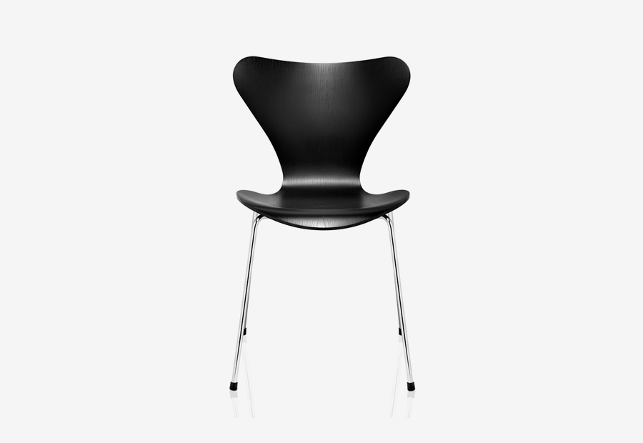 Arne Jacobsen, Chair 3107 from Series 7, 1955. Manufactured by Fritz Hansen, Denmark.
A piece of design.
Arne Jacobsen, Chair 3107 from Series 7, 1955. Manufactured by Fritz Hansen, Denmark.
A piece of design.
The chairs from Serie 7 by Arne Jacobsen
A typeface.
Frutiger. The purest modernist font.
How do you approach the design of a new project?
I cannot create a design without having researched the context first. I need to know everything I can about the client’s world before I jump in with some of my own ideas. I read a lot and I often start with doodles or with more sophisticated drawings. When I design a poster, I contextualize it and combine elements significant to the subject.
Without considering technology, what do you think are the main differences between the design from the past and the current one?
Perhaps the prolific appetite from a larger audience and young designers who are starving for design.
Has the way people perceive the design changed?
It became more coded. More like a labyrinthine visual puzzle.
What would you recommend to a young designer?
Never settle for something safe, but to always aim for the unexpected: The solution that provides the viewer with a new challenge.
What job would you have done if you had not became a graphic designer?
I would have become a dancer.
What was your favourite game when you were a child?
Puppets.
Thank you very much.
Thank you too.
 © 2013-16 Philippe Apeloig, Nicola-Matteo Munari. All rights reserved.
TO THE TOP ↑
Portfolio
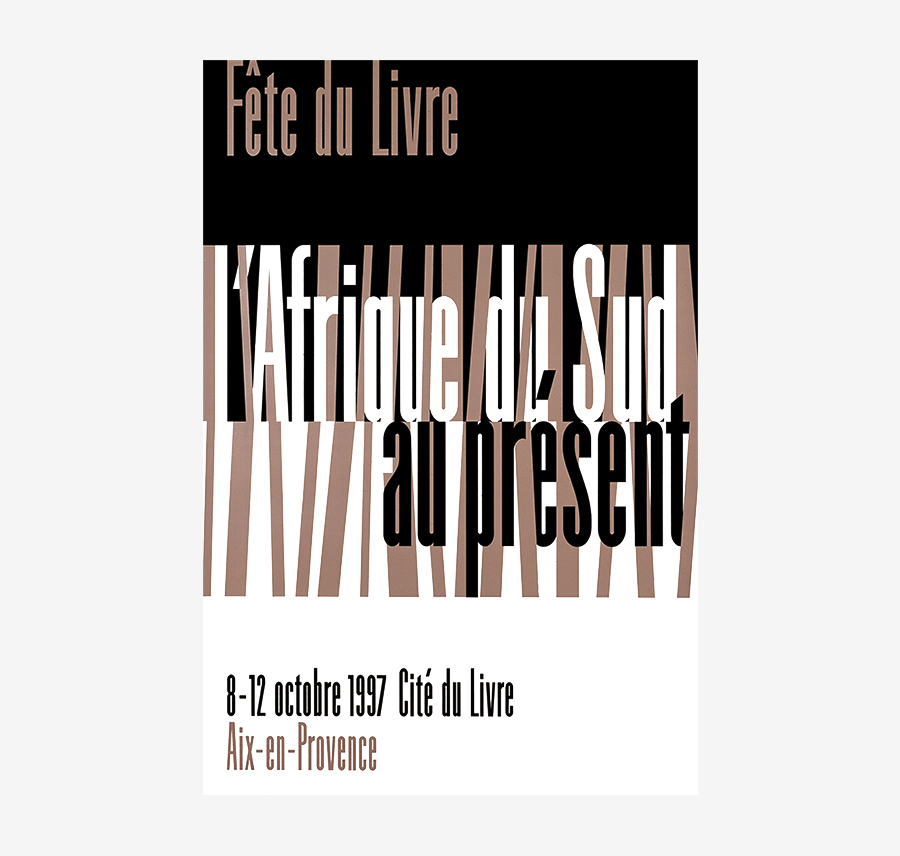
L’Afrique du Sud au présent
Poster, 175×120 cm
1997
Designed for the Book Festival of Aix-en-Provence.
Icade Immobilier
Mark
2003
Designed for a French estate agency. Also credited to have been designed in 2005.
Petit Palais
Mark
2004
Designed for the Petit Palais Musée des Beaux-Arts (Museum of Fine Arts), Paris. Also credited to have been designed in 2012.
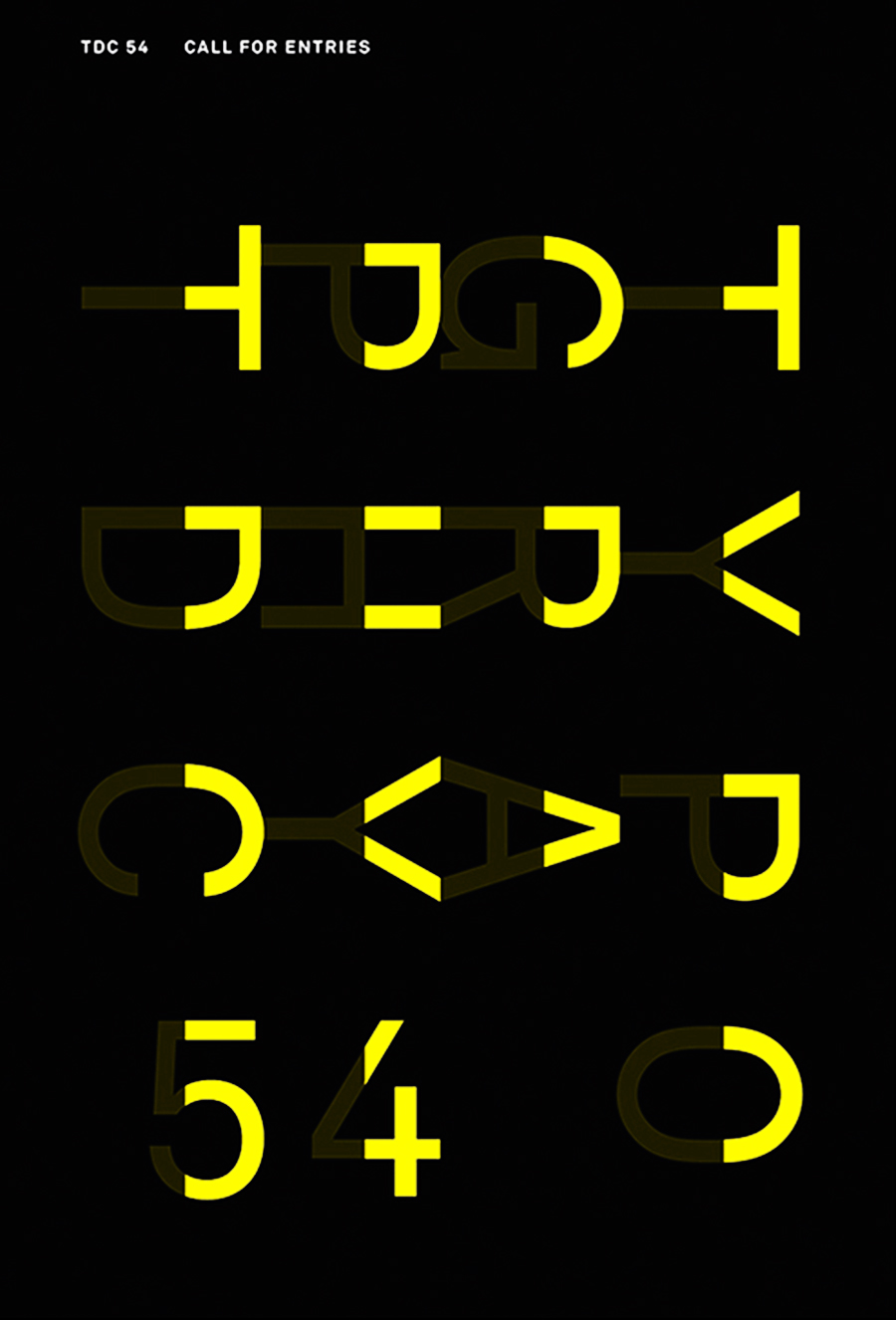
Typography TDC 54
Poster, 175×120 cm
2007
Designed for the TDC (Type Directors Club) of New York.
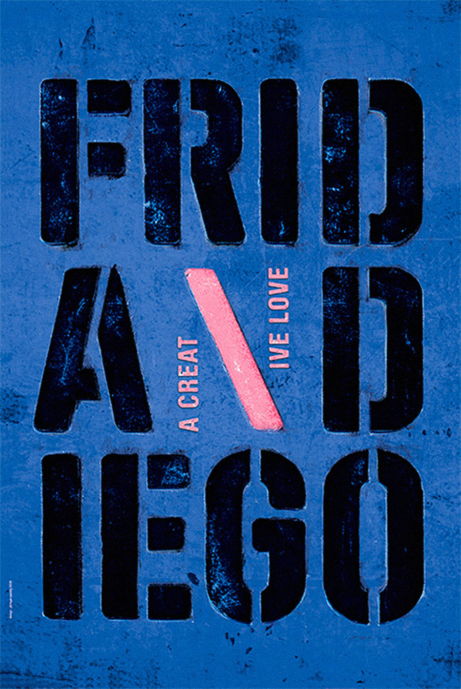
Frida and Diego
Poster, 175×120 cm
2008
Designed for the AGI (Alliance Graphique Internationale).
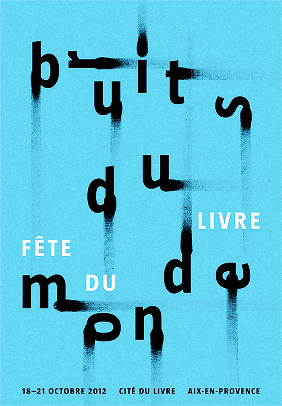
Bruits du Monde
Poster, 175×120 cm
2012
Designed for the Book Festival of Aix-en-Provence.
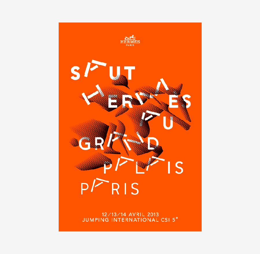
Saut Hermès
Poster, 175×120 cm
2013
Links & Docs
Articles
Designboom Typorama
Fontshop Fontmag
It’s Nice That Typorama
Mareen Fischinger Studio Philippe Apeloig
Nouvelle Noire Typorama
TDC Typorama
Interviews
Cool Hunting Typorama
Desktop Mag Interview (Part 1)
Desktop Mag Interview (Part 2)
Profiles
Facebook Studio Philippe Apeloig
Ideas on Design Philippe Apeloig
Studio Philippe Apeloig Official Website
Wikipedia Philippe Apeloig
Projects
Nouvelle Noire Apeloig Type Library
MoMA Collection
Type Token Typorama
Videos
Emotional Branding Alliances Master of Typography
Sylvestre Lucia Interview
TO THE TOP ↑
Comments
If you wish to add a comment please feel free to write at
info@designculture.it
TO THE TOP ↑
Follow on Facebook
Partnerships

Archivio Grafica Italiana is the first digital resource to the Italian graphic design heritage. Founded by Nicola Munari in 2015.

Design consultancy based in Piacenza, Italy. Founded by Nicola Munari in 2015, it operates in the whole field of design.
TO THE TOP ↑
© 2013-16 Nicola-Matteo Munari. All rights reserved.