Motoo Nakanishi
Kobe, Japan, 1938
Introduction
I am very glad to present you an interview with Motoo Nakanishi, whose name is still uncommon to many in the West, but in my opinion deserves to be associated to those of the greatest designers of the 20th century.
Nakanishi is the founder and pioneer of Japanese corporate identity’s industry having dedicated himself to corporate communication since early 1960s both as a researcher, designer, and educator.
During his career, he published about 50 books on the subject of CI (corporate identity) and developed more than 100 projects for prestigious Japanese, Korean, and Chinese companies thus acquiring the status of “father of Asian CI.”
There are three things in particular that I consider the greatest contributions brought by Nakanishi to the field of communication design:
1.
His comprehensive research on corporate communication, that through its publication constitutes an incomparable documentation of timeless value. (Also documenting that the practice of corporate identity design wasn’t as much limited to the visual expression as the promoters of contemporary branding sustain.) Unfortunately, many of his books are only published in Japanese and then unaccessible to most of the people in the West.
2.
His great commitment to promote a culture of communication design that I consider a consciously modern one. A culture by which corporate aesthetics generates business benefits because of its social and cultural values. It’s a cultural vision implying that companies are social institutions and that the only way they can sustainably prosper is by having a cultural responsibility towards the society itself.
3.
The true innovative, strategic, and sustainable corporate identity programs that he developed for some of the best-known Japanese companies. In my opinion his work is a true resource for today’s and tomorrow’s corporate management and a cultural reference for all the people.
Although Nakanishi’s consultancy PAOS has been object of studies in the U.S.A., I’m no aware of other interviews with Nakanishi published by Western media, so I’m particularly proud to introduce him to anyone who doesn’t know him yet, especially to young designers.
Enjoy your reading,
 Nicola-Matteo Munari
TO THE TOP ↑
Motoo Nakanishi
Biography
Born in 1938 in Kobe, Hyogo Prefecture, Japan. He graduated in 1959 from the Kuwasawa Design School of Tokyo and earned a Bachelor of Fine Arts in 1964 from the Waseda University, also based in Tokyo.
He entered the Waseda University in 1960, the same year of Tokyo’s WoDeCo—the first World Design Conference. Nakanishi recruited students from all faculties and embarked on developing the activities of the Design Research Society, that in a few years grown up to more than 500 members.
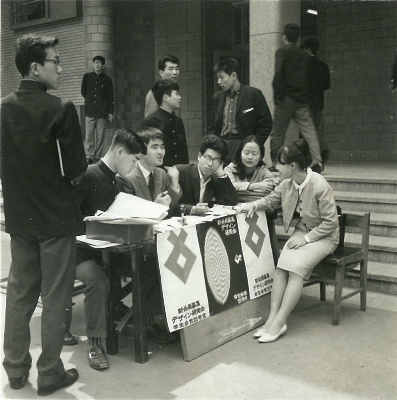 Students of the Design Research Society recruiting new members, 1960s.
Inspired by the belief that Waseda University should set up a center for design education, Nakanishi announced a proposal for the establishment of Waseda’s Design Faculty that then became the first design faculty of a major university in Japan.
In the same period, he also co-authored “Design Policy: Corporate Image Formation” (1964), Japan’s first book on the subject of corporate identity.
In 1966 he started a firm called UP Design with the help of three of his juniors at Waseda University and the same year he developed TDK Design Manual, Japan’s first corporate identity standards manual, also making the first use of DECOMAS name (Design Coordination as a Management Strategy).
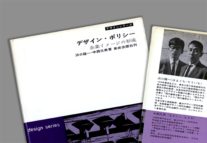 Detail of Nakanishi’s “Design Policy: Corporate Image Formation”, 1964.
In 1968 he founded PAOS (Progressive Artists Open System), a consultancy working in the field of corporate identity design. PAOS encountered a major success and established satellite offices in New York City in 1980, Boston in 1985, Beijing in 1995, and Shanghai in 1997.
During his career, Nakanishi served more than 100 companies including Mazda, Kenwood, Bridgestone, NTT (Nippon Telegraph and Telephone), The Mainichi Newspaper, Nissan, and others.
He also collaborated with some of the best-known Japanese, American, and European typo/graphic designers such as Herb Lubalin, Shin Matsunaga, Colin Forbes, Yusaku Kamekura,
Ivan Chermayeff, Tom Geismar, and Takenobu Igarashi.
During his entire life, Nakanishi deeply committed himself to researching, teaching, and promoting corporate design strategy. Besides having gathered what is perhaps the greatest global collection of corporate design manuals, he published nearly 50 books about corporate identity including DECOMAS (1971), the amazing series of 13 volumes Design Systems for Corporations (1976-91), Corporate Design Systems 1-2 (1979), and many others.
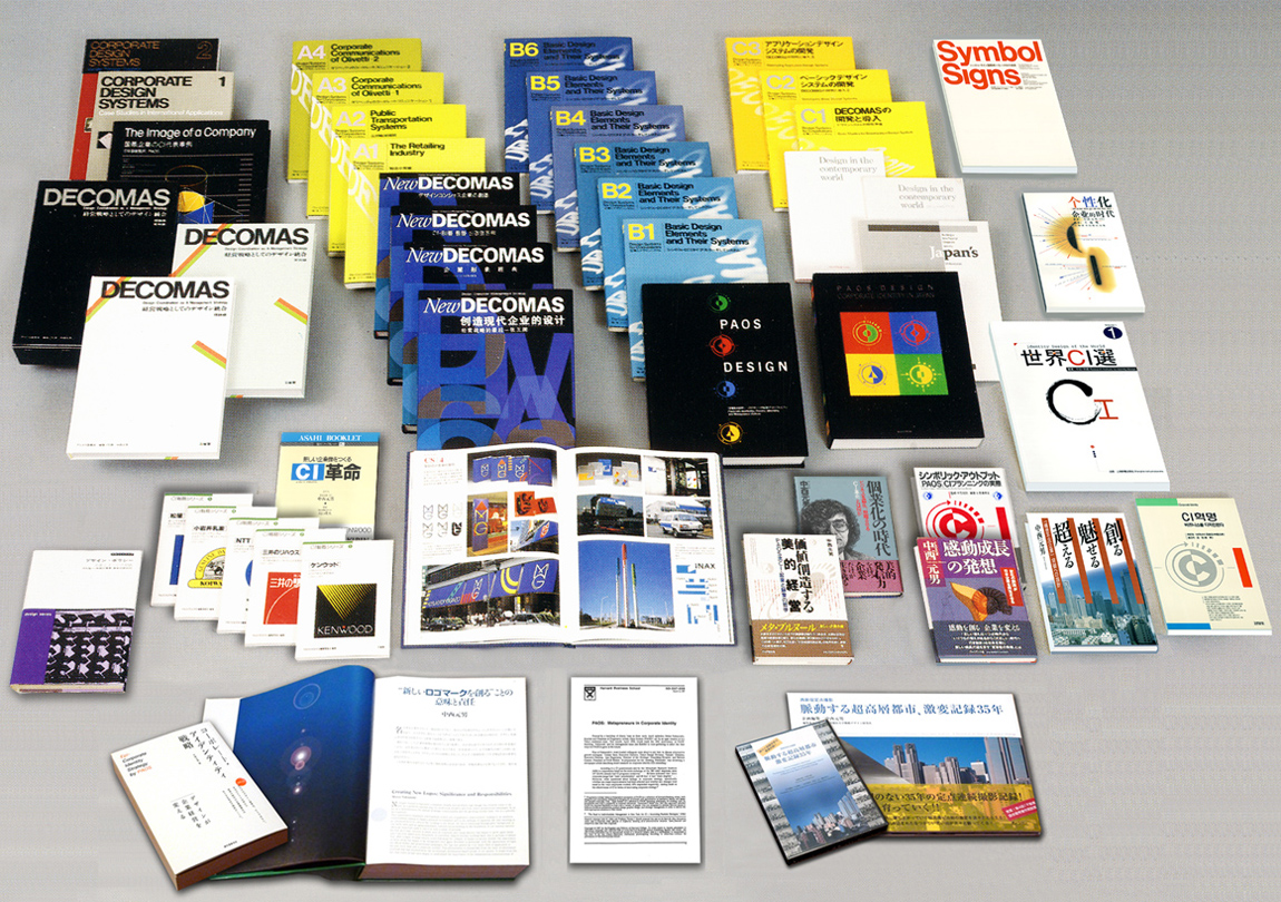 The numerous books about corporate identity design written by Motoo Nakanishi, 1964-2010.
His academic curriculum includes working as visiting professor at both Waseda University and KDS (Kuwasawa Design School) and as advisor to JWDA (Japan Web Designers Association).
In 1997 he was invited to deliver lectures at Harvard and Stanford University, while in 2010-17 he acted as course director of STRAMD (Strategic Management Design) business school with the purpose of training with a wider scope the next generation of designers.
Nakanishi is also active in design associations and served as chairman of the jury of the prestigious G-Mark (Good Design Award), the JDCA (Japan Design Consultants Association), and the Corporate Identity Council of Japan, as well as director of JAGDA (Japan Graphic Designers Association) and other associations.
In 2000 he founded WGD (World Good Design), an organization collecting information on good design awards from all around the world and promoting the concept of design as a ‘social infrastructure’.
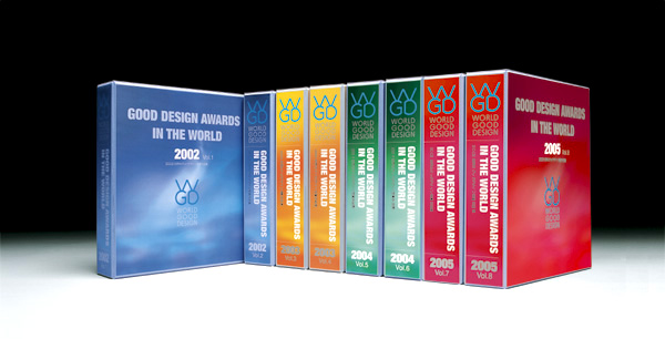 Some of World Good Design’s archival publications.
The member of WGD are known as ‘designists’ and in 2004 Nakanishi also started Designist.net, a blog dedicated to “Motoo Nakanishi’s Experimental Life,” that despite being published only in Japanese is a great resource for anyone interested in design.
In 2015 Nakanishi strongly criticized the lack of a strategic approach towards design regarding the selection of Tokyo 2020 emblem, that led to international repercussions. As the Emblem Selection Committee went back to square one, he was elected as a member and participated in the selection of the Olympic emblem.
Subsequently, he served as the chairman of the Judging Committee of the design competition Beyond 2020, an initiative undertaken by the Cabinet Office to stimulate interest in the Olympics at the private enterprise level.
TO THE TOP ↑
Quotations
“A company is required to contribute to social mechanism: to society, culture, and the environment. It must also create new values and give thought to establishing and developing a unique identity.”
“A genuine corporate identity [encompasses] a strategy that gives meaning to the existence of a company.”
“Design has the potential to shape corporate management and, moreover, it should be destined to become a vital element in sustaining and improving the aesthetic consciousness and social infrastructure of the people; in creating cultural, social, and environmental values.”
“In recent years, unimaginative and superficial corporate identities have become widespread and ‘brand’, as a popular epidemic, has become the buzzword of the moment.”
“Managing a business means having a growth paradigm that articulates how to achieve attractiveness in the social and cultural spheres — not just in terms of market value. It also means cultivating corporate citizenship.”
“The role of design as intelligent, aesthetic, and sensitive infrastructure is becoming increasingly significant as the society matures.”
“To be successful, a company must embrace both economic and cultural concerns with equal enthusiasm.”
All quotations come from the website of PAOS.
TO THE TOP ↑
Q&A
Published May 8, 2018
Recorded February 28 – May 1, 2018
When and why did you choose to become a designer? Did your interest originate from graphic design, advertising, or what?
When I was around 20 and unsure of what future career to take I was impressed initially by the Bauhaus philosophy and method. Rather than working in a specific field of design I thought I would like to utilize design in the area of corporate management and social activities.
Did graphic design already was a common profession in Japan when you was a student?
Yes.
So did you already have graphic design courses at the university?
It wasn’t called graphic design but there was a course with the same intent. Initially, I studied a course at a technical college in Basic Design, that is the basics of various fields of design. I then graduated to a general university and began my own independent research on design in corporate management and application of those ideas.
Corporate identity design was an innovative task during early 1960s. You basically introduced it in Japan. How did you become acquainted about CI systems? And what interested you the most in CI design?
Soon after beginning to study design I learnt about Olivetti. In the course of gathering detailed information about it and researching it I came in contact with CI particularly focused on U.S. corporations and I began gathering documents and information about it and doing research.
A Japanese publishing company, Sanseido — one of Japan’s leading dictionary and textbook publishers — got to know about this and they said they wanted to publish a book in the field. I conducted a survey in the United States for three months on CI projects and CI consulting to which I added theory and practical strategies to suit the Japanese management style. A book was published in 1971 under the title “DECOMAS: Design Coordination as A Management Strategy”. That then became my future career and became a new field of specialization in Asia.
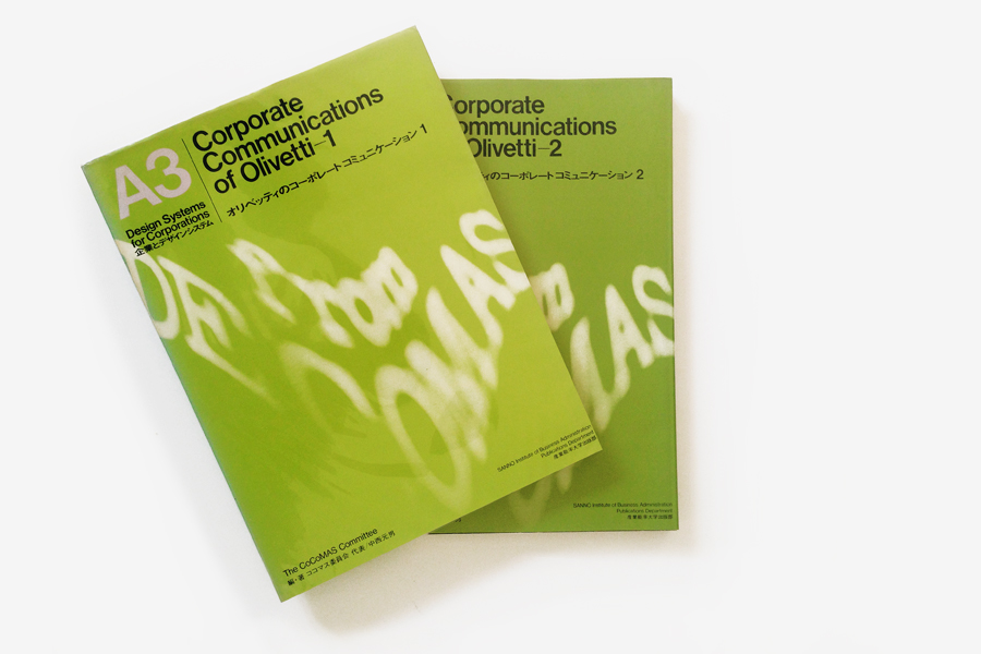 “Corporate Communications of Olivetti”, 1978-79. Photo by Nicola Munari.
What is the ultimate aim of corporate identity design?
“Corporate Communications of Olivetti”, 1978-79. Photo by Nicola Munari.
What is the ultimate aim of corporate identity design?
To provide sophisticated marketing and management capability within a corporate management strategy.
And what are the benefits of a company who embraces a CI program?
To create a superior and optimum management environment.
What do you think are the essential qualities that a CI system should possess?
For the company in question, it should provide a long-term management perspective and establish unique values.
Do you think that good CI systems designed in the past can still work today? Or they should be redesigned according to trends?
From our experience there are companies, such as TDK, where the CI system created 50 years ago is still alive today.
[N.B. Nakanishi developed TDK Design Manual in 1966-68. That was Japan’s first CI manual.] Essentially, it is preferable not to change the system and to create a CI which has a stock value. However, it is necessary to deal with evolution and changes in the nature of a business or the management environment.
You have frequently entrusted external designers (such as Herb Lubalin, Colin Forbes, etc.) to design logotypes. Why didn’t you design them at PAOS? Do you think that logo design require a different skill from CI design?
The ‘OS’ of the company name PAOS stands for Open System. That means aiming to use the optimum system to create the required solution. We always aim to use the optimum human resources to achieve the client’s objective. Therefore as far as the budget permits, irrespective of whether the resources are internal or external to the company, we pursue the optimum combination of human resources and do not insist on using internal staff designers.
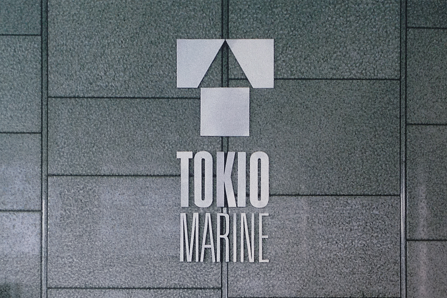 PAOS set up a logo design competition for Tokyo Marine won by Ivan Chermayeff, 1983.
Did you usually develop the visual identity systems starting from the logo? How much does the logo affect the design of a VI system?
PAOS set up a logo design competition for Tokyo Marine won by Ivan Chermayeff, 1983.
Did you usually develop the visual identity systems starting from the logo? How much does the logo affect the design of a VI system?
PAOS staff displays outstanding ability in creating identity design systems. We therefore always use people with outstanding ability to create logo designs irrespective of whether they are internal or external to the company. At PAOS our understanding is that logos represent the birth of the design towards achievement of the objective, while the identity system represents the growth of the design.
What is the purpose of a corporate strategy?
As far as possible to achieve the development and growth of the company in the long term.
In recent years, corporate identity has been criticized by many because considered too rigid. So the concepts of ‘corporate diversity’ and ‘unbranding’ have been proposed. What do you think about that? Do you think that rigorous CI systems are still useful today?
The question is difficult to fully understand. In the case of a CI system where a company’s individuality and growth are guaranteed, the CI system needs to adapt to the contemporary environment and to be optimized for the market environment. It’s not a matter of whether a CI system is rigorous or not but what’s important is whether today, when we are transitioning from a period of growth to a mature society, the CI system has the power to create adaptive values.
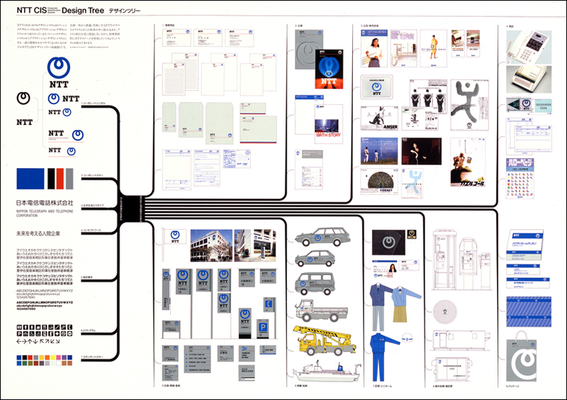 CIS (Corporate Identity System) Design Tree of NTT (Nippon Telegraph and Telephone), 1984.
Do you think that the discipline of corporate design has changed since you started working? Did it evolve?
CIS (Corporate Identity System) Design Tree of NTT (Nippon Telegraph and Telephone), 1984.
Do you think that the discipline of corporate design has changed since you started working? Did it evolve?
The major trend is the shift and evolution from quantitative growth to qualitative maturity.
What is the difference between branding and design? Do you think that branding is an evolution of corporate identity? Or perhaps, is it something more related to marketing?
In the evolution from the industrial age to the information age there is an even greater need for creating information value for companies, businesses, products, and services. Seeking brand values acceptable to consumers and the ordinary person is an inevitable act within that trend and, as a result of achieving that, we have reached an age that yields marketing results.
How does corporate design systems relate to advertising and to marketing?
Corporate design systems, not restricted to advertising or marketing, are software assets and corporate management technology that underpin corporate activity (companies, businesses, products, and services) as we move to an advanced information society.
Do you think that CI design implies a social responsibility? Perhaps, a responsibility that marketing doesn’t imply?
CI design is what should create both a company’s market value and its social value.
Do you think that printed manuals still work today? And that they will be useful also in the future? Or is it better to produce only PDFs and online manuals like many companies do?
The mainstream of communications and corporate management is rapidly being digitalized and yet the analog value of manuals is not limited to just a management tool. Manuals play a role as a symbol and an authoritative document. I think that role will continue in the future.
The question is whether the general framework of design can be realized or not.
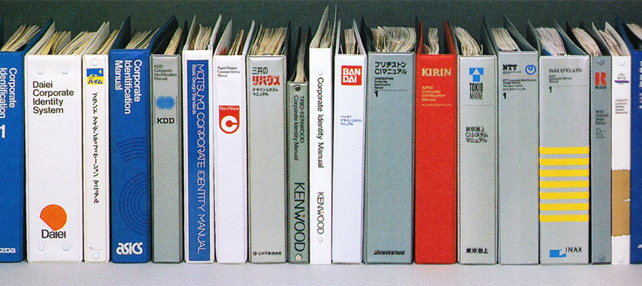 Some of the numerous corporate identity standards manuals designed by PAOS.
You have produced many CI manuals. How do you think should be used such a manual?
Should it be a resource for designers or the management? Or both?
Should it illustrate the core strategic principles, the design layouts in detail, or what else?
Some of the numerous corporate identity standards manuals designed by PAOS.
You have produced many CI manuals. How do you think should be used such a manual?
Should it be a resource for designers or the management? Or both?
Should it illustrate the core strategic principles, the design layouts in detail, or what else?
Contemporary CI manuals are documents which define guidelines for the company’s existence and brand strategy and they also serve as authoritative documents.
On the other hand, we are in a trend where manuals for marketing and management are rapidly being digitalized. In the future, as the evolution of the internet of things and AI progresses within corporate activity, this role and structure will become even more important and apparent.
How would you define the design of communication in general?
What do you think is the ultimate purpose of communication design in today’s society?
In the future, companies will need to become even closer to customers, consumers, and ordinary people. Communications and design, which need to be embedded in management activity, will be called on to play an even more important role.
What are the key features of your design?
To provide the client with the optimum management environment, in other words to support and guide the relevant company such that it can demonstrate the power to have the corporate vitality described below:
1. To always be in step with the present age.
2. To have the foresight to see the future.
3. To have the capacity to create the values for a new age.
 In 1983 PAOS coordinated Bandai’s CI program and logo competition won by Shin Matsunaga.
And what is your strongest skill as a designer?
In 1983 PAOS coordinated Bandai’s CI program and logo competition won by Shin Matsunaga.
And what is your strongest skill as a designer?
To be able to have the ability to contribute to what is described in the previous answer.
Do you think that visual design can be considered a form of art?
Or should it be something closer to engineering?
While maintaining a high level of art, as a management tool it needs to be able to demonstrate a technological function.
How does corporate design integrate to traditional values of Japanese culture?
Do you think there is any connection with Japan’s past history?
Or is it something completely new from a cultural point of view?
Since Japan was situated in the Far East on the edge of Asia, and since it was sensitive to new values from ancient times, it actively adapted all kinds of incoming and leading-edge culture. At the same time, it escaped from colonization by mainland China and the strong European countries and America. Historically, it became a melting pot of various civilizations and while mixing these together it created its own culture and civilization. This identity as a mixed culture, in other words, “a culture which absorbed the best of other cultures,” resulted in a Japanese culture which had its own unique features. These were simplified and refined in a unique stylistic aesthetics in which existed something new.
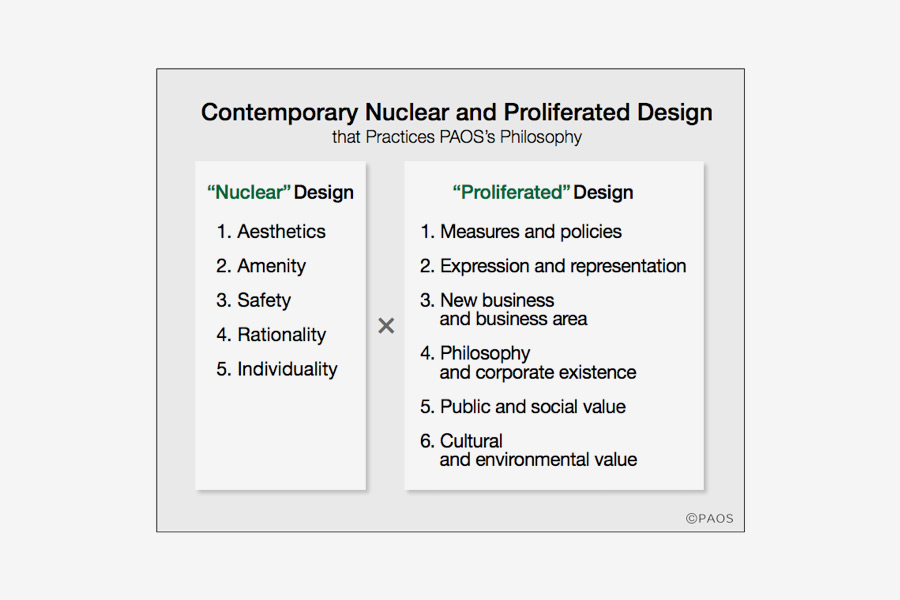
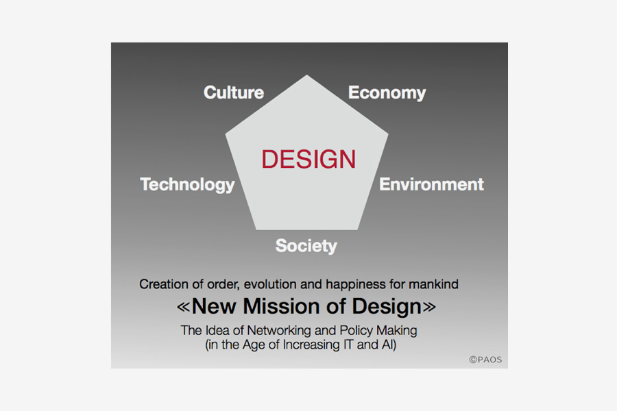
Can you describe your approach at PAOS?
In particular, what do you mean by “meta-design strategy”?
The two philosophies provided below describe the basis for PAOS’s design movement and activity. They are the strategy for meta-design which surpasses conventional design theories and philosophies.
 Courtesy of PAOS.
Thank you very much.
Courtesy of PAOS.
Thank you very much.
Thanks.
© 2018 Motoo Nakanishi, Nicola-Matteo Munari. All rights reserved.
TO THE TOP ↑
Portfolio
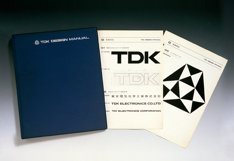
TDK Design Manual
1966
This is Japan’s first corporate identity design manual. TDK’s predecessor, Tokyo Dekikagaku Kogyo (TDK Electronics), was a little-known company but TDK became the first Japanese company to use Latin alphabet for its logotype. Nakanishi proposed to apply the Nippon Classification System for Books to CI manuals and subsequently this became a widely used methodology for brand control manuals. Designed with Teruyoshi Murakami, a graduate of HfG Ulm.
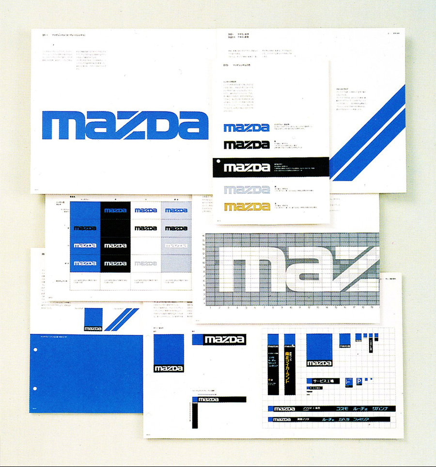
Mazda Motor Corporation
1971-75
For Mazda, PAOS developed a consistent corporate image that marked the beginning of a global reach for the automaker and pioneered major CI programs in Japan. The logotype was selected through a design competition won by Rei Yoshimura, whose proposal was subjected to careful typographic refinements.
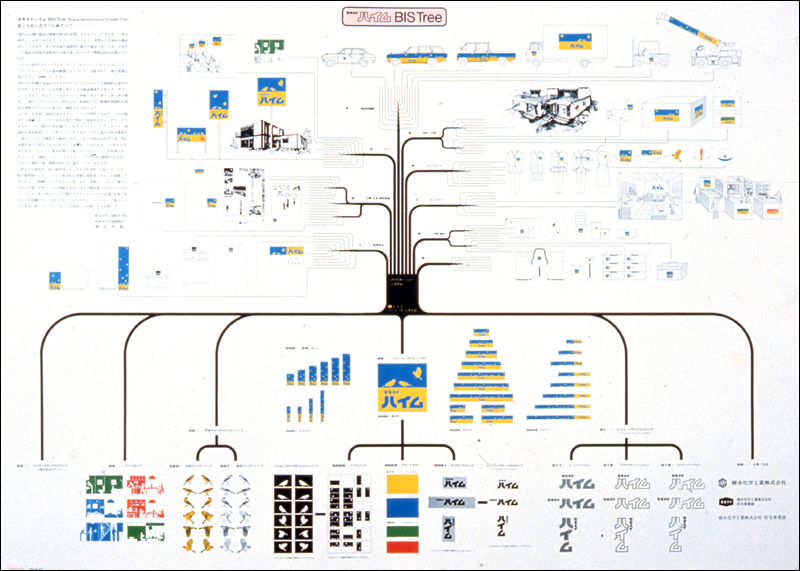
Sekisui Chemical Co.
1972-2001
PAOS was commissioned to conduct consulting and design development for Sekisui Heim, a company manufacturing innovative detached houses made 90% in factory and is now one of Japan’s leading housing manufacturers. PAOS developed a concept book, a fact book, a brand identity manual and a mid-to-long-term business development plan. The project continued for around 20 years and marked the introduction of PAOS’s first Brand Identity System Tree.
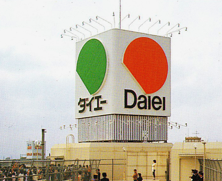
The Daiei Inc.
1973-75
Daiei is one of Japan’s top retailers. PAOS upgraded the company’s design system and developed a comprehensive CI program that lasted 11 years. Beyond the basic identity elements (mark and logotype), the program also included the packaging design, signage system, transportation graphics, and dedicated CI programs for Daiei’s subsidiary brands. Once again, the corporate mark was selected through a design competition coordinated by PAOS. The winning proposal was designed by Rei Yoshimura.
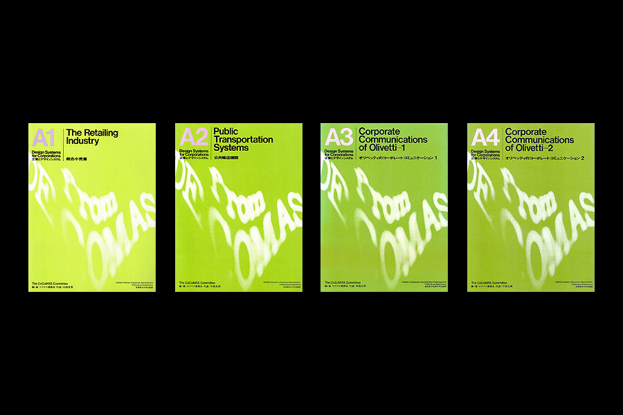
Design Systems for Corporations A1-A4
1976-78
The 13 volumes of Design Systems for Corporations (A-B-C) constitute one of the best publications ever about corporate communication and a documentation of paramount historic value. Compiled by the CoCoMas Committee, the books introduced the passage “from DECOMAS to COCOMAS” (Corporate Communications as a Management Strategy). The A series deals with the retail industry, public transportation systems, and the Italian company Olivetti.
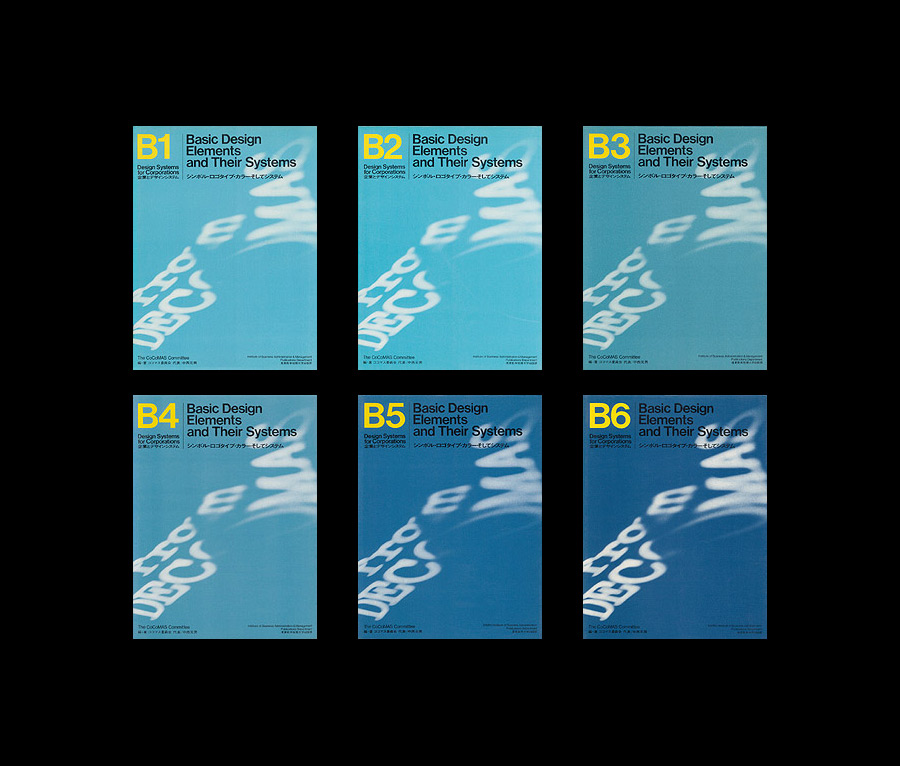
Design Systems for Corporations B1-B6
1976-83
The B series introduces examples of Basic Design Elements and Their Systems, in-depth case-studying what were at that time some of the world’s most interesting CI systems including that of Ciba-Geigy, Reuters, Mazda, AT&T, FIAT, BP, 3M, and many others.
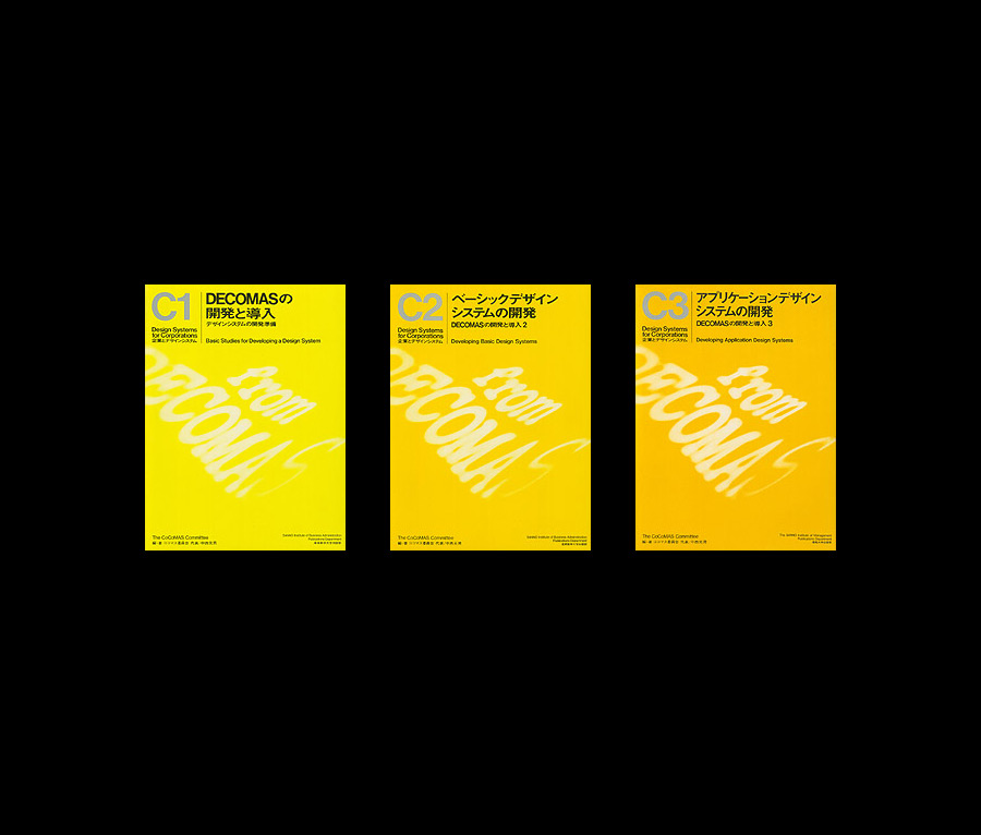
Design Systems for Corporations C1-C3
1979-91
The C series collects examples of Japanese companies which at that time operated under their own uniquely Japanese management environment, so it was only published in Japanese. It deals with the details of basic research and development programs regarding corporate design system development.
The D series, about CI systems implementation and management, was also conceived but never published.
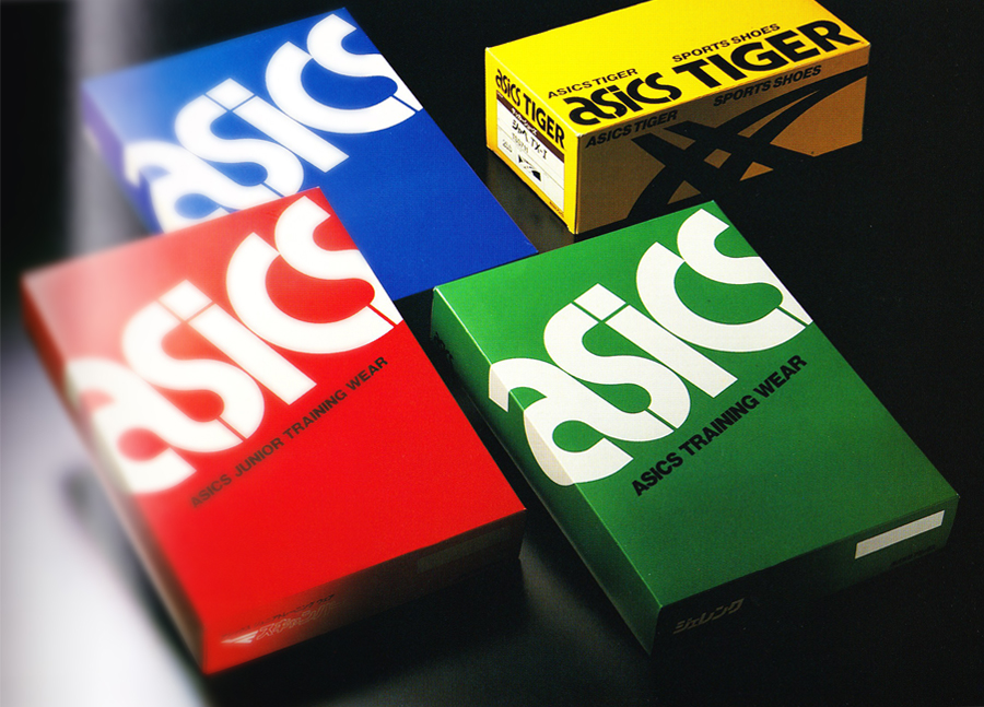
Asics Corporation
1977
Asics Corporation debuted in 1977 as Japan’s second-largest general sporting goods maker. PAOS gave the company its name, that is the acronym for Latin expression that sums up the corporate philosophy (Anima Sana In Corpore Sano) and designed an integrated CI system. To design the logotype PAOS selected internationally acclaimed type designer Herb Lubalin, who developed 17 proposals.
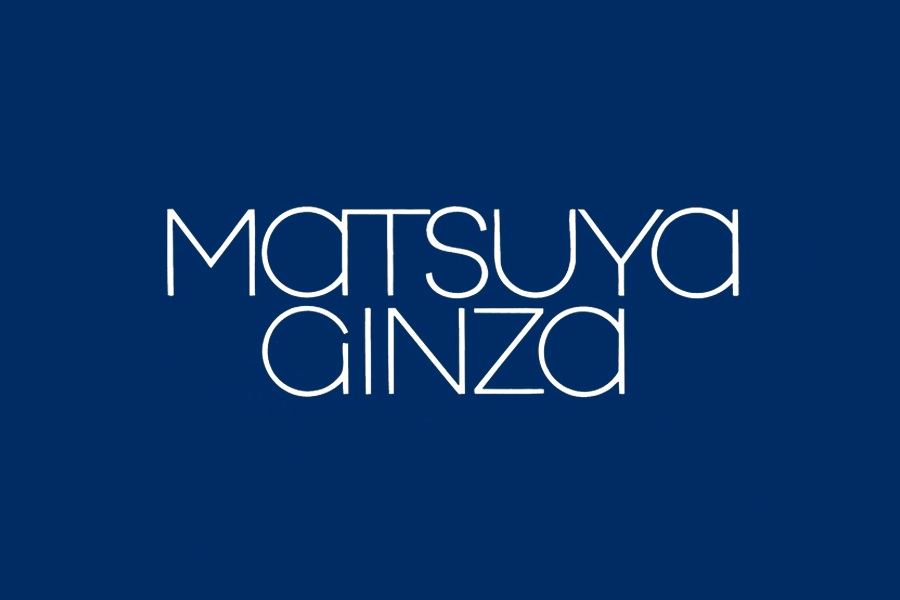
Matsuya Co.
1977
Founded in 1869 in Ginza, Tokyo, Matsuya is one of Japan’s oldest and most admired department stores. During a difficult period for the company, PAOS developed a design strategy that led to the implementation of a visual identity system that became a colorful attraction to shoppers helping Matsuya’s successful comeback. The logo was selected through a design competition won by Masayoshi Nakajo.
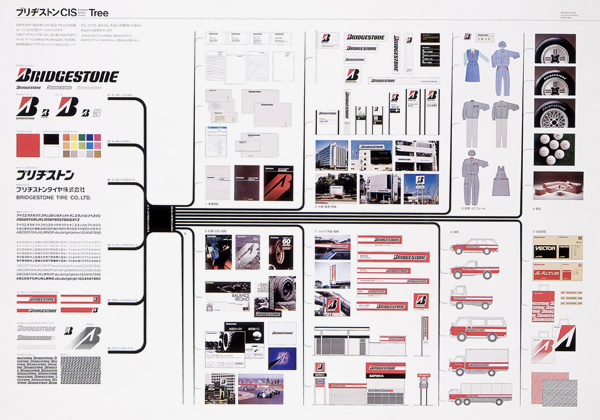
Bridgestone Corporation
1980
“Priority was initially given to establishing a visual image and brand strategy for the company,” considering these as the motive force that would pull it towards global expansion as the company celebrated the 50th year since its foundation. “Soon this project explicitly defined a target of rising from the sixth largest tire manufacturer to become the global player it is today.”
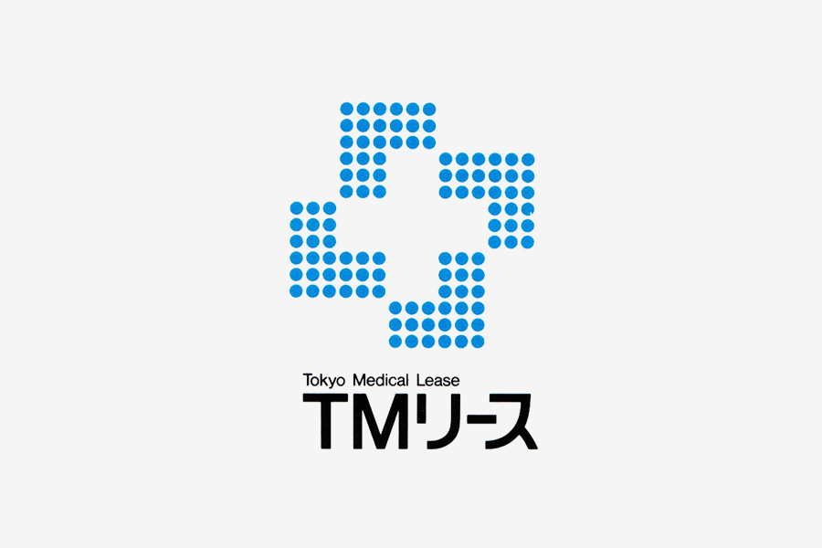
Tokyo Medical Lease
1980
Trademark for Tokyo Medical Lease, for which PAOS also designed the entire corporate identity program.
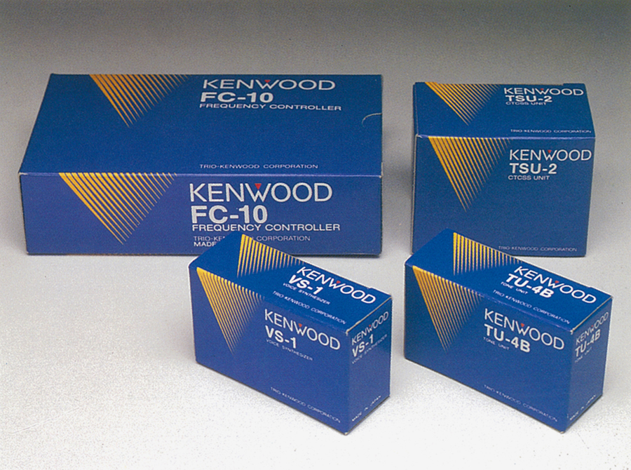
Kenwood Corporation
1981
“The success of the Kenwood project was to become a mythical success for CI.” Formerly known as Trio Corporation, it was one of Japan’s top three audio manufacturers. Since PAOS couldn’t use the Trio name — a trademark already being used in the U.S. — it proposed to develop a new corporate brand, Kenwood, that became world famous. The new VI system encompassed all the company’s communication media from the logotype on to packaging and factory exteriors.
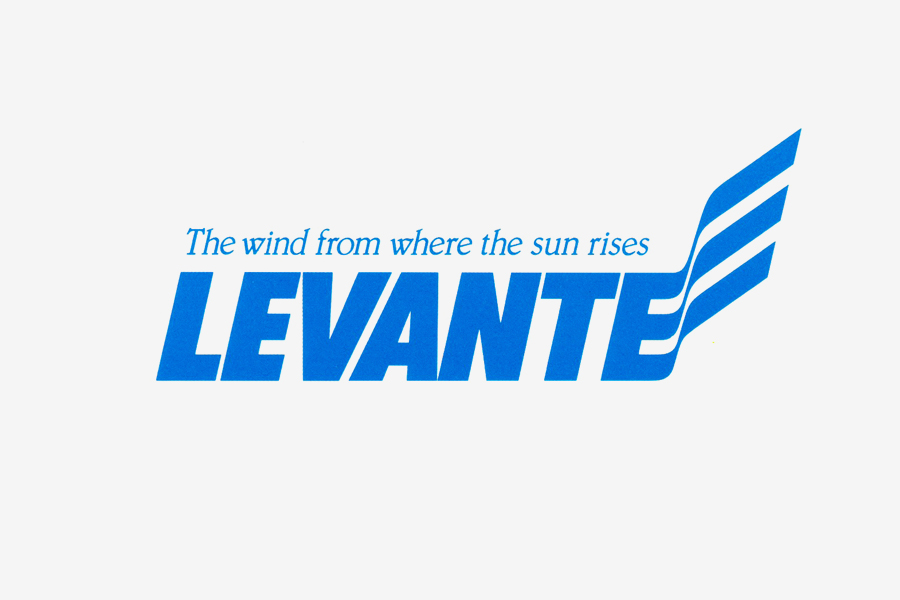
Levante
1981
Established in 1981, Levante Inc. was an affiliate of Sports Harbor and manufactured windsurfing products. The logotype effectively suggests the idea of speed, wind, and water.
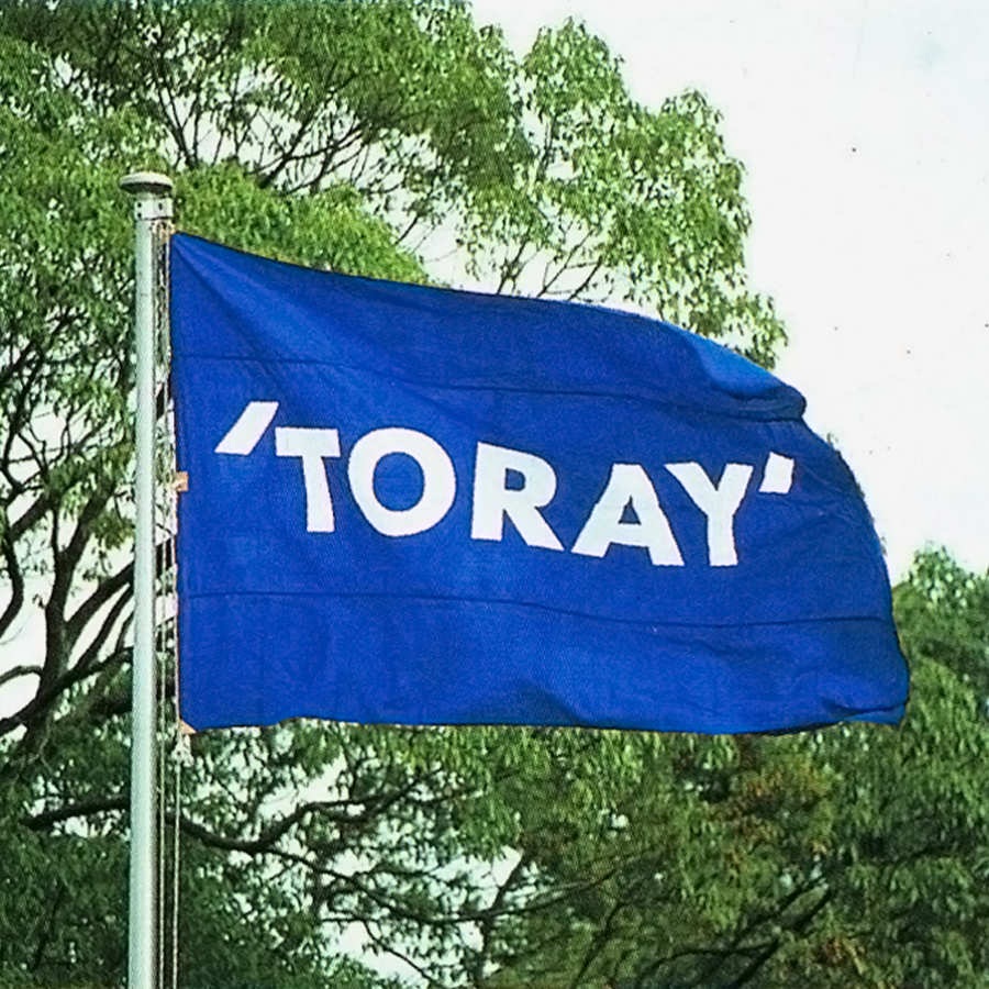
Toray Industries Inc.
1983-86
Founded in 1926 as a rayon manufacturer, Toray risen to the top position in the synthetic fiber industry. PAOS designed the entire CI program also coordinating the work of renowned British graphic designer Colin Forbes, who was entrusted to design the company’s logotype.
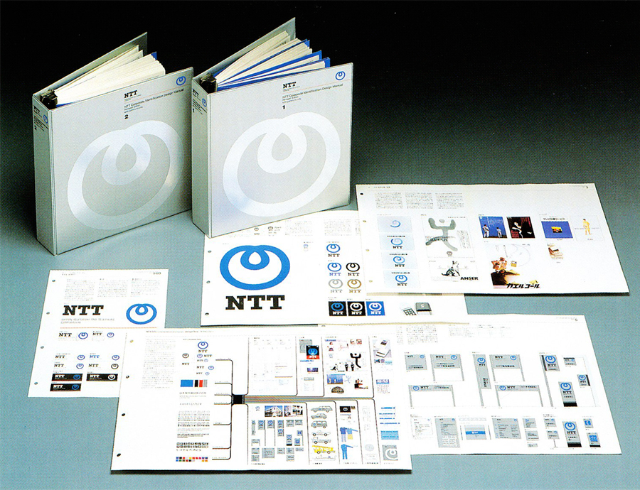
NTT (Nippon Telegraph & Telephon)
1984
After 115 years of government management, NTT was privatized and became Japan’s largest private company. “The necessity of changing the bureaucratic mentality and of affecting the shift to a business structure were the biggest hurdles to the introduction of CI at NTT.” To totally rework NTT’s image as a public company, PAOS developed a strategy to create the image of a distinct service company. “The VI system and CI manual were intended to revolutionize the mind set of NTT’s 330.000 employees — 1.000.000 if you include subsidiaries and suppliers.” The design of the new company mark was entrusted to Yusaku Kamekura, one of Japan’s most revered graphic designers.
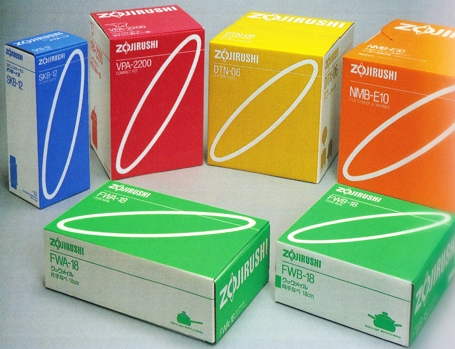
Zojirushi
1984-86
In 1984 PAOS and Dentsu – a leading Japanese advertising firm – began a CI program for Zojirushi, a leader in househould appliances manufacturing. One of the ultimate goals was to make the new symbol becoming the core of the VI system.
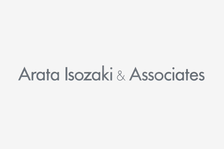
Arata Isozaki & Associates
1988
Logotype for internationally acclaimed Japanese architect Arata Isozaki, developed by PAOS during work to compile a catalogue of the architect’s creations. “The design congeals Isozaki’s assertive style, in functionality, form, space, expressivenes, and clear outlines.”
Links & Docs
PAOS Official Website
World Good Design Official Website
Designist Blog
TO THE TOP ↑
Comments
If you wish to add a comment please feel free to write at
info@designculture.it
TO THE TOP ↑
Follow on Facebook
Partnerships

Archivio Grafica Italiana is the first digital resource to the Italian graphic design heritage. Founded by Nicola Munari in 2015.

Design consultancy based in Piacenza, Italy. Founded by Nicola Munari in 2015, it operates in the whole field of design.
TO THE TOP ↑
© 2013-18 Nicola-Matteo Munari. All rights reserved.