Wim Crouwel
Groningen, 1931
Who’s Who
Willem Hendrik Crouwel is one of the greatest graphic designers worldwide. He studied at the Academie Minerva (Art School) in Groningen. After two years spent collaborating with the prominent Dutch painter and designer Dick Elffers (1910-1990), he attended the evening classes at the IvKNO—Instituut voor Kunstnijverheidsonderwijs (Institute for Craftsmanship Education) in Amsterdam, today known as the Rietveld Academy.
In 1955 he opened an office together with Kho Liang Ie (1927-1975)—a Dutch, Indonesian-born designer—working in the fields of exhibition, graphics, and product design. One of Crouwel’s first clients was the Van Abbemuseum in Eindhoven for which he designed catalogs, invitations, and posters until 1964. When Edy de Wilde (1919-2005)—director of the Van Abbemuseum—became director of the Stedelijk Museum in Amsterdam he took Crouwel with him. Until the end of his directorship in 1985, Crouwel was solely responsible for the Stedelijk’s identity, designing almost all its posters and catalogs. For the Stedelijk, he developed a modular grid system that provided visual consistency to the museum’s graphic identity. His growing attitude to grid-based design resulted in the nickname Mr. Gridnik, the same of a typeface he designed in 1973 for Olivetti.
In 1963 he co-founded Total Design, the first multi-disciplinary design firm in The Netherlands. Other founding members were Friso Kramer and Benno Wissing, soon joined by Ben Bos. It soon became one of the best design offices worldwide, serving prestigious clients such as De Bijenkorf, the Dutch Post Office (PTT), Peter Stuyvesant, Randstand, the Schiphol Airport, and the Dutch Pavilion for the 1970 Osaka World Fair. During the 1960s his work began to be widely published on international design magazine, such as Domus.
In 1967 he released the well-known, experimental typeface called New Alphabet, conceived to work with the limited CRT (Cathode Ray Tube) technology used by early computer monitors. This technology rendered images in large pixels that made curvilinear letterforms difficult to reconstruct, thus Crouwel used only straight lines and diagonals. New Alphabet is, in Crouwel’s words, “never meant to be really used,” but a statement on the impact of new technologies on centuries of typographic tradition. In 2011 it was acquired for the permanent collection of the Museum of Modern Art (MoMA), New York, that include several other projects designed by Crouwel.
Member of AGI (Alliance Graphique Internationale) since 1957, Officer of the Order of Orange-Nassau, Officer of the Most Excellence Order of the British Empire, Knight of the Order of the Netherlands Lion, and Honorary Royal Designer for Industry. In 1963 he became the first General Secretary of Icograda (the International Council of Graphic Design Associations). He also received numerous awards, including the Piet Zwart Prize and the Anton Stankowski Preis in 1991, and the Gerrit Noordzij Prize in 2009.
Crouwel taught during his whole career. In the 1950s he gave a design course at the Royal Academy of Art and Design (AKV) in ’s-Hertogenbosch. In 1965 he gave a typography course at the Delft University, where in 1972 he was appointed Associate Professor. In 1980 he became a full Professor and in 1985 he was appointed Dean of the Faculty. At the same time, he was appointed Director of the Boijmans van Beuningen Museum in Rotterdam, holding this position until his retirement in 1993. From 1987 to 1993 he also taught at the EUR (Erasmus University in Rotterdam).
Wim Crouwel is a virtuoso of experimentation, who both lived and anticipated his own time. He combined rigorous structural logics with meaningful expressiveness, showing an extraordinary mastery in color and typography, making letters becoming wonderful images. He produced many of the few masterpieces that perfectly match functionality with aesthetics, and could be truly considered great works of both art and graphic design.
Enjoy your reading,
 TO THE TOP ↑
Quotations
“Akzidenz Grotesk was not available in Holland. When I did my first larger graphic design commissions—and I wanted to use Akzidenz Grotesk—I would buy Swiss newspapers and cut the letters out and glue them in place, and then take photographs to use as artwork.”
“Graphic design is not a luxury, but a necessity,” 1968.
“It’s an absolute necessity to have good graphic design at one’s disposal,” 1968.
“I was very interested in modern architecture, and I read a lot of books about it. Every Wednesday afternoon […] I went to the library and looked through the architecture and interiors magazines. […] I learned a lot from books.”
“I always used one word to make an image, a kind of image-based typography.”
TO THE TOP ↑
Q&A
Published Sep 16, 2013
Recorded May 7, 2013
What did you want to do when you were growing up?
To become an architect.
What was your educational path?
High School (Beta Direction) and Art Academy (painting, decorative art, and sculpture). In art school I thought of becoming a painter.
Which was your favorite subject at school?
Drawing classes.
When and how did your career start?
It started in 1952 after I left my birth place, Groningen, and went to Amsterdam. Through the advice of an older colleague graphic designer, I got a job in an exhibition firm. Gradually I became their designer of exhibitions. To learn graphic design in that period I went to evening classes at the Academy in Amsterdam.
How your design has evolved since that time?
After about three years in that company I started my own freelance practice as a designer. Gradually I found my way. For that, the 1950s were very important.
What would you like to design today?
One more experimental typeface, but since that is a hell of a job—and I am old—I don’t think it will ever be realized.
Has the way people perceive the design changed?
Since the computer with its programs entered this world, everyone thinks he or she can design.
Massimo Vignelli says that “Design is One,” and that a designer has to deal with “the spoon to the city,” as Adolf Loos once said. Is this approach still possible?
In today’s world design is as important as it has ever been.
A designer you admire.
A graphic designer that I admired already when he was still alive, and who influenced me very much, is Josef Müller-Brockmann.
A piece of design.
The furniture collection of Charles Eames.
A piece of architecture.
The new extension of the Stedelijk Museum in Amsterdam, designed by my son Mels.
Without considering technology, what are the main differences between the design from the past and the current one?
The principles of design have not changed. Only the world is in a constant change.
What would you recommend to a young designer?
Keep your radar turning in order to see everything that happens, and make your own choice.
How would you define a good design?
Fulfilling its purpose in a straight forward way.
How would you describe your design?
For me, creating structure is a most important means.
Which was your favourite game when you were a child?
Building tents for a circus. [“Every year a circus was held near our house, and I was always very interested in this. Not because of the circus performances, but because of the tent and the tent’s construction. It intrigued me. At home I made a small tent from old drapes and wires, and put nails in the floor to construct a real tent. I was very interested in technical installations and manufacturing techniques.” From “A Graphic Odyssey” (Unit Editions, 2011)].
Thank you very much.
Best wishes.
 © 2013-16 Wim Crouwel, Nicola-Matteo Munari. All rights reserved.
TO THE TOP ↑
Q&A
Published Feb 8, 2016
Recorded July 18, 2015
What has been the most important book to you as a designer?
There are many books that were important for me. But most important for me were the books of Josef Müller Brockmann.
Did you have a design mentor? If yes, what did you learn from him?
I did not have a real direct mentor. But I learned from a number of designers: Max Bill, Josef Müller Brockmann, Karl Gerstner, Emil Ruder, Richard Paul Lohse. The main lessons were on structure.
What was your strongest skill as a designer?
Typography and three-dimensional design.
What is the thing that you have enjoyed the most of being a designer?
Never a dull moment!
What did you enjoy the most of working in Amsterdam?
It is a lively and nice city to live in.
What do you think is the most effective way of presenting a project?
To tell the client what made you find the right solution. Explain your way of thinking.
What is the importance of experience? How it can contribute to better address a project?
The knowledge how to understand a project.
Do you think that your activity as director of Boijmans-van-Beuningen Museum influenced the quality of your design? What kind of relation there was between the two activities?
My directorship came late in my career. My most important work lay behind me. I just went on being myself, it was a fresh new beginning. I hardly did any design work during these eight years. I enjoyed it very much.
Should design produce things which are necessarily useful?
This is wishful thinking. In reality, design is often not useful at all.
What positive contribution design can give to society?
Any creative way of thinking can be positive for society, especially the conceptual facets of design.
Thank you very much.
Thank you.
© 2015-16 Wim Crouwel, Nicola-Matteo Munari. All rights reserved.
TO THE TOP ↑
Portfolio
Hiroshima
Poster, 88×60 cm
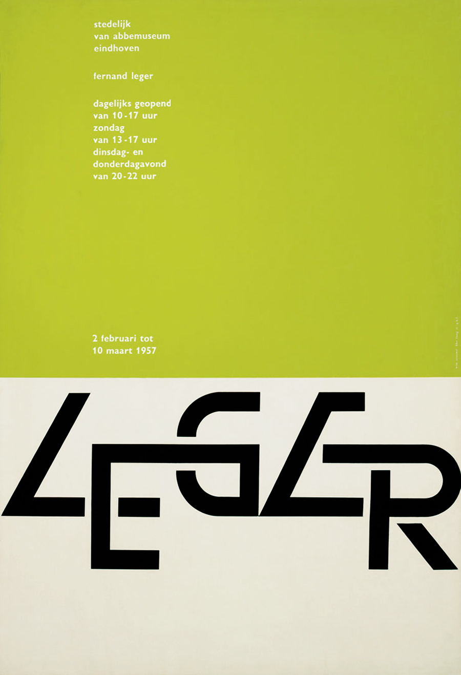
1957
Fernand Leger
Poster, 88×60 cm
1957
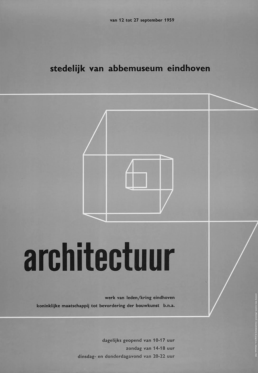
Architectuur
Poster, 88×61 cm
1959
Originally printed in two colors.
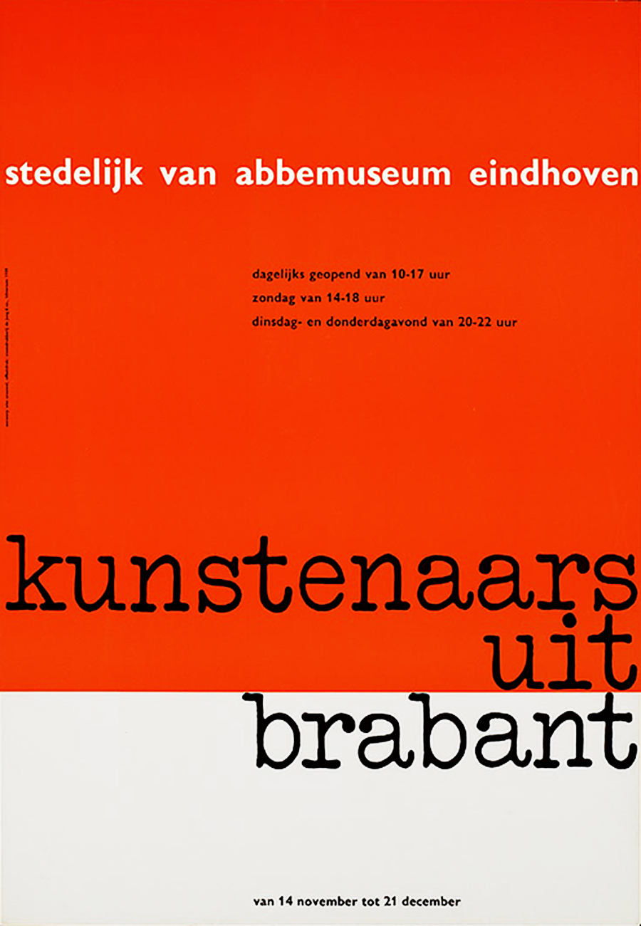
Kunstenaars uit Brabant
Poster, 88×61 cm
1959
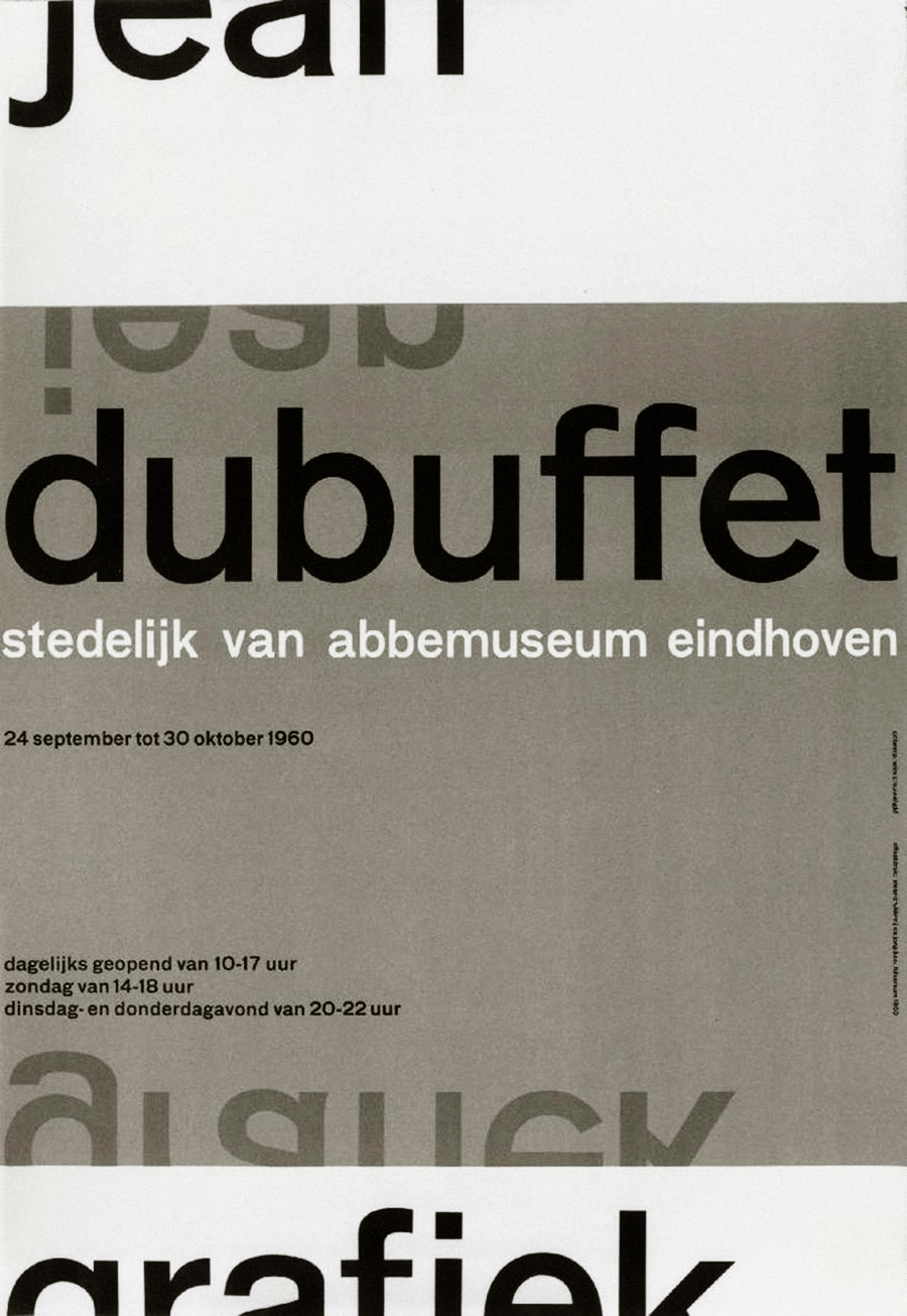
Jean Dubuffet Grafiek
Poster, 88×61 cm
1960
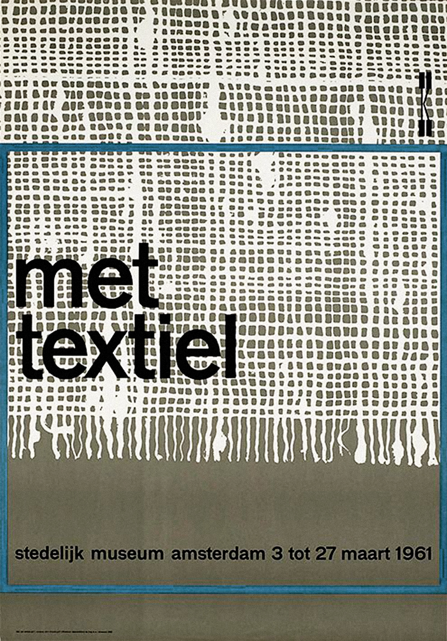
Met Textiel
Poster, 101×70 cm
1961
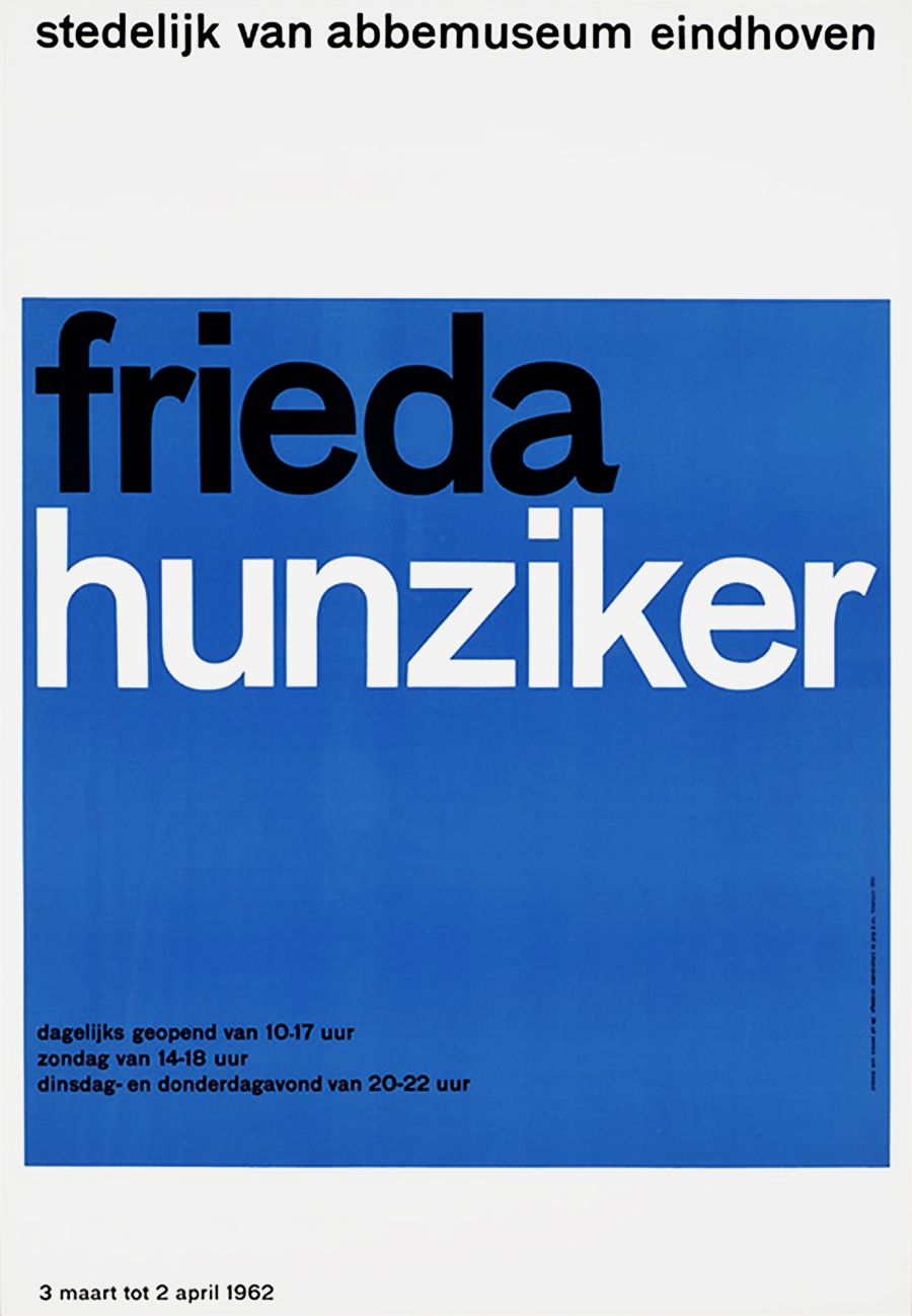
Frieda Hunziker
Poster, 88×61 cm
1962
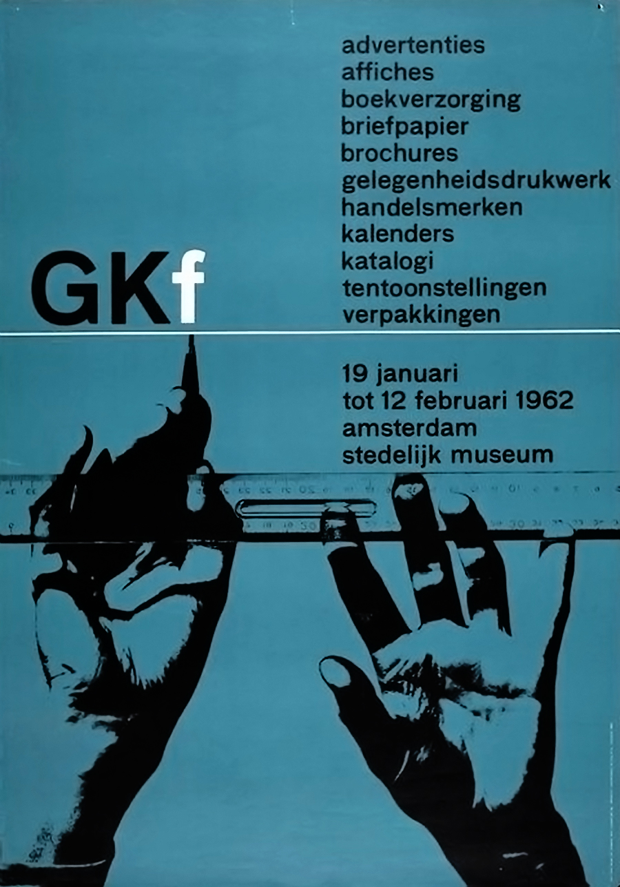
GKf
Poster, 100×69.5 cm
1962
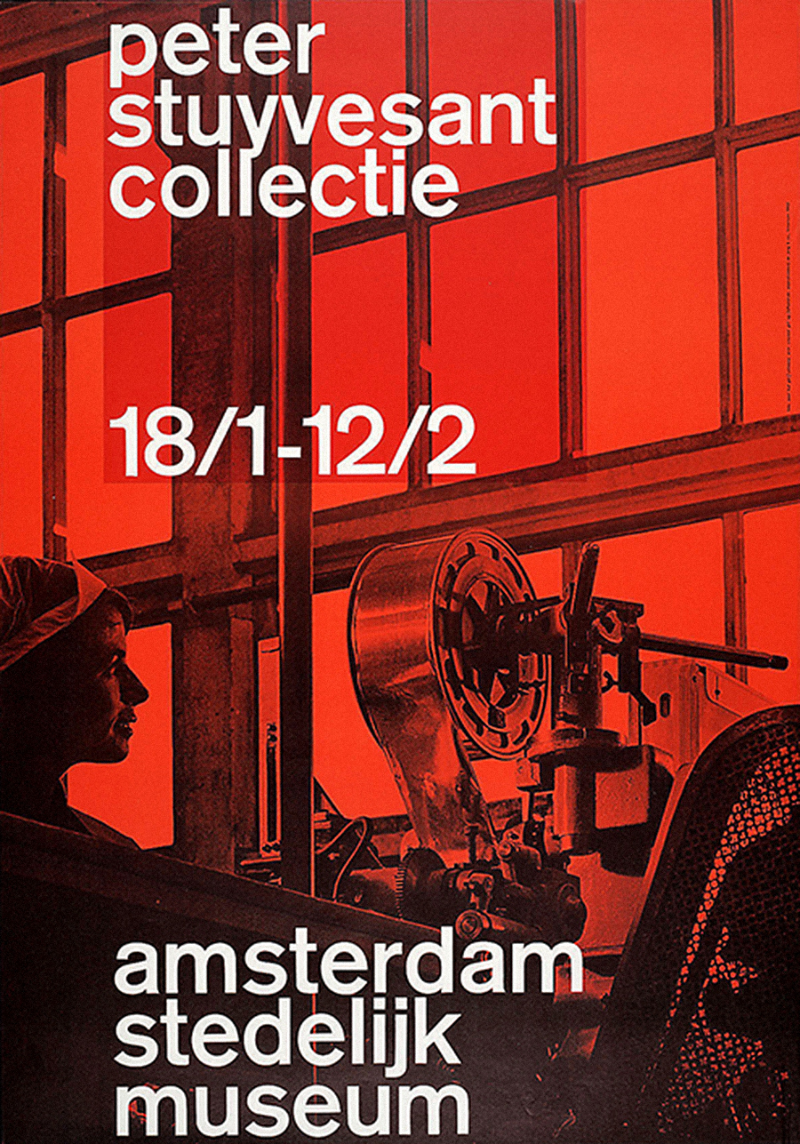
Peter Stuyvesant Collection
Poster, 101×70 cm
1962
Photo by Paul Huf.
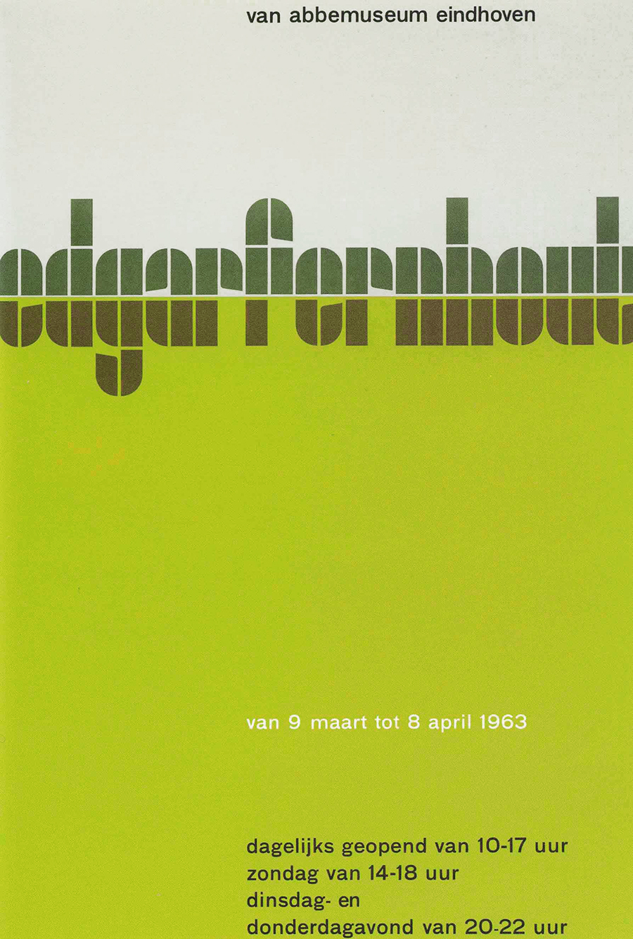
Edgar Fernhout
Poster, 88×60 cm
1963
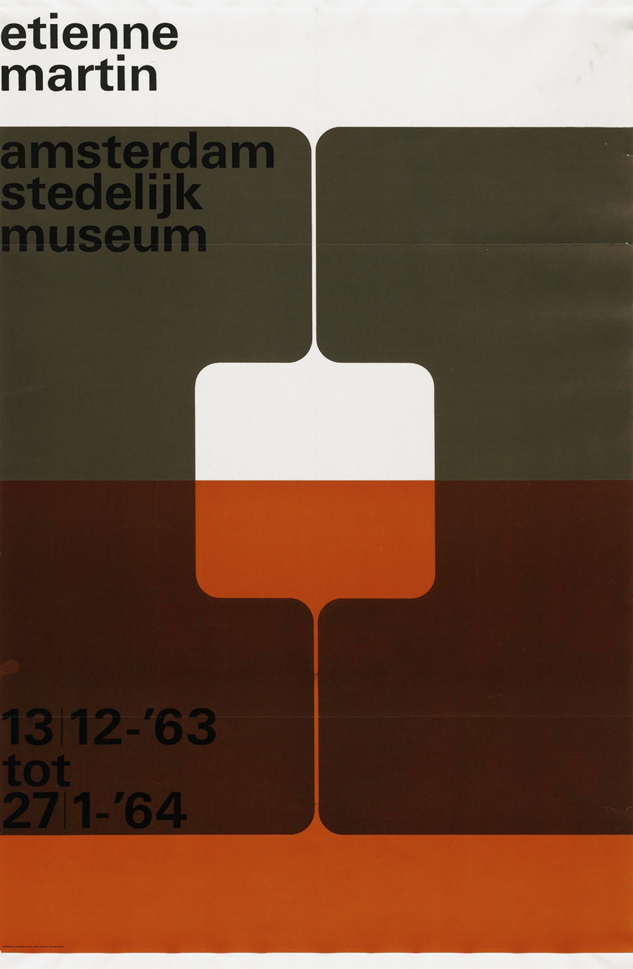
Etienne Martin
Poster, 95×62 cm
1963
Part of the permanent collection of the MoMA (Museum of Modern Art), New York.
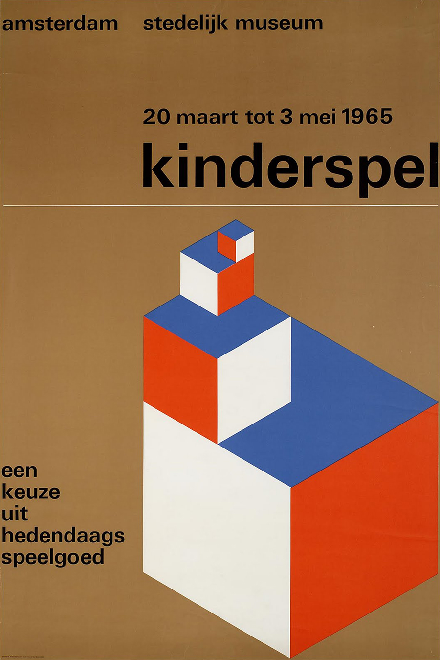
Kinderspel
Poster, 95×63.5 cm
1965
A poster promoting an exhibition of contemporary toys at the Stelijk Museum, Amsterdam.
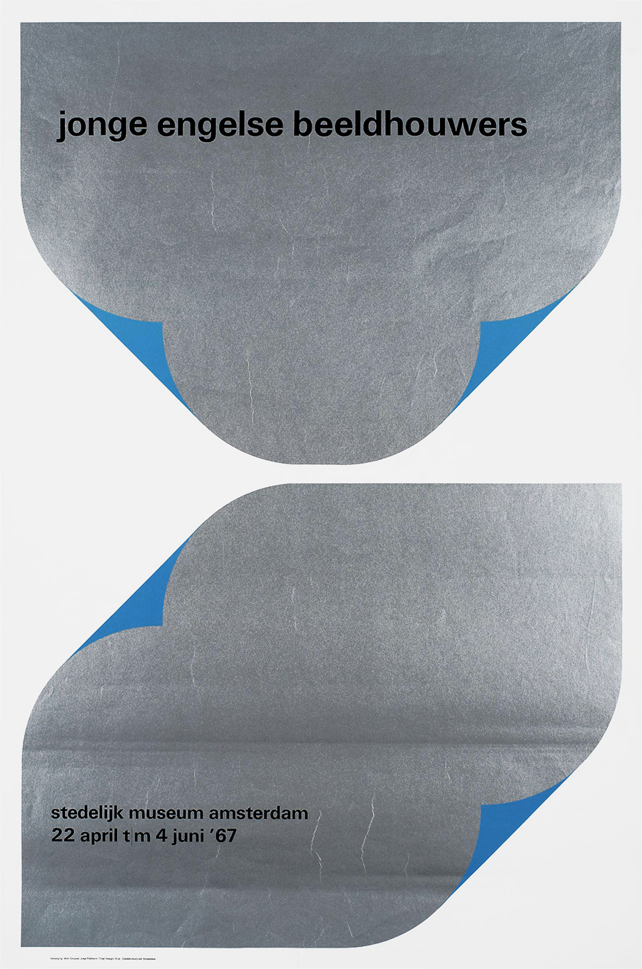
Jonge Engelse Beeldhouwers
Poster
1967
Poster for an exhibition of “Young British Sculptors” at the Stedelijk Museum, Amsterdam. Designed with Josje Pollman at Total Design.
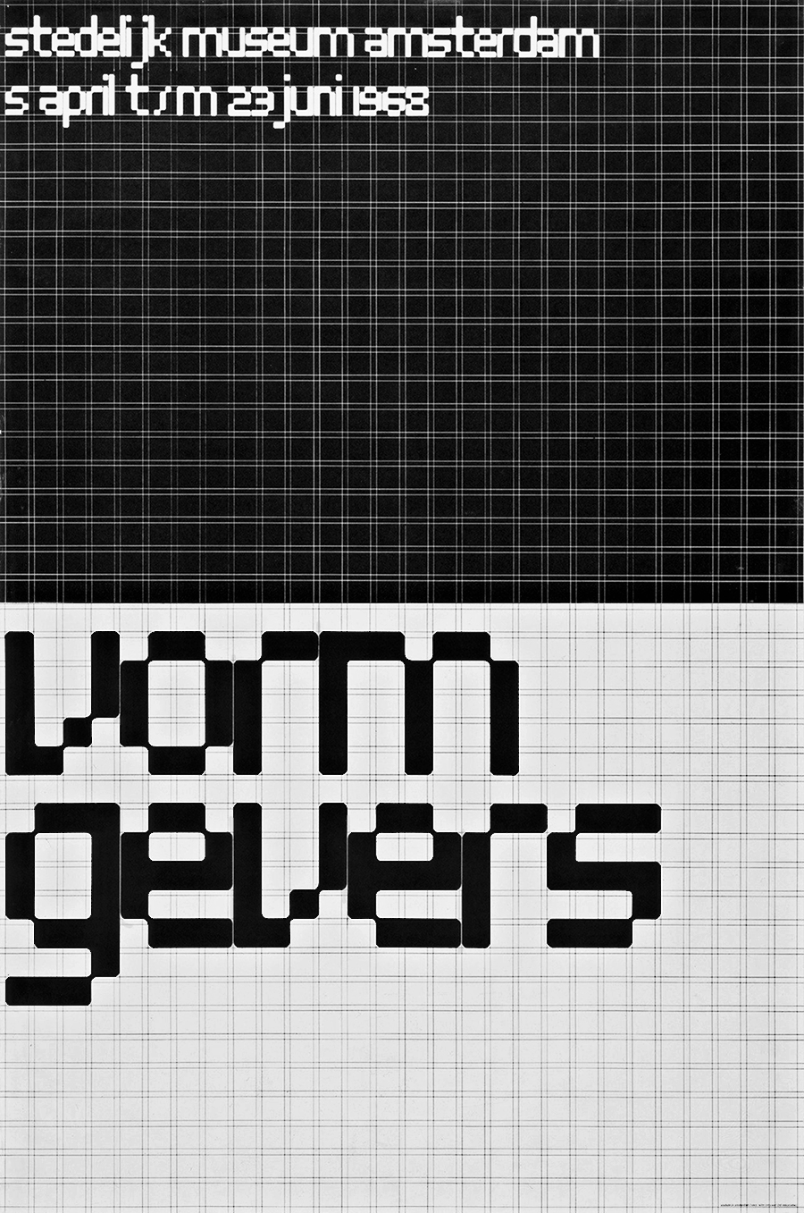
Vormgevers
Poster, 95×63.5 cm
1967
Designed to promote an exhibition titled “Vormgevers” (Form Givers, i.e. Designers). It has become a graphic design classic, and probably the best-known poster designed by Wim Crouwel.
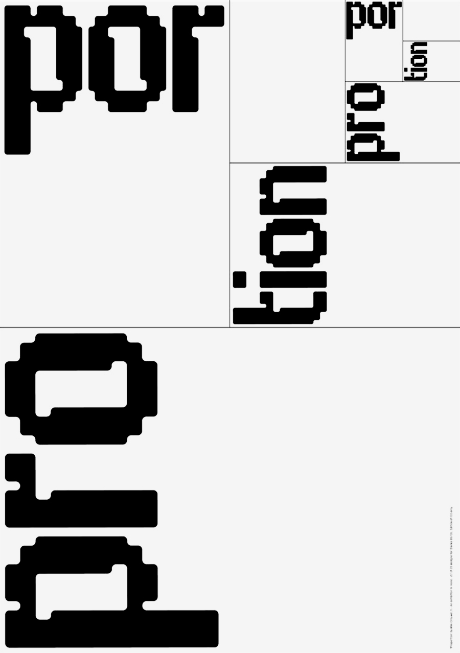
Proportion
Poster, 84×59.5 cm
2006
Links & Docs
Articles
Dezeen Typefaces
Icon of Graphics Wim Crouwel
Profiles
Wikipedia Wim Crouwel
Projects
Adviz Wim Crouwel
eMuseum Wim Crouwel
Flickr Wim Crouwel
Geheugen van Nederland Wim Crouwel
MoMA Collection
Nago Wim Crouwel Instituut
Art of Posters Wim Crouwel
Van Sabben Wim Crouwel
Iso 50 Vintage Design
Picssr Wim Crouwel
Videos
Art Tube Wim Crouwel 2015/1968
Crane TV A Graphic Odyssey
Étapes Wim Crouwel
Helvetica Film Wim Crouwel in Helvetica
MfG Zürich Swiss Style
Phaidon Press Advice for young designers
Phaidon Press A profile of Wim Crouwel
Spin Interview by Tony Brook
Submarine Channel Dutch Profile
TO THE TOP ↑
Comments
If you wish to add a comment please feel free to write at
info@designculture.it
TO THE TOP ↑
Follow on Facebook
Partnerships

Archivio Grafica Italiana is the first digital resource to the Italian graphic design heritage. Founded by Nicola Munari in 2015.

Design consultancy based in Piacenza, Italy. Founded by Nicola Munari in 2015, it operates in the whole field of design.
TO THE TOP ↑
© 2013-16 Nicola-Matteo Munari. All rights reserved.