Salvatore Gregorietti is an important master of Italian graphic design who dedicated himself to projects marked by visual clarity and structural consistency that became a tangible contribution to our collective culture.
The grandson of a liberty painter, his father was director of the prestigious Museo Poldi Pezzoli of Milan. In 1958, after graduating from the Brera Arts High School, he moved to Zurich and enrolled in the Kunstgewerbeschule (School of Arts and Crafts).
After two years, he returned to Italy and was hired by
Massimo Vignelli as his assistant. During this period he collaborated on many famous projects for prominent clients such as Piccolo Teatro, Pirelli, and Sansoni and also carried out works for his own clients including Milano Libri, Linus magazine, and the Peanuts books.
In 1965 he joined Unimark International, the first international graphic design firm founded by
Massimo Vignelli, Bob Noorda, and four American partners. Gregorietti worked at Unimark Milan in partnership with Bob Noorda, focusing on corporate identity and editorial design.
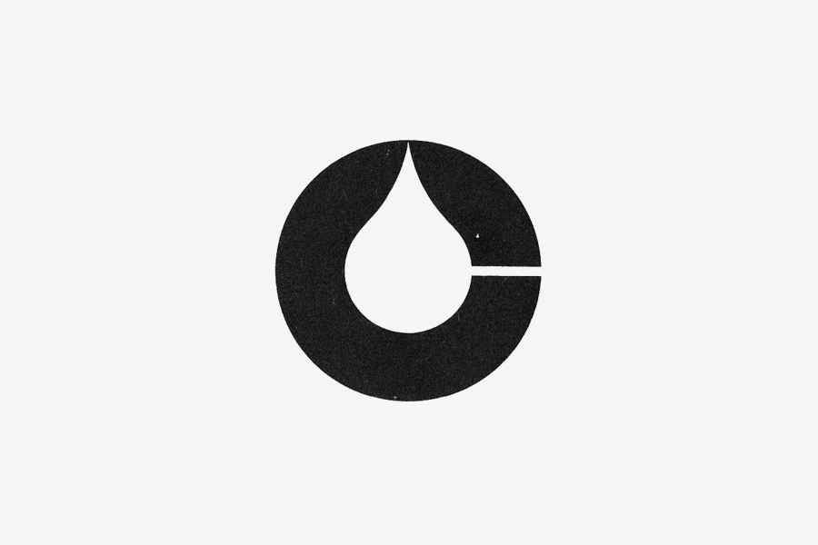
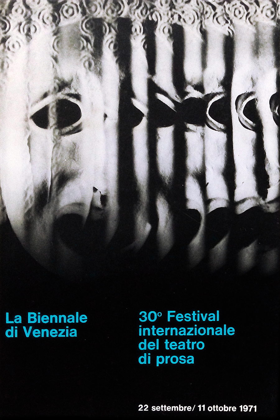
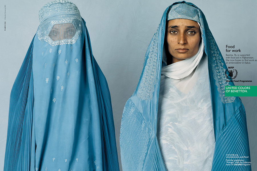
From the mid-1960s to the late 1980s, he served major clients designing the logotypes of Agip and Pirelli, the coordinated identity programs of Confindustria, San Paolo Banking Institute, the Venice Biennale (1968-72), and corporate graphics for Cassina, LaRinascente and many others. He also acted as art director of Prénatal and design consultant to Benetton for more or less twenty years, taking charge of all the advertising graphics, catalogs, reports, and coordinating the graphics office of Fabrica, the communication research center of Benetton.
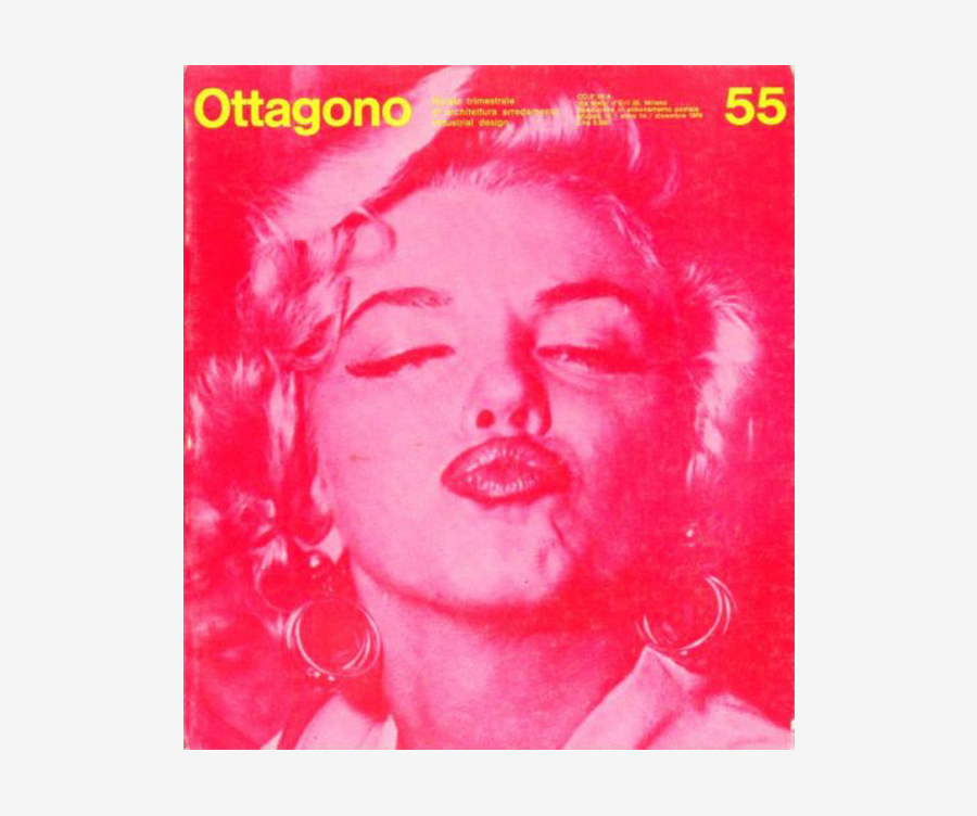
From 1967 to 1988 he designed Ottagono, a beautiful architecture and design magazine for which he was awarded a Compasso d’Oro in 1979. In 1970-71 he designed Ubu, a famous Italian alternative culture magazine, while from 1973 to 1992 he designed Casa Vogue magazine. He also designed Capital, Carnet, Corto Maltese, and many other periodicals.
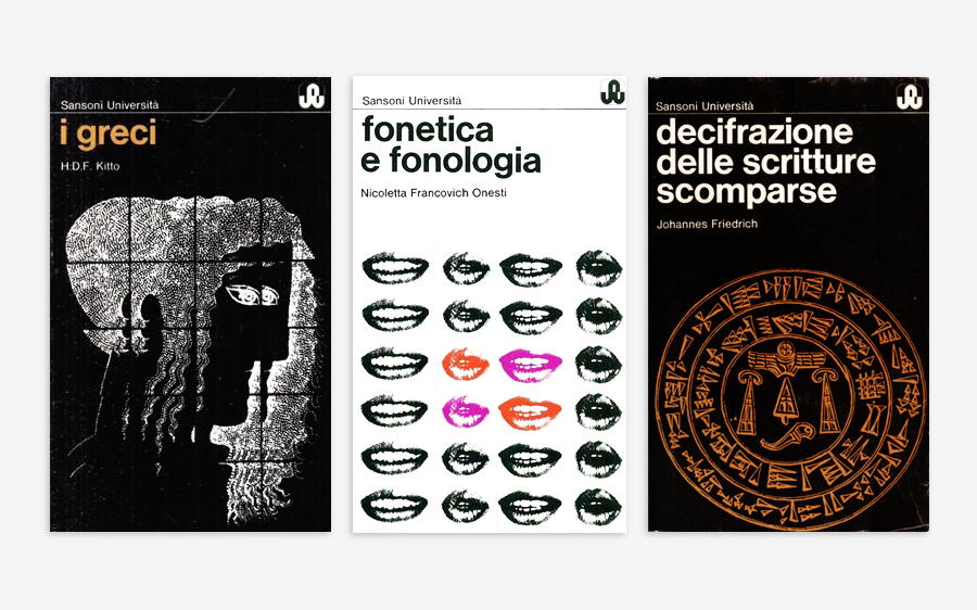
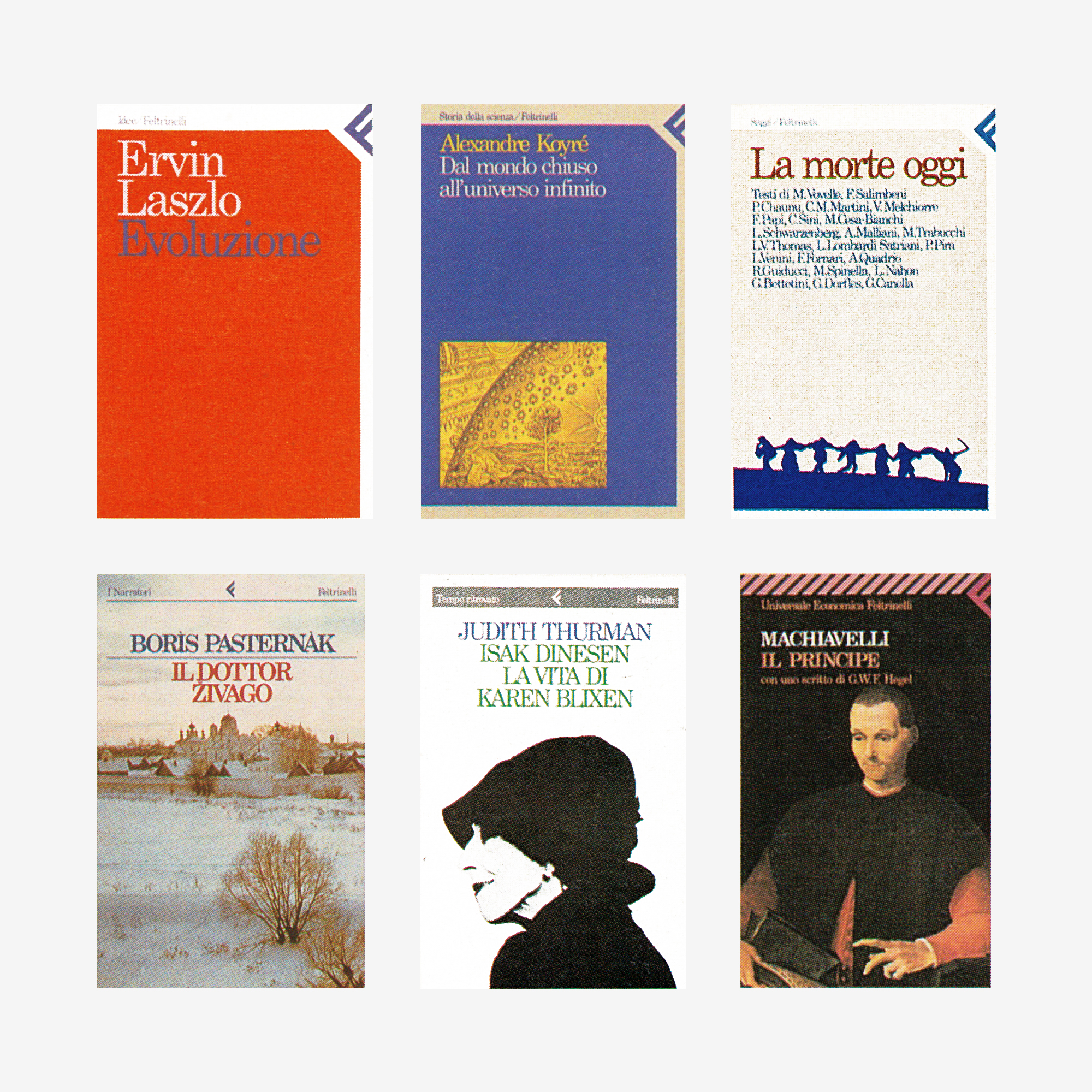
From the late 1970s to the 1990s, he designed numerous book series, covers, and corporate graphics for Bompiani, Cepim, Emme Edizioni, Longanesi, Sansoni, Sylvestre Bonnard, and other prominent Italian publishers including Feltrinelli for which in 1981-82 he completely redesign all the book series according to the coordinated graphics designed with Bob Noorda.
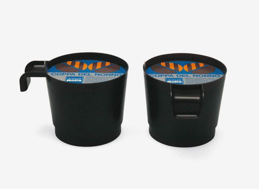
He also worked in the fields of product, furniture, and transport design drawing lighting fixtures, dinnerwares, chairs, sail boats, and the iconic Coppa del Nonno, one of the best known Italian ice-creams.
From 1980 to 1986 he taught at the Accademia di Belle Arti of Carrara (Academy of Fine Arts), and also gave courses at the IED – Istituto Europeo di Design (European Institute of Design). His work received important recognitions from the ADC (Art Directors Club), and the ADI – Associazione Disegno Industriale (Industrial Design Association), including the 1979 Compasso d’Oro award. He also published a major book about writings titled “La forma della scrittura,” (Feltrinelli, 1988).
The following interview is the result of an extensive conversation we had at his home talking about his early experience with
Massimo Vignelli, the long journey at Unimark International, and his latest works for the Museo Poldi Pezzoli and the Fondazione Giangiacomo Feltrinelli.
A comprehensive monograph about his work will be published in late 2016.
I truly wish to thank Mr. Gregorietti for his incredible kindness and hospitality.
Enjoy your reading,
 TO THE TOP ↑
Chapter 1. Swiss Graphics
Chapter 2. Vignelli Design
Chapter 3. Unimark International
Chapter 4. About Design
Chapter 1. Swiss Graphics
Let’s start from the very beginning. You were born in Palermo, Sicily.
Yes, my family was strongly rooted and quite known in Palermo. I was named after my grandfather, who was a great liberty painter, restorer, and mosaicist. In Mondello, a seaside location near Palermo, there is the Villino Gregorietti, a house built by the renowned architect Ernesto Basile.
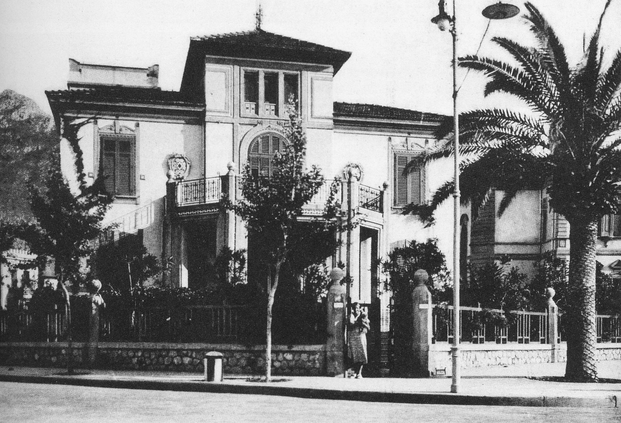 Ernesto Basile, Villino Gregorietti, 1924-26, Palermo.
When did you move to Milan and why?
Ernesto Basile, Villino Gregorietti, 1924-26, Palermo.
When did you move to Milan and why?
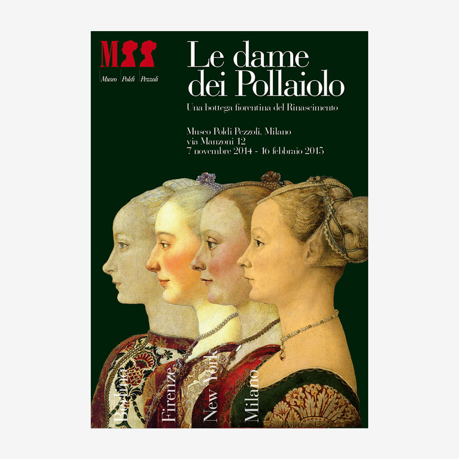
We moved to Milan when I was a child because my father was appointed to reconstruct the Museo Poldi Pezzoli, that was bombed during the Second World War. He became director of the museum and held this position for about thirty years. This is the reason why I am working today for the Poldi Pezzoli for free. I am doing it as a kind of tribute to my father.
Where did you study in Milan?
First, I attended an Ursuline School near our house in Via Pacini. Then, I studied at Parini (Lower Secondary School), and later on at the Brera Arts High School where my father also taught, but he wasn’t a teacher of mine. In 1958, once graduated from Brera, I went to Zurich and enrolled in the Kunstgewerbeschule (School of Arts and Crafts).
Why did you decide to go to Switzerland? There are many Swiss who came to Italy but not so many Italians who went to Switzerland.
We were only in three: Oliviero Toscani, Antonio Tabet, and myself. It was really an uncommon and somehow difficult experience because most of the Italians who went to Switzerland at that time were laborers. A bourgeois gentleman who even arrived with a Cinquecento was considered a weird and generated some envy.
Who did you meet in Zurich?
I lived in the house of Walter Diethelm, who was a well known Swiss graphic designer. While at school, I studied under Joseph Binder. Unfortunately, I didn’t have Josef Müller-Brockmann as a teacher. Anyway, after two years I was kicked out of the school.
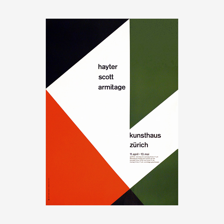 Walter Diethelm, Hayter Scott Armitage, 1959. Poster for the Kunsthaus Zürich.
Why did that happen?
Walter Diethelm, Hayter Scott Armitage, 1959. Poster for the Kunsthaus Zürich.
Why did that happen?
There was a fair in Zurich called Knabenschiessen (Target Shooting Competition). I was very curious about it and visited the fair during lesson time. A teacher of mine, whose name I can’t remember, saw me there and denounced that unexcused absence to the school!
How long would have been the entire course?
Four years. Only Oliviero Toscani finished it.
I guess the course was in German, then did you speak in German?
It should have been in German but actually was in Schwyzerdütsch, that has nothing to do with German. I learned a little bit of German but can’t remember it at all. Anyway, we didn’t talk a lot, rather we worked hard.
Did you already have a clear perception of what Swiss graphic design was before going to Switzerland?
Yes, I think so. When I was at the Brera High School, I already knew that in Switzerland and also in Germany there was a specific graphics movement focusing on precision and rationalism, and I was really interested in it.
Helvetica and Neue Grafik were released precisely in those years.
Yes, there was the Haas Grotesk, today known as Helvetica, and before it there was the Akzidenz Grotesk, that the Americans called Standard thus generating some confusion. Everywhere in Zurich you could see Josef Müller-Brockmann’s posters hanging along the streets. Swiss designers did many beautiful things at that time!
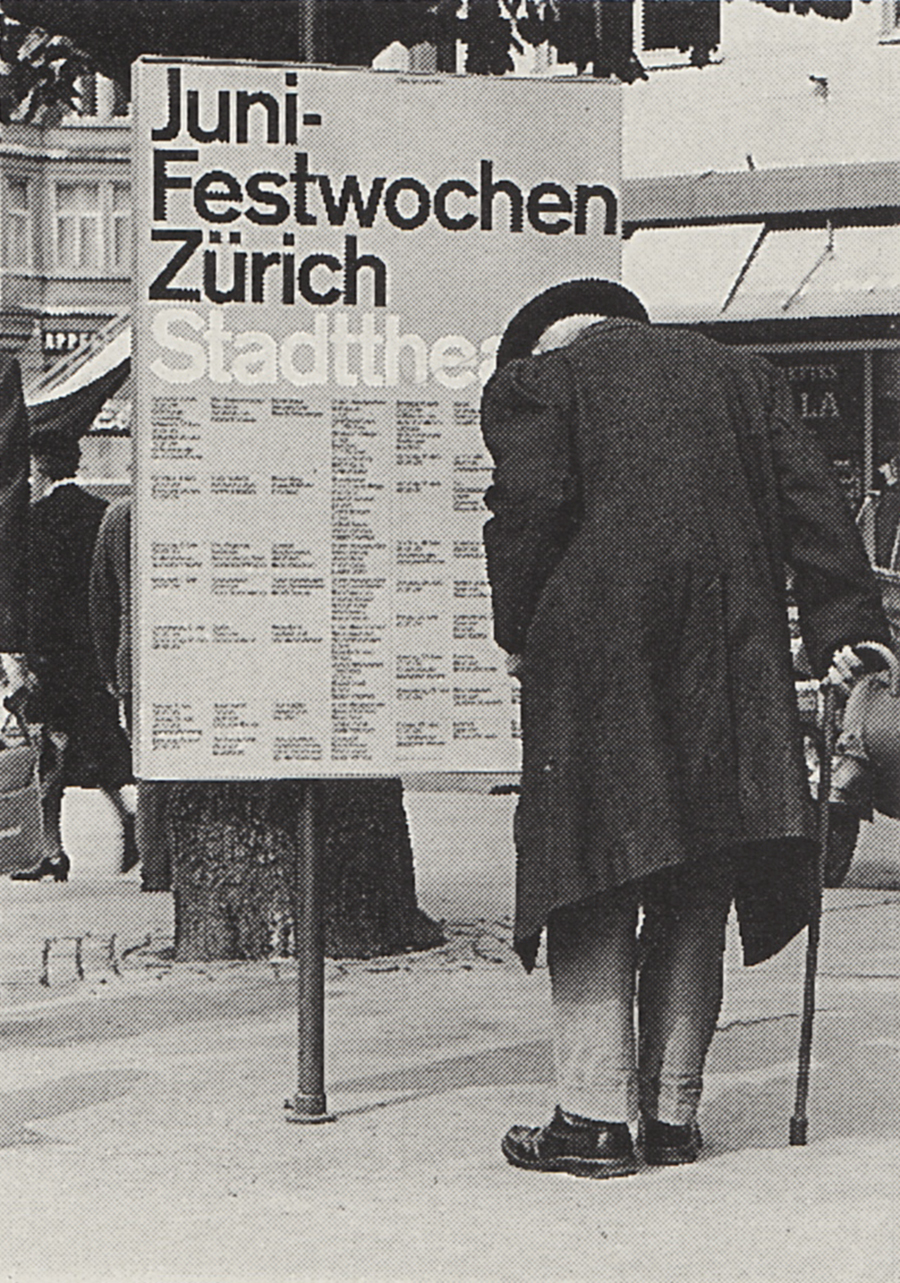 A poster designed by Josef Müller-Brockmann for the Stadttheater Zürich (today Opernhaus), 1961. Previously unseen on the internet. Source: Lars Müller Publishers.
Why did you decide to study graphic design? Did your parents encourage you to pursue this path?
A poster designed by Josef Müller-Brockmann for the Stadttheater Zürich (today Opernhaus), 1961. Previously unseen on the internet. Source: Lars Müller Publishers.
Why did you decide to study graphic design? Did your parents encourage you to pursue this path?
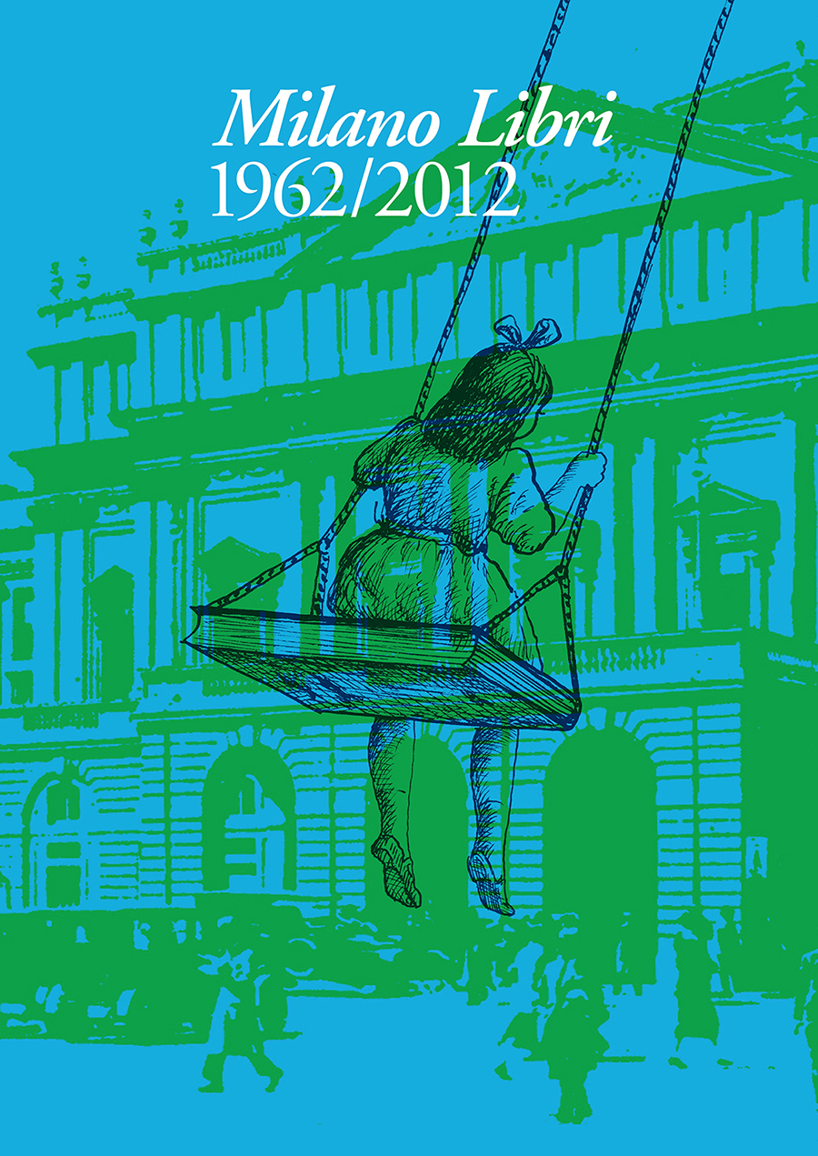
My parents understood that I was quite good in graphic design and they supported me very much. Indeed, some of the first projects I did once back in Milan were commissioned by my sister, who established Milano Libri in 1962, and by her husband Giovanni Gandini, who invented Linus magazine in 1964.
What is Milano Libri?
It was a center of writers, intellectuals, but also cartoonists like Topor and Copi based in Via Verdi, near the Scala. Initially, it was a bookshop but soon became a publishing house, the first to translate and to publish in Italy the Peanuts for which I designed all the covers
.
TO THE TOP ↑
Chapter 2. Vignelli Design
In what year did you move back to Milan? And how did you start working with Massimo Vignelli?
I returned to Milan in 1960, I think. Antonio Tabet started working with
Heinz Waibl and told me that
Massimo Vignelli was searching for an assistant. He was just returned to Italy after an experience at CCA (Container Corporation of America) in Chicago, Illinois. Then, I introduced myself to
Vignelli and we immediately started to work together.
What projects did you worked together with Vignelli?
I worked many projects from books to posters. He started the designs and I completed them. We had some transfer fonts that he brought from the U.S.A. because in Italy there were none at that time. Otherwise, we did a photocomposition using movable types, and if you need to adjust the kerning you have to cut and glue all the letters one by one!
I guess it was a completely different job compared to contemporary, computer based graphic design.
Yes, indeed. It required manual skill that today with the computer is completely useless. You built graphics by cutting and gluing. That was the only way to do it. Honestly, I am somehow still using the computer like if I am gluing the letters one by one!
Sometimes, I do it too. I think that one of most important things that I have learned working with Italo Lupi is exactly to use the computer like scissors, paper, and glue.
I think that you have to do it that way, because otherwise the computer gives you so many possibilities that you can’t control your work, in particular if you don’t have a strongly rooted design culture.
Did Ms. Vignelli also work with you at that time? How she contributed?
Lella Vignelli was a perfect coordinator. She took care of the clients and scolded us to respect the deadlines. She also did some designs, for example Poltronova.
 Lella Vignelli, Saratoga, 1964, armchairs and table for Poltronova.
What contribution brought to your design activity the experience you did with Vignelli? Is there any particular lesson that your learned from him?
Lella Vignelli, Saratoga, 1964, armchairs and table for Poltronova.
What contribution brought to your design activity the experience you did with Vignelli? Is there any particular lesson that your learned from him?
I learned a lot from him. I learned the basics of the design culture in Switzerland and that made easy to understand and acquire
Vignelli’s design philosophy. His design was for sure rational, but with a little bit of intellectual freedom. Anyway, rigor and architectural geometry never came less. I am still trying to perpetuate this same philosophy with all my strength.
At the beginnig of your careers, do you think that you could contribute to somehow change the world through your work?
Yes. When I started to work there was still the echo of the war. We came from a fierce period and society really needed to be rebuilt. When we started working we hoped at least to produce visual objects that could be easier to understand and pleasant to be look at. But nothing more than that
.
TO THE TOP ↑
Chapter 3. Unimark International
When did you start working for LaRinascente?
I had a long and good collaboration with LaRinascente in the late 1960s, working with art director Adriana Botti Monti, and with photographers like Aldo Ballo and Sergio Libis (Serge Libiszewski). I set up my own studio within LaRinascente, and at the same time worked at Unimark International that was founded by
Massimo Vignelli in 1965.
Did he previously talk to you about the idea of establishing such an international design firm? Do you think that it was a project he cultivated for some time or a sparkling decision? And what did you think when he told you about it?
Sometimes, he talked to me about his experience in the U.S.A. but never mentioned the idea of establishing such a studio until the proposal came from Ralph Eckerstrom for whom
Vignelli worked at CCA (Container Corporation of America), Chicago. That marked the beginning of the adventure and, in the beginning, the idea seemed very thrilling to me. Not so thrilling later, when we understood that the American megalomania would have brought us to failure.
In 1972 Vignelli left and Unimark America started to fail. By 1979 all the American offices were closed. Only Unimark Milan survived until 2000. What do you think was the reason? Did you also work in the American offices of Unimark?
Yes, I worked for Halle’s Brothers at Unimark Cleveland, Ohio. The local office was specifically opened because we got that specific client. This was a typical behaviour of Unimark America, to open a new office where the client was based. A strategy that revealed itself to be complete bankruptcy. Anyway, I was asked to design that project for Halle’s Brothers because the Americans were maniac with specified expertise and, according to such a vision, I had the expertise in department store design having previously worked for LaRinascente in Milan.
How the work at Unimark Milan was organized?
In the beginning,
Vignelli still worked in Milan but soon moved to the U.S.A. Bob Noorda and I took charge of the design, and we have a couple of assistants who completed the projects. That’s it, there was no real hierarchy.
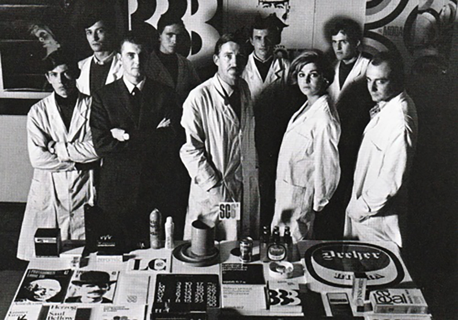 The staff of Unimark Milan wearing the white smocks. Gregorietti is the one on the right.
Who took commissions from clients? Did the designers join the meetings with clients?
The staff of Unimark Milan wearing the white smocks. Gregorietti is the one on the right.
Who took commissions from clients? Did the designers join the meetings with clients?
Designers joined the clients at briefing and presentations. Otherwise, the relationships were kept by an account manager who in Milan was Mario Boeri, who previously worked for Pirelli.
Did you already use the white mocks before Unimark?
The white mock was a mania of
Vignelli. I continued to use it for some time and then I took it off.
Did you already knew Bob Noorda and Emilio Fioravanti before joining Unimark?
I already knew Bob Noorda, while I knew Emilio Fioravanti when he joined Unimark as an assistant.
I have always been curious by the fact that although you had previously worked as the assistant of Vignelli, some of his projects were later carried on by Emilio Fioravanti, who was instead a former student of Noorda at the Umanitaria School. Did that happen because you carried out other projects or because you and Fioravanti had different roles?
Vignelli, Noorda, and myself were the first partners of Unimark Milan. There was Mario Boeri as administrator, and later on Franco Mirenzi who also joined as a partner. All the other people were assistants. Fioravanti started to assist
Vignelli on the Piccolo Teatro’s posters and Galileo magazine, and then he continued to work on that projects.
Not always there is a clear attribution to the projects produced by Unimark.
Yes that’s true, because many times we started working together, but often someone carried out some works on his own. For example, I initially designed Ottagono magazine with Noorda but from the third issue I took charge of the project and designed it completely on my own. The same thing happened with
Vignelli for the “Protagonisti della Storia Universale” book series by C.E.I. and for the “URSS nella Seconda Guerra Mondiale” book series by Sansoni
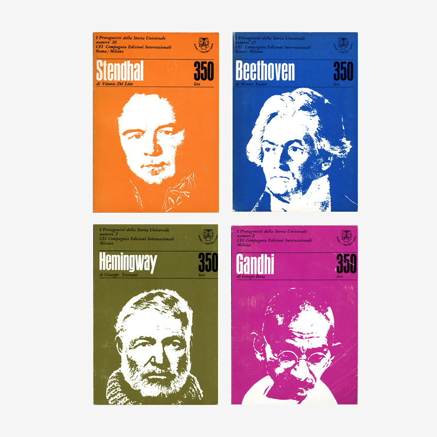 Massimo Vignelli and Salvatore Gregorietti (Unimark Milan), Protagonisti della Storia Universale (C.E.I. 1966).
Feltrinelli SC/10 book series was one of the first project by Unimark or it was done before?
Massimo Vignelli and Salvatore Gregorietti (Unimark Milan), Protagonisti della Storia Universale (C.E.I. 1966).
Feltrinelli SC/10 book series was one of the first project by Unimark or it was done before?
It was among the first projects by Unimark. It was designed by
Vignelli alone.
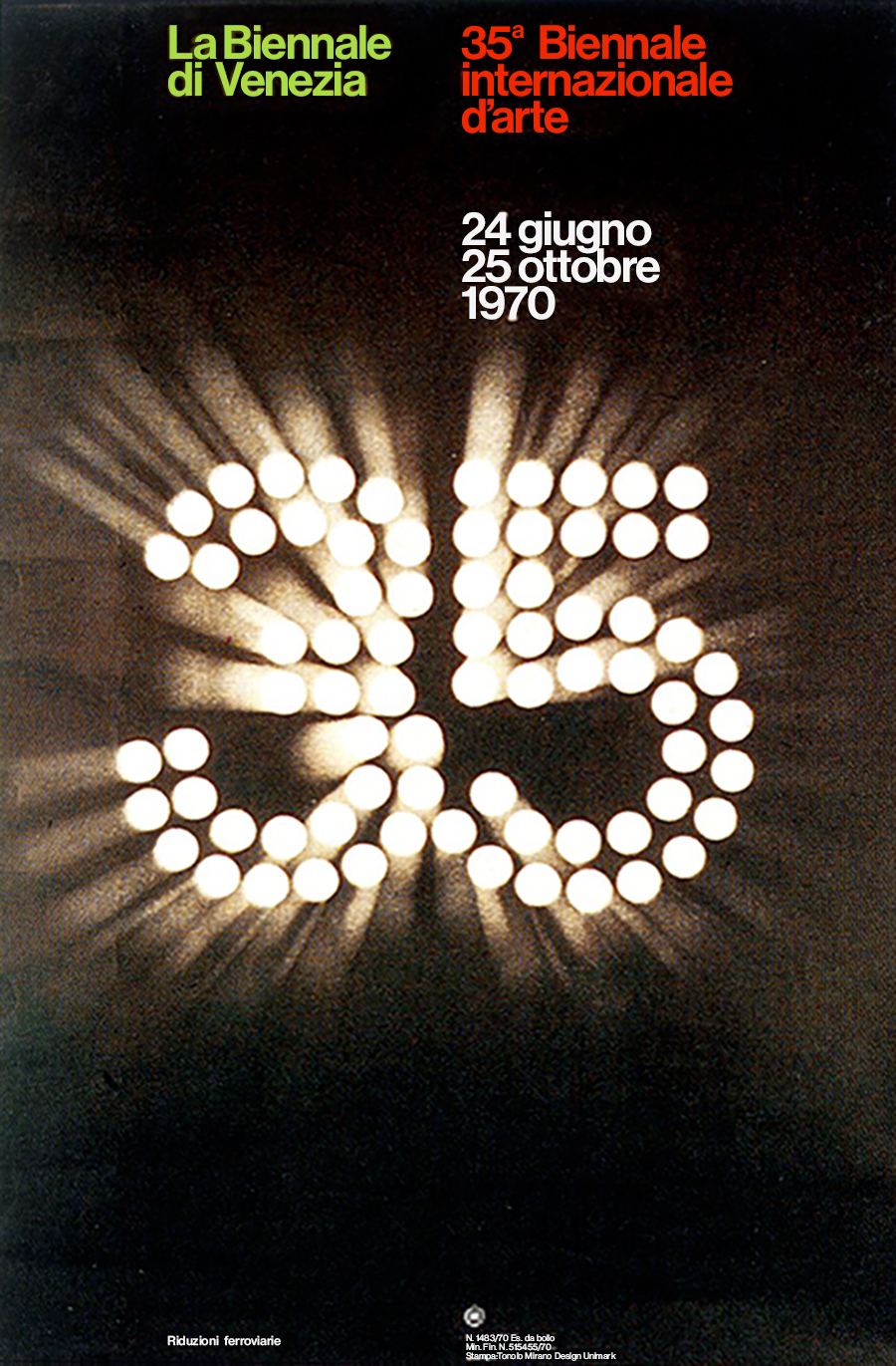
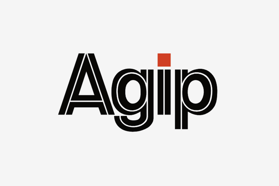
In 1970-71 Unimark was asked to design the corporate identity of Agip. How did you contribute the project?
I designed the corporate logotype with the traffic line in the middle of the letters. That input marked the whole corporate identity of Agip that was then developed by Bob Noorda, Franco Gaffuri, and myself.
And what about the redesign of Feltrinelli book series done in 1982?
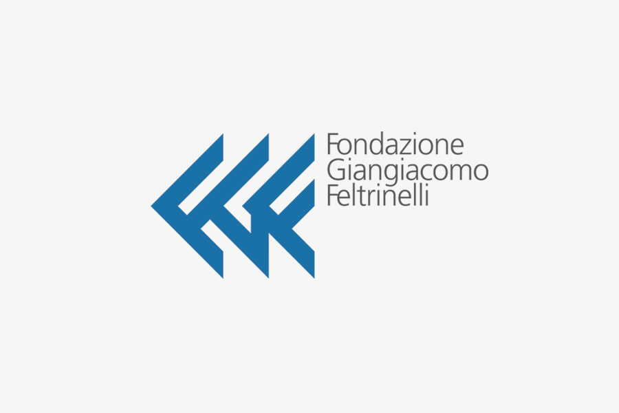
I set up the project with Noorda and then carried it out on my own, entirely designing some book series like I Narratori. Also the mark that Feltrinelli uses today is a redesign I did of the one originally designed by Noorda. It actually corresponds to the third F of the FGF (Fondazione Giangiacomo Feltrinelli) mark, which has been structured following a precise construction grid.
In 1982 you also redesigned the definitive Pirelli’s logotype and Unimark arranged the logo’s first graphics standards manual.
Yes, I normalized the shape of the logotype by designing a modular grid.
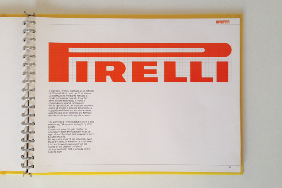 Unimark Milan, Pirelli Logotype Guidelines, 1982. Previously unseen on the internet.
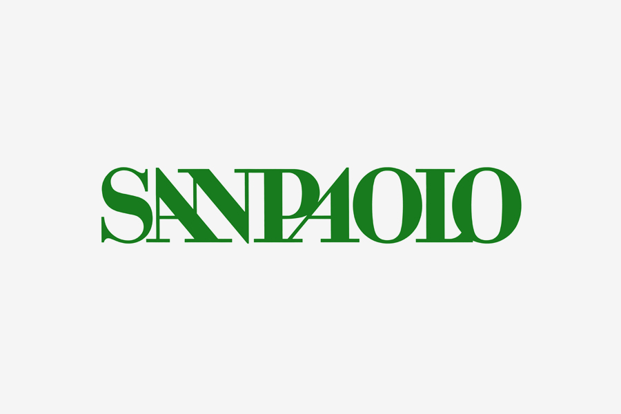
I also like the logotype for San Paolo Banking Institute that was simply but effectively characterized through the two slanted A.
Unimark Milan, Pirelli Logotype Guidelines, 1982. Previously unseen on the internet.
I also like the logotype for San Paolo Banking Institute that was simply but effectively characterized through the two slanted A.
I drew it in that way because the client asked for just a logotype, not a mark, that could actually be a logo-type. Then, it required a distinctive shape that made it easily recognizable. You see, if
Vignelli would have been in Milan when I designed that logo he would never let me do it in that way because he didn’t admit that kind of formal freedom. He was much more rigorous than me. I transgressed many times, but always trying to make something appropriate.
I assumed that he preferred plain typographic logotypes to symbolic marks, and by following this attitude I really think that Unimark crucially contributed to the fortune and fame of Helvetica in particular in the United States, where nobody used it before Unimark.
Absolutely, Unimark strongly contributed to the diffusion of Helvetica (Haas Grotesk).
Then, somehow that feature of the logotype for San Paolo came from a precise client’s need. How do you think the client influences the quality of the work?
I strongly believe that the quality of the work greatly depends on the quality of the clients. The quality of the clients is of paramount importance and I must admit that I have been very lucky with my clients, also because I have always worked for friends; people with which I have always had a human relationship as friends besides the professional relationship, and I think that this thing has been a most important factor in the quality of the design result.
Working with photographers like Aldo Ballo, Oliviero Toscani, and Serge Libiszweski you produced a lot of works where photography prevails. What is the importance of graphic design in a photographic poster or book cover?
It is very important. You have to choose the right photo from hundreds, the proper cropping, the right layout, the position of the mark, so to produce the best relationship with the image
.
TO THE TOP ↑
Chapter 4. About Design
Is there a graphic designer whose work you particularly admire?
Among the living ones? Well, I admire
Italo Lupi and Pierluigi Cerri, who is both an architect and a graphic designer. I like his design very much because it is very structured.
And among the architects?
I don’t know, specially considering that to find a straight line is very rare today, and I am still an enthusiast of orthogonality. I think that contemporary architecture is an end in itself. There is nothing but formalism, there is no structure. While in the past, I really loved Ettore Sottsass who was somehow a genius. He did something that I would have never done, but he did it very well.
Is there a piece of architecture that you particularly admire?
The Seagram Building by
Mies van der Rohe in New York City and the Pirelli Tower by Gio Ponti and Pier Luigi Nervi in Milan. I also like three small houses that I have asked to design to the Monti brothers (Gianemilio Monti, Piero Monti, and Anna Bertarini Monti) in Via Machiavelli, Milan, in 1970-71. They feature a precise structure but also interesting volumes.
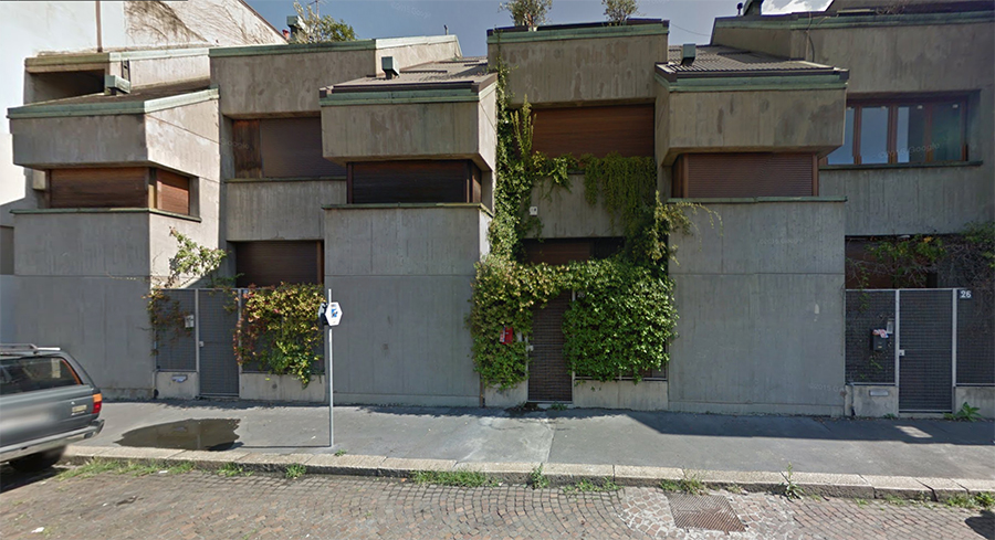 GPA Monti, Via Machiavelli 26-28, Milan, 1970-71.
Is there a typeface that you prefer?
GPA Monti, Via Machiavelli 26-28, Milan, 1970-71.
Is there a typeface that you prefer?
There are just a few typefaces that I particularly appreciate because I think they are the most suitable for specific applications: Helvetica (Haas Grotesk), Akzidenz, Bodoni, Garamond, and Caslon.
What job would you have liked to do if you didn’t become a designer?
I don’t know. I have always liked sailing and I also designed a sail boat with Alessandro Vismara, the founder of Vismara Marine. I also worked as an antique dealer because my mother had an antique shop in Via della Spiga, Milan. When she closed, I opened my own antique shop. I did it when I was working for Benetton. At that time, I lived in Paris for a couple of months a year to prepare the photographs for the advertising campaigns and the catalogs, and Paris is the major market for the antiques. Anyway, I honestly don’t know what else I could have done, maybe nothing else because I practice this profession with real passion, and passion kills any other desire.
How did your design change from the beginnings until today?
I will soon publish a monograph about my work that I would like to title “Un progetto lungo cinquant’anni,” (A 50 Years Long Project). It is quite expressive, I think. The principles of design didn’t change but of course they evolved. However, also within freedom rationality is always at the core.
What is your definition of design?
I don’t think there is a definitive definition of design. It is wrong to reduce everything to a definition. Design possesses so many aspects that is impossible to put them all under a single definition. Furthermore, there are many different ways of design and they could be judge only according to one’s own culture. I prefer not trying to formulate a definition.
Then, what are the aspects that you try to bring into the project? For example, I see a sharp simplicity that distinguishes your works. An attitude that I consider to be very functional to produce a clear but strong communication.
There are projects that require simplicity because otherwise they become illegible. While there are other projects that can be more articulated. But also in this case, if you examine my work you will always find a structure—we can call it an architecture—that defines the foundations. I think that both simple and complex projects require to be based on such an architecture.
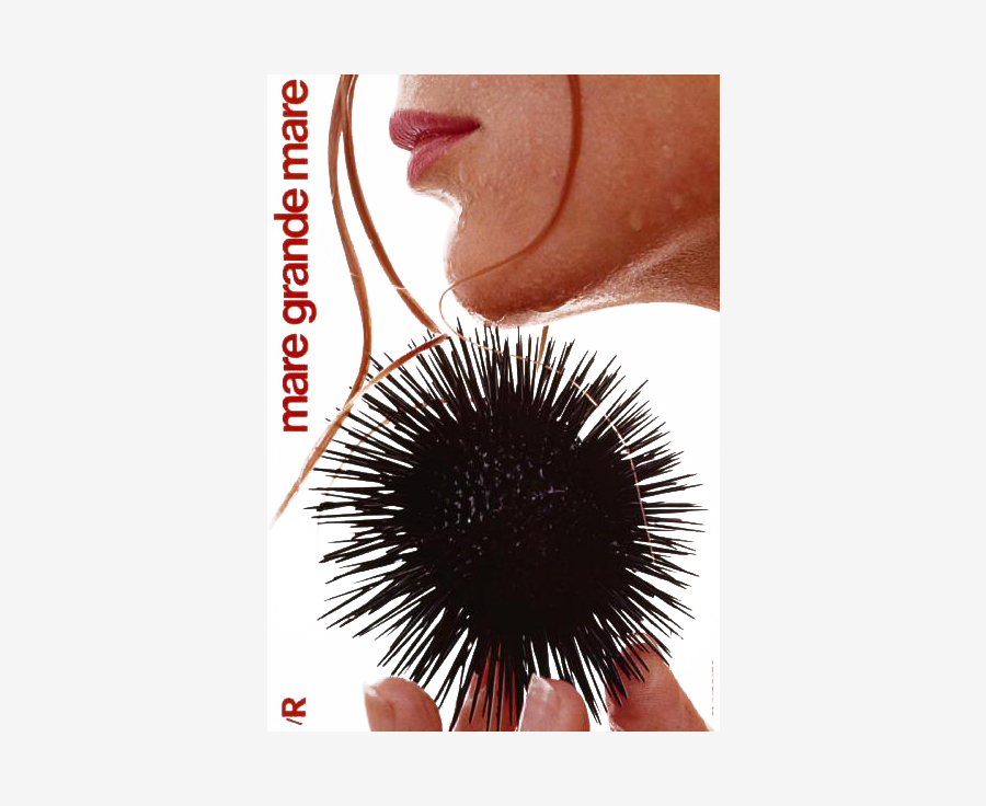 Salvatore Gregorietti, AD Adriana Botti. Mare grande mare, 1969. Photo by Serge Libiszewski.
Massimo Vignelli always said that design is one. Considering that you worked in the field of both graphics and product, do you really think that design is one discipline that can be applied to several different subjects such as graphics, products, furniture, and so on?
Salvatore Gregorietti, AD Adriana Botti. Mare grande mare, 1969. Photo by Serge Libiszewski.
Massimo Vignelli always said that design is one. Considering that you worked in the field of both graphics and product, do you really think that design is one discipline that can be applied to several different subjects such as graphics, products, furniture, and so on?
Yes, I think so. Maybe architecture requires a specific technical competence, but all the other fields are completely compatible. They are all defined by the same design discipline.
Do you think that experience can contribute to better approach a design project?
For sure but instead of experience you have to say culture. Experience is useful if it creates a design culture.
Most of your work is deeply rooted in Italy. What do you think are the best and worst things of working in Italy? What did you enjoy?
Well, I enjoyed it because in Italy I have a lot of friends! Friendship has been a most important thing from a professional point of view. The 90% of the work I did has been done with people that I knew very well.
What contribution design can bring to society?
You can only give a contribution to the people who want to receive it. There is no generic contribution you can bring to the whole society, because there are sectors of society that are completely closed. Maybe, I gave a small contribution to that small piece of society who was interested to receive it, but that’s all. None of us produced a global revolution.
What do you think is the best quality of your work?
Passion. After fifty years I am still designing with a lot of passion, and this is a very important thing because it makes you approaching everything with great obstinacy and determination. I really like my profession and this is not so common as you can think. Many people do it because they don’t know what to do. On the contrary, passion makes yourself questioning about what you do and why you do it in that way.
When did you originate such a passion?
Since I was a child I have always been interested in aesthetics and art because of my family, my father and my grandfather.
And why passion pushed you towards graphic design rather than art?
Because at one point I decided that I was not an artist. I was quite good in hand-drawing at Brera but I wasn’t interested in the exclusively artistic part of the work. Then, I moved towards a bit more concrete application. I was more interested in structure and rationality.
What was your favorite game as a child?
Meccano.
Thank you very much.
Thank you too.
 © 2016 Nicola-Matteo Munari, Salvatore Gregorietti. All rights reserved.
TO THE TOP ↑