Massimo Vignelli
Milan, Italy, 1931 – New York City, New York, 2014
Introduction
Massimo Vignelli is one of the most important protagonists in the history of design, and graphic design in particular. He designed graphic systems that had, and still have today, a tangible utility for millions of people everyday, thanks to his determination in basing the design on a true understanding of the users’s real needs.
Through both his deep cultural commitment and his real comprehension of the design discipline, Vignelli crucially contributed to the design profession by keeping alive and also promoting the evolution of the fundamental principles that were developed by the Modern Movement during the early 20th century, thus revealing to everyone their ongoing validity.
A validity that we can see in his own design, as demonstrated by both the strength and functionality that still characterise it, and also by the interest toward Vignelli’s design shared by thousands of people from all over the world. The work of Vignelli indeed shows a timeless validity housed in its pragmatic, rational, and visually forceful nature.
Vignelli taught us to appreciate the functionality and elegance of simple, rational shapes—an aesthetic that is result of a deep cultural sensitivity, before being a matter of style or taste. His opera will always be an excellent example to make people understand the social value of design and to make designers understand the need to adopt a professional discipline that will allow to properly manage such a responsibility.
I will be forever grateful to him for being the first one to believe in Designculture and giving me the first interview, for his interest toward my own work, and for sharing with me his thoughts about design.
Enjoy your reading,
 TO THE TOP ↑
Who’s Who
Massimo Vignelli has been one of the most important designers of the 20th century. A deskmate of
Heinz Waibl from 1946 to 1950 at the Arts High School in Milan, and a classmate of Marirosa Toscani Ballo at the Brera Academy of Arts in 1948-50. He studied architecture at the Politecnico of Milan in 1951-53 and the School of Architecture at the University of Venice in 1953-57, but interrupted his studies before graduating.
Since he was 16 years old, he started to collect a series of short internships with some of the best Italian architects and designers of that time —
Achille Castiglioni and
Pier Giacomo Castiglioni,
Giulio Minoletti,
Giancarlo De Carlo, Franco Albini, and
Ignazio Gardella.
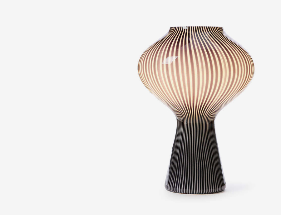 A table lamp from the series Fungo, that Vignelli designed with Paolo Venini in 1955.
While still a student at Brera, Vignelli worked for Rotofoto, the photo agency of Fedele Toscani—father of internationally renowned photographer Oliviero Toscani. While he was based in Venice, he designed a series of lighting fixtures for his friend Paolo Venini—founder of the eponymous blown glass manufacturing company—inclusing the iconic Fungo lamp (1955). In the same period, he also designed a house that was built in the Venetian and published on Domus magazine (May, 1955) realising that “the architectural process was too slow if compared to the speed of the industrial design process.” He then started to focus more and more on editorial, product, and packaging design projects.
In 1957 Vignelli married Elena Valle, who from than on became known as Lella Vignelli (1934-2016). Lella came from an important family of architects—his brother was renowned architect Gino Valle (1923-2003)—she was an architect too and a fundamental professional partner to Massimo during his entire career. The same year the couple left for the USA, where Vignelli was offered a fellowship from a silverware manufacturing company based in Newburyport, Massachusetts. While working there, he was invited to teach graphic design at the Institute of Design, New Bauhaus in Chicago, where he acted as an educator in 1958-59. Meanwhile, Lella started working as an architect at SOM (Skidmore, Owings and Merrill)—one of America’s best-known architectural firms.
In 1960 their visas expired and the couple moved back to Milan, where they opened the Lella & Massimo Vignelli Office of Design and Architecture (1960-64) focusing on furniture, product, and graphic design for important Italian and European companies like Olivetti, Penguin Books, Piccolo Teatro, Pirelli, Poltronova, Triennale, Venice Biennale, and Xerox. The first assistant of Vignelli at his office was
Salvatore Gregorietti, who will also became one of the best designers in the history of Italian graphic design. It was at that time that the Vignellis defined the basis of their expressive language and started receiving official recognitions for their work—in 1964 the Compact stacking dinnerware that they designed was awarded a Compasso d’Oro, one of the most prestigious design awards in the world.
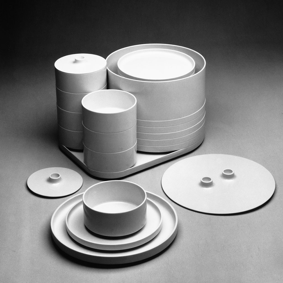 Lella and Massimo Vignelli, “Compact,” stacking dinnerware for ARPE, 1964 (MoMA Collection).
Vignelli also continued teaching at Umanitaria School in Milan in 1960-64 and the University of Venice in 1962-64. A colleague at both academies was Bob Noorda, one of the very best designers in the history of Italian graphic design. Since Noorda and his wife Ornella—also a designer—shared a similar design attitude to that of the Vignellis, they started to consider the possibility to collaborate in a joint studio. Ralph Eckerstrom—former design director of CCA (Container Corporation of America) for whom Vignelli worked during his permanence in Chicago—was also asked to join the initiative and on January 4, 1965 Unimark International, Corporation for Design and Marketing was founded, also in partnership with Larry Klein (a Chicago-based designer), James Fogleman (former design director at Ciba), and Wally Gutches (former plant manager at CCA).
Unimark is a milestone in the history of design. It was the first design consultancy with an international scope and offices worldwide—Chicago, New York, Milan, Detroit, Johannesburg, Cleveland, Denver, San Francisco, London, Melbourne, and for a short time Copenhagen, Aspen, and Palo Alto. Vignelli was design director and senior vice-president, coordinating the work of all the offices to be visually consistent. It became soon one of the world’s best design firms producing iconic projects that are still part of the people’s visual culture. The list includes Ford (1965), Knoll (1966), and American Airlines (1967) corporate identities, as well as the New York City Subway’s sign system (1966) and its Graphic Standards Manual (1970).
The work done by Vignelli at Unimark indelibly marked the entire world’s graphic design production and offered the most important contribution to the fortune and fame of the typeface Helvetica. (While unfortunately Lella couldn’t join the firm because of U.S. laws from that time forbidding married couples to work together.)
In 1971 Vignelli left Unimark—that soon went bankrupt in almost all of its offices—and established a smaller firm called Vignelli Associates, where he could work together with his wife. The couple developed projects in all the fields of design, following their belief saying that “design is one” discipline that can be applied to many different fields. During that time, Vignelli designed many projects for major companies including Knoll (1972-87), Bloomingdale’s (1972), Lancia (1977), US National Parks Service (1977), Sotheby’s (1981), Cinzano (1984), Ferrovie dello Stato (1999), and many others. As Vignelli himself stated, his design can be described as “semantically correct, syntactically consistent, and pragmatically understandable—visually powerful, intellectually elegant and, above all, timeless.”
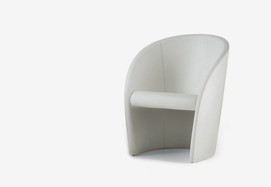 Lella and Massimo Vignelli, “Intervista,” series of armchairs for Poltrona Frau, 1989.
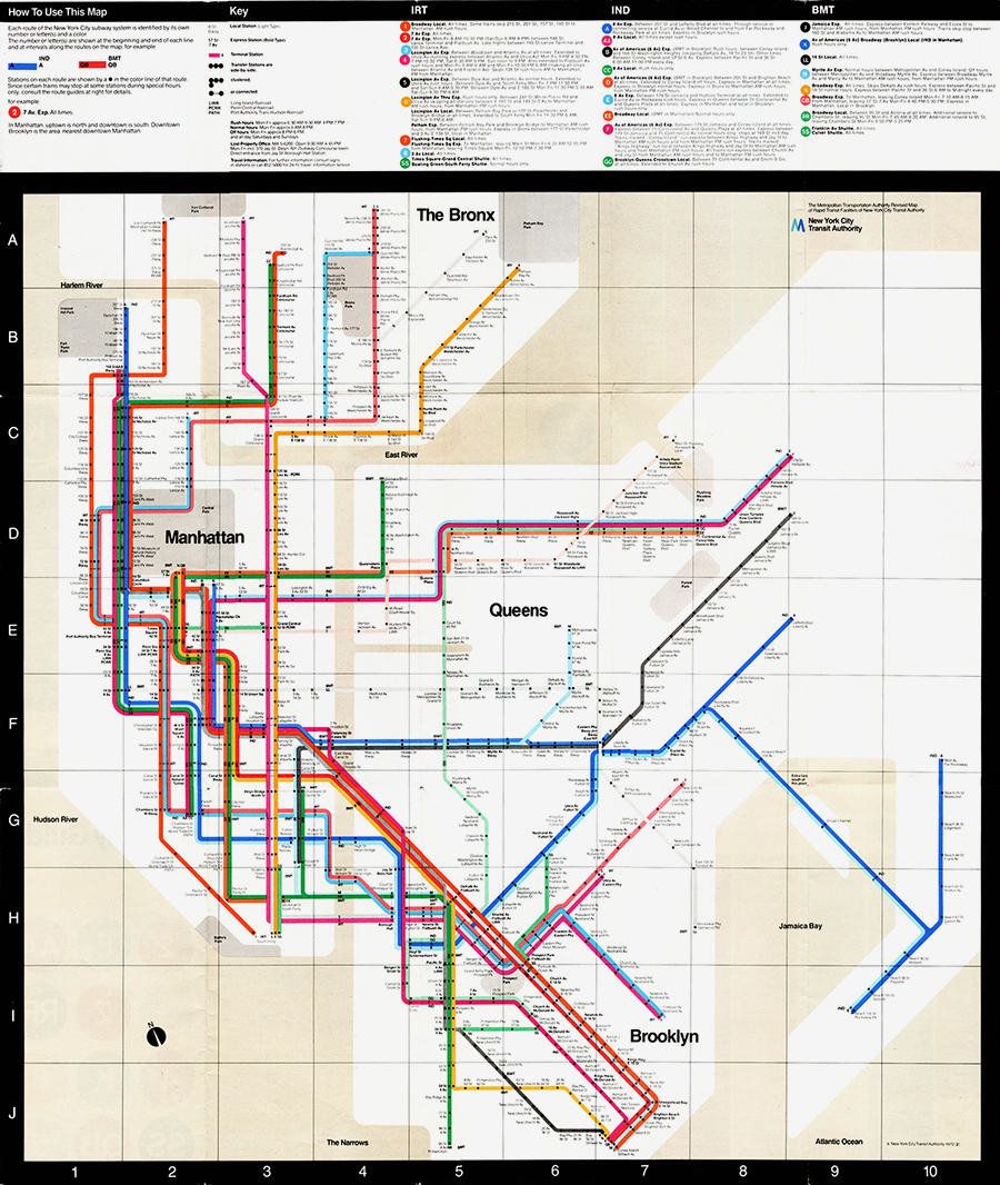
In 1970 Vignelli designed a diagrammatic map for the New York Subway System, following Harry Beck’s design criteria from his London Underground map (1933)—thus using only 45 and 90 degrees lines. In this way the route diagram was simplified and reading the map is self-explanatory. While today this solution is an international standard, at that time passengers felt uncomfortable with a map that didn’t match the real geography, so in 1970 it was dropped and replaced with a conventional map.However, in 2008 Vignelli was invited to design a new diagrammatic map that was later revised in collaboration with his assistants,
Beatriz Cifuentes and Yoshiki Waterhouse, and finally adopted as the official map of the New York Subway’s app.
In 2008 the Vignellis founded and designed the Vignelli Center for Design Studies at the RIT (Rochester Institute of Technology). The institution houses the archives of Lella and Massimo Vignelli, striving to promote their design legacy all over the world.
During his career, Vignelli taught at the Institute of Design (New Bauhaus) in Chicago in 1957-58, the Umanitaria School in Milan in 1960-64, the University of Venice’s School of Design in 1962-64, the Columbia University’s School of Architecture in 1967-68, the Philadelphia College of Art in 1969, and the Parsons School of Design in 1980-81. He also gave lectures and workshops in China, Europe, and the USA.
He has been a member of ADI (Industrial Design Association) since its founding in 1956, and also served on its board of directors in 1960-64. Member of AGI (Alliance Graphique Internationale) since 1965, he was also president in 1985-88. Former president of AIGA (American Institute of Graphic Arts) in 1976-77. Former vice-president of the Architectural League of New York. Member of IDSA (Industrial Designers Society of America).
Vignelli was awarded numerous recognitions including the Triennale Grand Prix in 1964, two Compasso d’Oro awards in 1964 and 1998, the AIA (American Institute of Architects) Industrial Arts Medal in 1974, the AIGA Gold Medal in 1983, the first Presidential Design Award in 1985, and the Architectural League of New York President’s Medal in 2011.
He also received lifetime achievement awards from the Brooklyn Museum in 1995 and the Cooper-Hewitt Museum in 2003. He was inducted in the ADC (Art Directors Club) Hall of Fame in 1982 and elected Honorary Royal Designer for Industry in 1996 by the RIBA (Royal Institute of British Architects). He also received honorary doctorates in fine arts and in architecture from the Parsons School of Design in 1982, the Pratt Institute in 1987, the Rhode Island School of Design in 1988, the University of Venice in 1994, the Corcoran School of Art in 1994, the Pasadena Art Center College of Design in 2000, and the RIT in 2002.
His work is part of the permanent collections of major museums including the Brooklyn Museum, Cooper-Hewitt Museum, Die Neue Sammlung, Met Museum, MoMA, Victoria & Albert Museum, and Vitra Museum. He also had individual exhibitions in Boston, Kansas City, Los Angeles, New York City, Milan, Toronto, Miami, Moscow, Leningrad, Helsinki, London, Budapest, Barcelona, Copenhagen, Munich, Prague, and Paris.
Many books have been published by Vignelli himself and others regarding his work. The best-known are Design:Vignelli (Rizzoli, 1990), Vignelli: From A to Z (Images Publishing, 2007), and The Vignelli Canon (Lars Müller Publishers, 2010), that he also released as a free PDF.
He died in New York City in 2014.
Enjoy your reading,
TO THE TOP ↑
Quotations
“Appropriateness transcends any issue of style.”
“An architectural education is fundamental for graphic design.”
“A good building costs no more or less than a bad building.”
“Designculture has the same value to that of Neue Grafik, the most important magazine of its era. It represents a fundamental historic moment in the development of our profession and reveals the importance of the seminal work done by our generation to new designers.”
“Design is not art. Design is utilitarian. Art is useful, but not utilitarian.”
“If you can design one thing, you can design everything.”
“Massimo Vignelli conceived design as a form of pureness. He fought against who worked without any professional dignity generating visual pollution,”
Italo Lupi.
For more quotations visit
The Words of Vignelli.
TO THE TOP ↑
Q&A
Published Sep 9, 2013
Recorded Feb 24-May 15, 2013
What did you want to do when you were growing up?
Exactly what I have done: working in all the fields of design, from graphic design to architecture, from interior design to product. As I have always said, “Design is One”.
What was your educational path?
Basically working in the studios of the greatest architects of my time:
Achille Castiglioni and
Pier Giacomo Castiglioni,
Giulio Minoletti,
Giancarlo De Carlo, Franco Albini,
Ignazio Gardella, and many others, before as a ruler penman and then as a partner. Moreover, the cohousing with Max Huber was a great occasion to learn much about graphic design. Then, the experience with glass design at Venini. Always with a great passion for architecture and industrial design.
What was your favorite subject at school?
At the art school: Architecture, History of Art, and Decoration.
When and how did you start your career?
I did my first job when I was 16, working for the Castiglioni brothers; and with all the others until 22 years old. Then I started working freelance in graphic design, packaging, and exhibit design.
What is the project that you remember with most pleasure and interest?
Every project, from the one I did on the very first day to the last one that I made yesterday.
A project that you would like to realise.
A corporate identity for a country, for example Italy or Vatican City. I will go to the Pope and say: “Your Holiness, the logo is O.K., but everything else has to go!”
The company’s graphic image of American Airlines has been changed after 45 years—when it was redesigned by Unimark. When is it better to change a visual identity and when to retain it?
Design reflects the responsibility towards the producer and the consumer and naturally constitutes a durable solution. Styling is ephemeral and gives shortlasting solutions. They have a different liability towards the user and it is economically important to understand such a difference. In a coordinated image for the industry it is important to design a long-lasting identity. The implementation of a new image is expensive and can’t be changed for the sake of novelty or—even worse—to cover up the shortcomings of a bad management. The same goes for design of furniture that, unlike a dress, will not be thrown away after a short time. Forced obsolescence is a crime, an expression of social irresponsibility that increases waste of energy and money, damaging the users.
One or more designers that you admire.
There are many, unfortunately almost all dead. In graphic design Pierre Mendell, in architecture
Mies van der Rohe, in industrial design
Dieter Rams (still alive), in furniture design Charles Eames, in editorial design Willy Fleckhaus. And many others.
A typeface that you like.
The new digital edition of
Helvetica, called Neue Haas Grotesk.
[Note: It was the original name of Helvetica, when it was first introduced by the Haas Type Foundry in Switzerland in 1957.] It is perfect and with many weights: thin, light, regular, medium, bold, extrabold, etc.
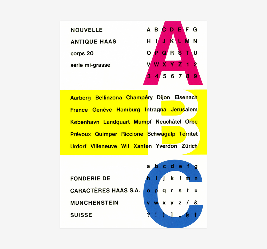 One of the first advertisements promoting Helvetica. Designed by Max Miedinger, 1957.
Can you tell me the story of how Helvetica was brought to Italy?
One of the first advertisements promoting Helvetica. Designed by Max Miedinger, 1957.
Can you tell me the story of how Helvetica was brought to Italy?
It was 1960 and no one in Italy had Helvetica. So I went to Felice Nava, whose printhouse was then located under Max Huber’s apartment, and asked him to go to Switzerland and buy it. A man of few words, he only answered: “I’ll go!” and left. On the way back, once at the customs, the border officers became suspicious seeing that his car was running really slow and all squashed to the ground. “Why is your car walking so low and slow?” they asked him. “Well… It could be the carburettor!” Of course it was full of lead blocks! They searched the car and confiscated all the typecases. When he came back to Milan I asked him what we should do and he said: “Huh, now I’ve wised up! I'll come back to Switzerland and pass the border through a different way!” This is what he did and this is how Helvetica was brought to Italy. From then on Nava’s fortune began: all the graphic designers went to him because he was the only one with the right typeface.
[Note: “Vignelli asked Nava to go to Switzerland and buy the lead blocks for that typeface […], but Nava wasn’t the only one with Helvetica in Milan. Tipocromo—that later changed its name in to Cromotipo—also had it in their catalogue,” as Giancarlo Iliprandi stated. After researching, I came to the conclusion that the first one to use Helvetica in Italy could have been Egidio Bonfante for the covers of Edizioni di Comunità, printed by the Stabilimento Poligrafico G. Colombi in 1960.] The peculiarity of Helvetica didn’t lies only in its shape, but in the fact that the types didn’t have shoulders, so that the letters could be set almost sticked one to the other, obtaining a unique compactness which was lacking with all the other typefaces.
Is it better drawing a new font or using the existing ones?
There are two main font families: serif (elzevirs) and sans-serif (grotesks). In both families there are some (few) great typefaces, the rest is commercial production. Among the serifs we have Garamond, Bodoni, Baskerville, Century Expanded, and Clarendon. Among the sans we have Futura, Gill Sans, Helvetica, Univers, and Optima. Sometimes it is possible to use a font with a weird look, but only to set a title or a logotype. There is no need to design a new font: What matters is the typographical structure, not the typeface!
And what about Our Bodoni, the typeface that you designed in 1989 in collaboration with type designer Tom Carnase?
Our Bodoni originated from our need to match Bodoni with Helvetica, keeping the same body-size with the same upper- and lowercase proportions. I think such an operation is more useful than designing a new typeface. There are many typefaces that could be improved through a redesign, for example Century. We did the same with Our Futura, changing the proportions and making them similar to Helvetica: higher lowercase and lower uppercase, improving the x-height and the kerning.
Has the way people perceive the design changed?
Definitely, but it is still unclear the marking between design and styling. Design is permanent, styling is ephemeral. The responsibilities are different, so are the results. However, we appreciate much more the aesthetic value—not the ethic—today than fifty years ago. Design, good or bad, is now part of our environment: It is around us and it has an influences on us.
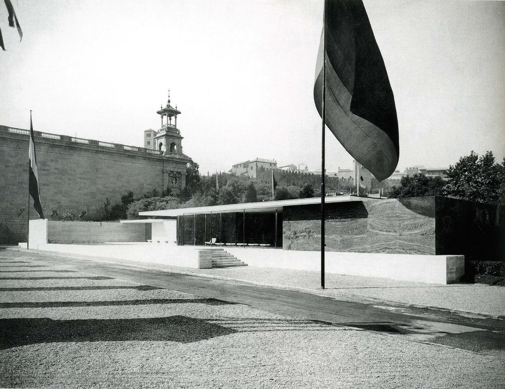 An old photograph portraing the German Pavilion by Mies van der Rohe, Barcelona, Spain, 1929.
A piece of architecture that you appreciate.
An old photograph portraing the German Pavilion by Mies van der Rohe, Barcelona, Spain, 1929.
A piece of architecture that you appreciate.
Villa Savoye by Le Corbusier, the Barcelona Pavilion by
Mies, and the National Assembly Building of Bangladesh by Louis Kahn. In my opinion, the three masterpieces of the 20th century!
Without considering technology, what are the main differences between the design from the past and the current one?
Over the past fifty years, graphic design has acquired professional awareness, moving away from the original painterly positions. Now graphic design is becoming visual communication. The term “graphic” does not make sense anymore, it does no longer correspond to our time and current technologies. From two-dimensional it has become four-dimensional. Complexities have increased, but the basic discipline remains valid.
Screen or printed paper?
Both: printed paper less and less, screen more and more. It is more versatile, it provides better colors, and it doesn’t take space.
Hand drawing or computer?
They are both useful: the first one to capture a concept, the second one to refine it.
Design, art, craft.
Design is not art. Design is utilitarian, art is useful but not utilitarian. Craftmanship is manual by nature, design is industrial by nature.
What would you recommend to a young designer?
Deepen your knowledge of the history of design and learn the work of all the protagonists. Learn the theories that determined the development of design. Develop a critical attitude and refine it continuously. Sieve and continuously assess everything surrounding us. Acquire a professional identity and enforce it. Meet the needs of the clients and not their desires, but if necessary evaluate them. Always remember that from a bad client you get a worse client, and from a good client you get a better one. Remember that the word aesthetics contains the word ethics: without this one the first one no longer exists!
A definition of good design.
A good design is a responsible design, expressing an intellectual elegance rather than its contrary: vulgarity.
A description of the Vignellis’s design.
From the very start sixty years ago, our design has been a constant struggle against the vulgar, the ephemeral, and the irresponsible rather than a quest for novelty. Based upon universal principles of rationality—expressed by the development of the Modern Movement in the 20th century—our design believes in discipline but not in dogma, it is not static but dynamic, versatile and coherent even within its own language.
What was your favourite game when you were a child?
The Meccano, and making imaginative scenographies.
Thank you very much.
Thank you too.
 © 2013-19 Massimo Vignelli, Nicola-Matteo Munari. All rights reserved.
TO THE TOP ↑
Portfolio
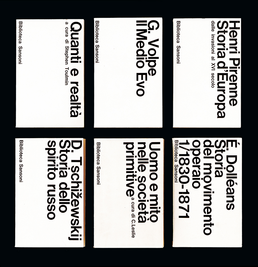
Biblioteca Sansoni
Book Series, 20×12.5 cm each
1963
One of many book series that Vignelli designed for Sansoni, Florence. “We turned the titles sideways to introduce large-sized type and reach greater impact at point of sale.” A simple but incredibly strong and elegant solution, that was highly innovative for the publishing industry of that time. Although based on a schematic layout, the different lenght of the words generate a different cover each time. Beautiful and timeless.
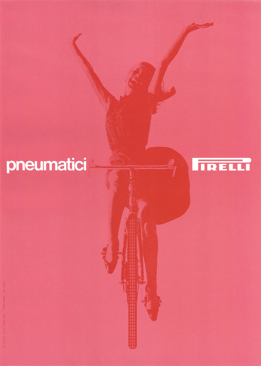
Pneumatici Pirelli
Poster, 68×48 cm
1963
One of the greatest masterpieces of the Italian graphic design. A completely pink tyre advertisement featuring a young lady that ride a bycicle without hands, communicating a sense of absolute freedom and limitless joy. An image of women empowerment to advertise an object which is tipically associated with male world.
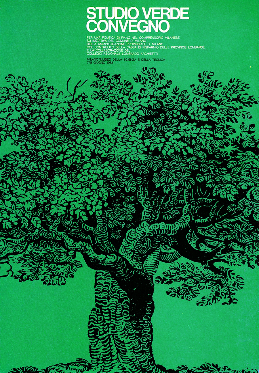
Studio Verde
Poster, c.70×50 cm
1963
Issued by the City of Milan for a conference about green urban design, held the Museo della Scienza e della Tenica (Museum of Science & Technology), Milan.
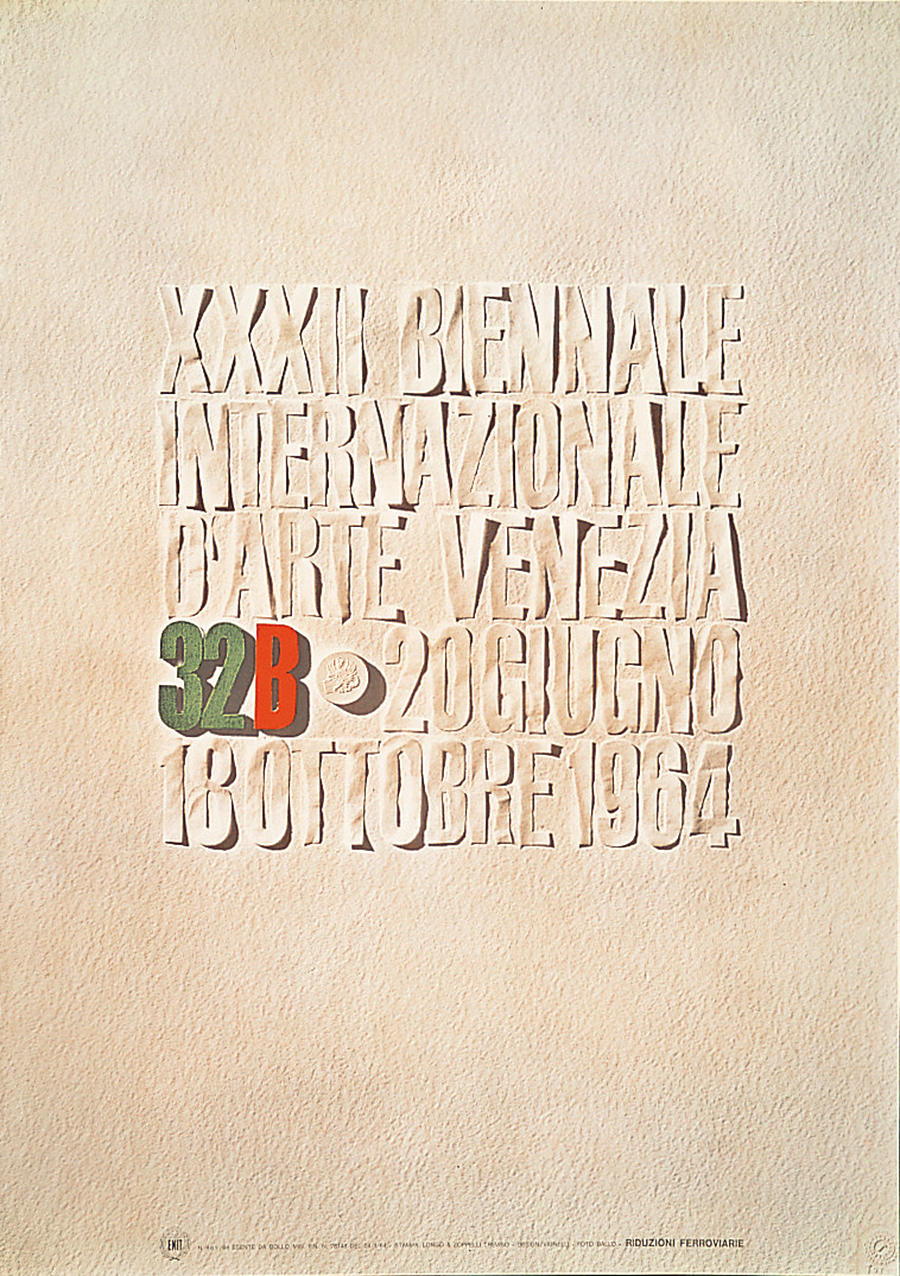
32B
Poster, c.100×70
1964
Designed for the International Biennale of Art in Venice. Vignelli cut the letters from a sheet of paper. Photo by Aldo Ballo.
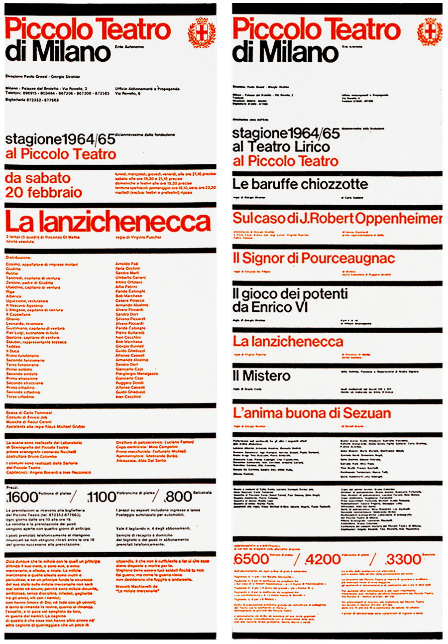
Piccolo Teatro
Posters, c.99×34 cm each
1964
Among the best pieces of the Italian graphic design. An excellent example of rhythm within order, featuring the “information bands which became a characteristic of our design in the years to follow.” The alternance of red and black titles identify the different theaters where the plays took place (Piccolo Teatro and Teatro Lirico).
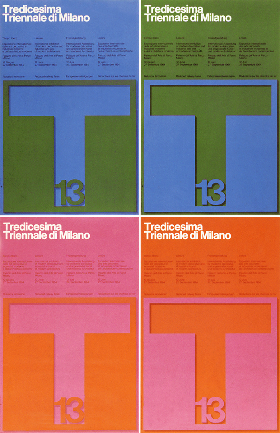
Tredicesima Triennale
Poster, c.100×70 cm
1964
The official poster for the 13th Triennale Exhibition in Milan. Vignelli was in charge for the whole identity of the exhibition. He designed the mark, posters, catalog, leaflet, and signage.
Knoll
Logotype
1966
The new logotype set in Helvetica was first paired with the mark designed in 1947 by Herbert Matter and later substituted it.
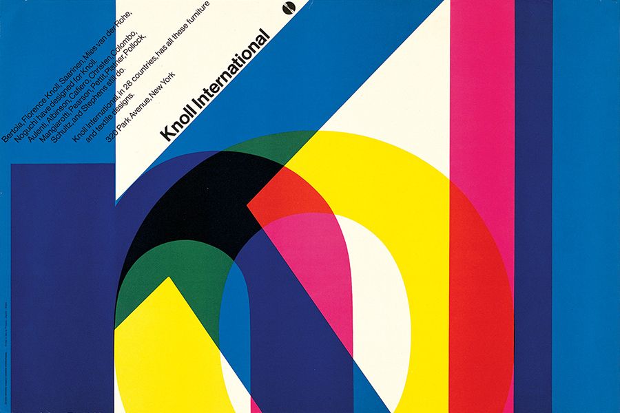
Knoll International
Poster, 82×122 cm
1967
One of the strongest and most beautiful posters in the history of graphic design. Influenced from the colorful overprints that distinguish the graphics of Max Huber—a former flatmate of Vignelli—it features a simpler and more rigorous geometric layout. Wonderful!
American AirlinesLogotype
1967
Designed with
Heinz Waibl at Unimark International. Contrary to what people thought for decades, Vignelli didn’t designed the stylized eagle that represented the brand. Indeed, he suggested to use the logotype only, set in Helvetica, half red and half blue to symbolize the American flag. I think that the true strenght of this graphic identity was precisely the typographic pureness that portrayed the company with absolute simplicity and clarity.
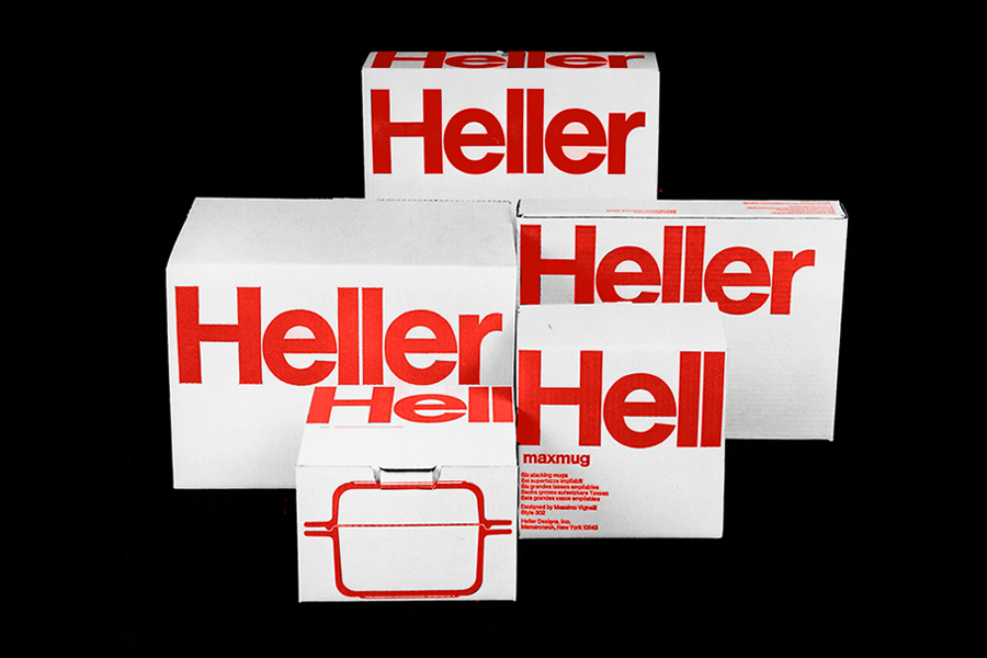
Heller Designs, Inc.
Packaging Line
1968
An excellent example of the strenght and clarity of Helvetica. A graphics that needs nothing more.
New York Subway Map
Foldable Map, 53×44 cm
1970
The product of logics and geometry to simplify complexity. A project that marked the advent of information design with an unprecedent awareness.
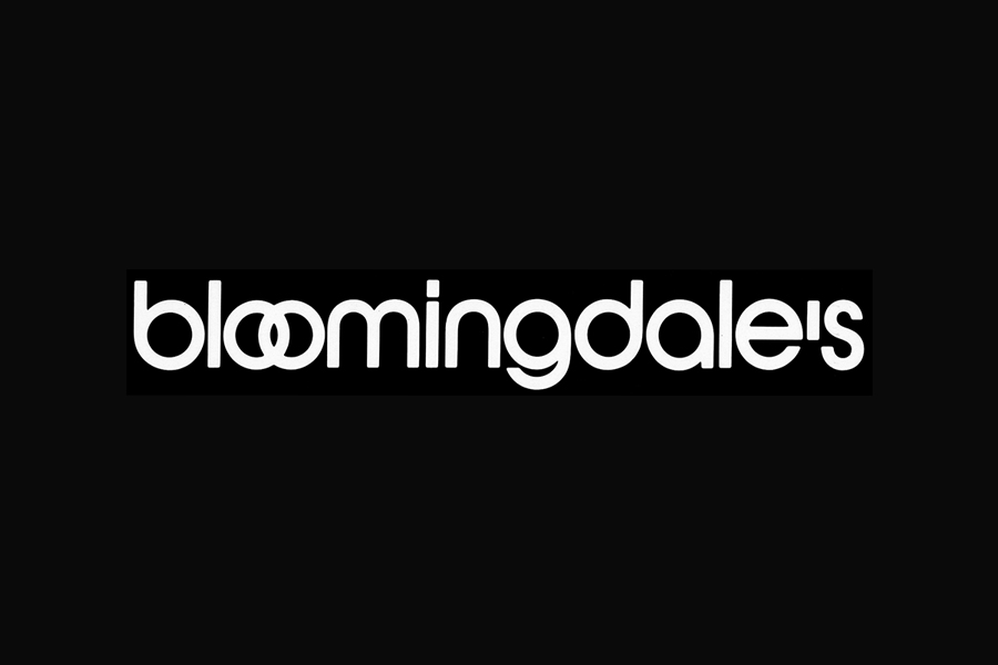
Bloomingdale’s
Logotype
1972
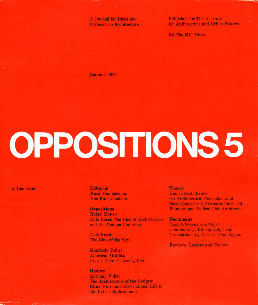
Oppositions
Magazine, 25×21.5 cm
1973-84
“We resisted all pressures to change the color of the cover from issue to issue, because we wanted to achieve a strong chromotype for the magazine’s identity.” Simplicity, elegance, and clarity.
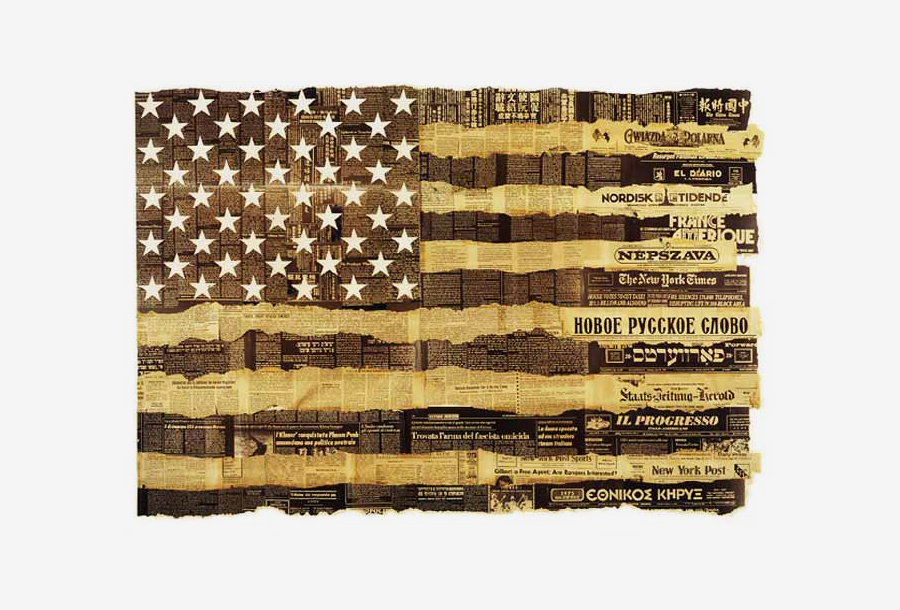
U.S.A. Bicentenary
Bicentennial Flag, 89×127 cm
1976
An example of Vignelli’s talent. He designed an uncommon and surprising solution with a strong visual impact and meaning. He was asked to designed a poster to celebrate the melting pot, but since he didn’t believe in this concept “this poster celebrates not a melting pot, but the lively interaction of the different ethnic groups that make the United States.” He collected all the foreign and national newspapers published in New York City in that moment, and arrange an American flag with parts of each one.
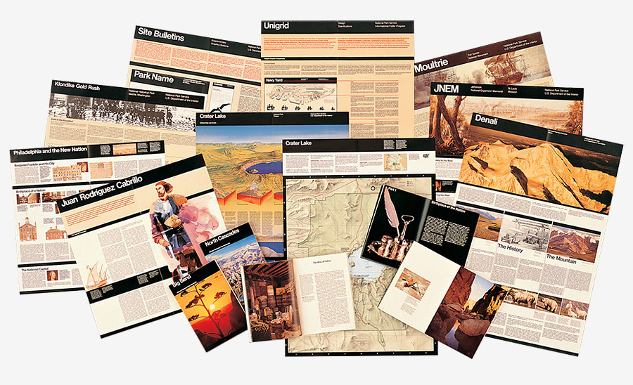
National Park Service
Publication Program
1977
The range of publications designed by Vignelli on the Unigrid is one of his best projects because generated a uniform production with strong identity, consistent order, and useful clarity. The project was awarded the first Presidential Design Award.
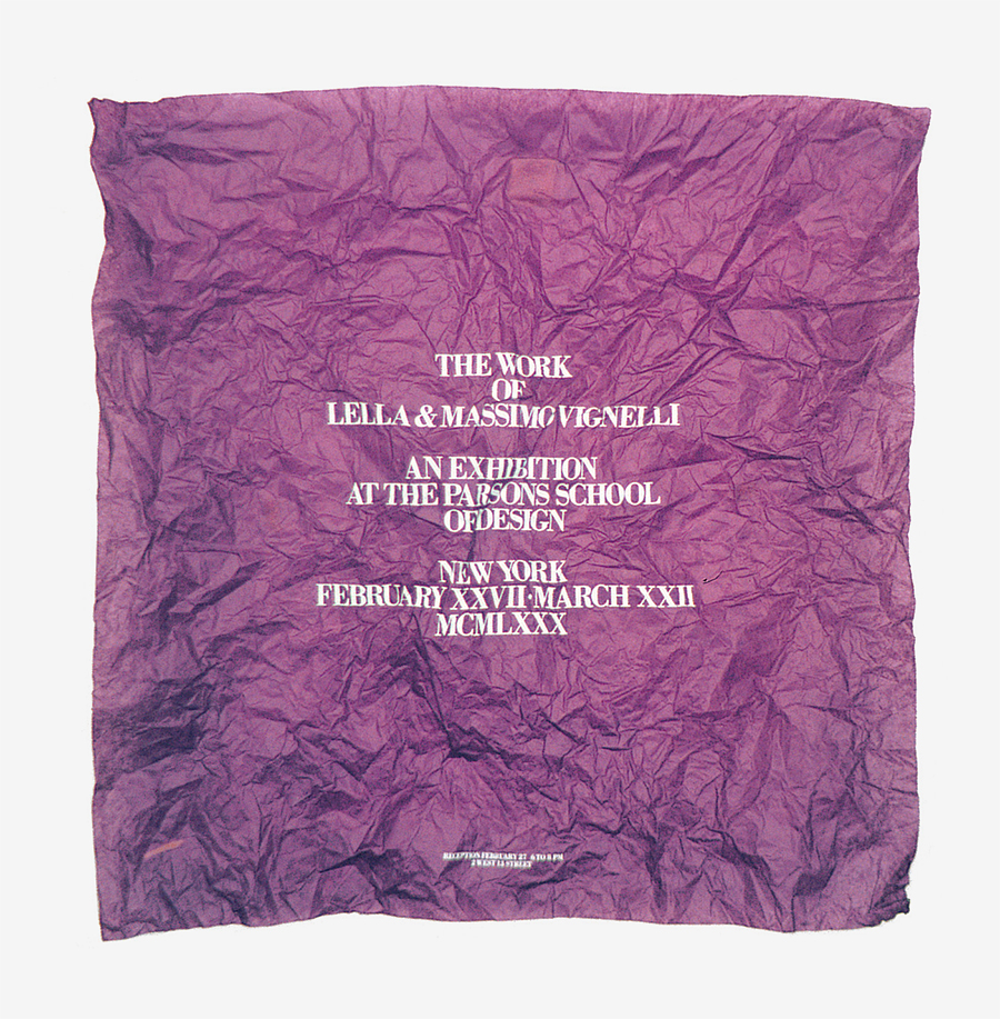
The Work of Vignelli
Invitation Flyer, 40×60 cm
1979
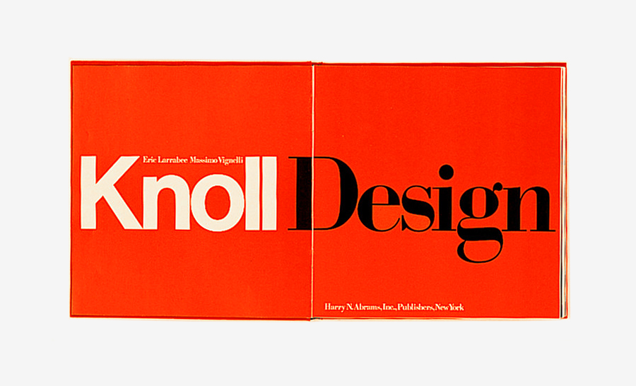
Knoll Design
Book, 30×29 cm
1981
One of the books you see and immediately it seems Christmas. A masterpiece in beauty, strenght, and elegance. Published by Harry N. Abrams.
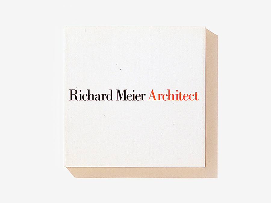
Richard Meier Architect
Book, 25×25 cm
1984
The elegance par excellence. Vignelli cleaned the cover from everything unneccesary, including the name of the publisher. It features an incredible sense of order and harmony. It seems an overture, when the lights go out and everyone makes silence to focus on the begin of the opera. A timeless masterpiece. Published by Rizzoli, New York.
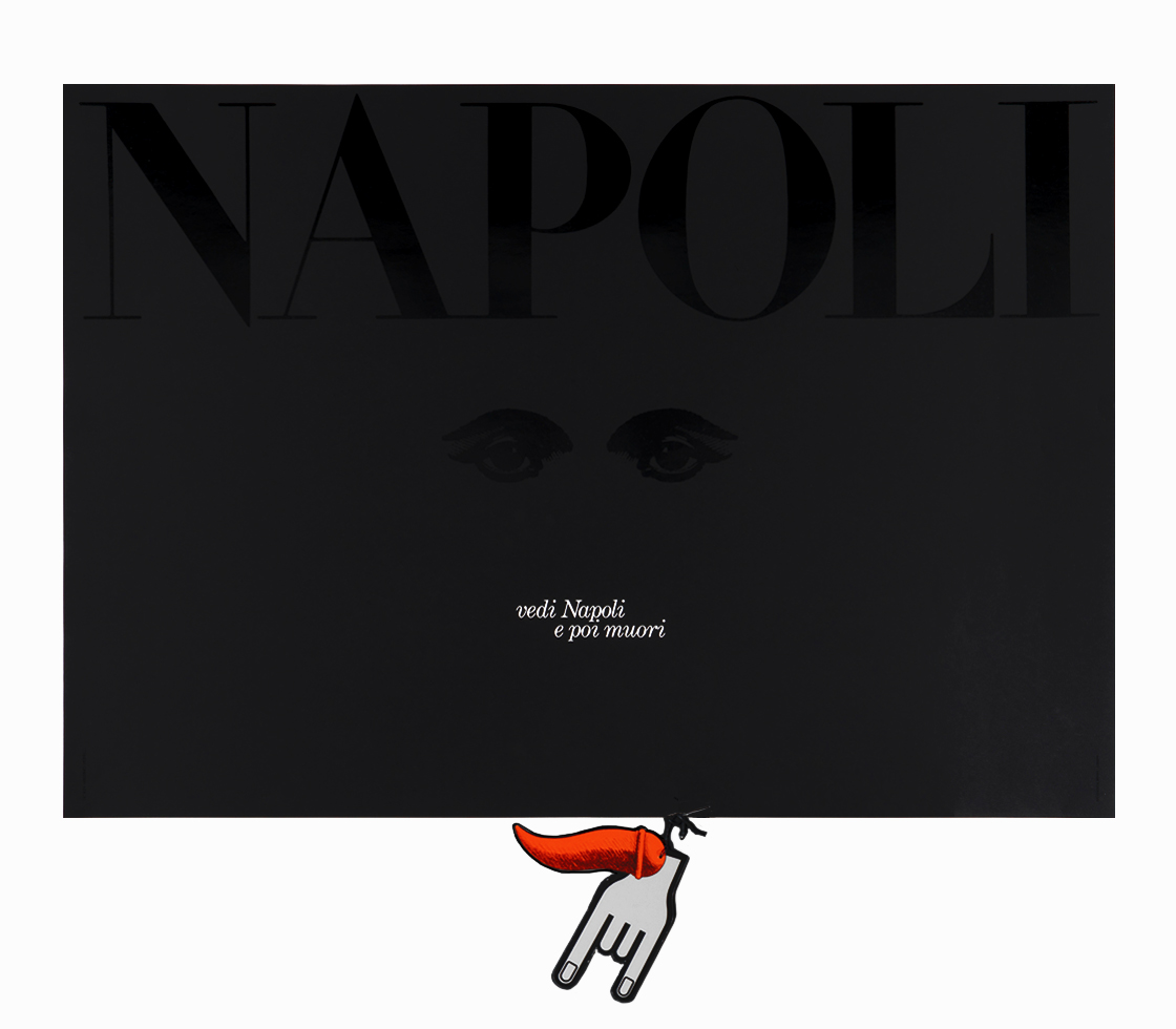
Vedi Napoli e poi muori
Poster, c.100×70 cm
1986
A beautiful, black, superstituous poster to celebrate Naples. The text reads the famous motto: “See Naples and die,” that Goethe heard during his Italian journey: “I won't say another word about the beauties of the city […]. As they say here, ‘Vedi Napoli e poi muori!—See Naples and die!’ One can't blame the Neapolitan for never wanting to leave his city.” Designed for the Foundation Napoli ’99.
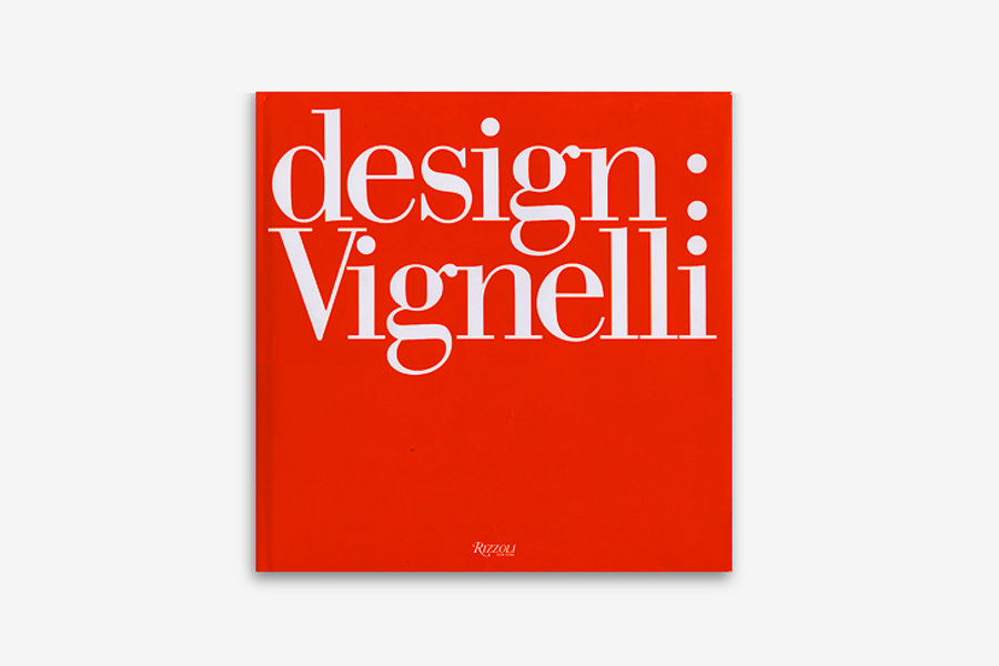
Design:Vignelli
Book, 25×25 cm
1991
Everytime I open this book it seems Christmas. It is a masterpiece of strenght and elegance.
Links & Docs
I strongly suggest you to read the extensive interview from the
Archives of American Art, that offers a thorough account of Vignelli’s design.
Articles
AGI NL Dear Massimo
AIAP Una telefonata a Vignelli
AIGA Medalist 1982
Architect’s Newspaper Massimo Vignelli 1931-2014
Architectural League President’s Medal 2011
Artnet Design’s Power Couple
Audobon Beauty Contest
Corriere della Sera Il design secondo Vignelli
Creative Bloq What Vignelli can teach…
Creative Review Dear Massimo [x]
Creative Review When designers wore lab coats
Design Observer Massimo Vignelli 1931-2014
Design Observer Vignelli’s Desk
Domus Massimo Vignelli
Elle Decor Design That Endures
Eye Magazine Reputations
Gary Hustwit Vignelli
i-Italy For you, Massimo
i-Italy Good Design
Il Fatto Quotidiano La tradizione italiana
John Madere Massimo Vignelli
Knoll Massimo Vignelli Commemoration
Knoll In coversation with Kathy Brew
Knoll Jon Naar recalls Massimo Vignelli
Knoll Remembering Massimo Vignelli
La Fondazione NY Memory of Massimo
Metroricerche Vignelli Transit Maps
National Parks Raising The Bar
Neenah The Great Massimo
New York Times A Designer’s Legacy
Noupe Design That Will Outlive Mankind
Places Journal Oppositions
RIT Icon of Design
Second Story My Meeting with Massimo
Type Directors Club Our Typographic Conscience
Vignelli Center The Master beyond the Designer
Audios
Soundcloud Brainpicker
Soundcloud Design Matters
Typeradio Massimo Vignelli (Part 1 of 4)
Documents
BK Italia Remembers Massimo Vignelli
Doc Droid Design Symposium
Manifesto Project The Vignelli Canon
Rationale Design Dot Zero 1
Rationale Design Non-Profit Organizations
Vignelli Associates Designed by Lella
Vignelli Associates Chart of Design Changes
Vignelli Associates The Vignelli Canon
Interviews
Archives of American Art Oral History Interview
Arch News Now A Cult of Objectivity
Behance An Interview with Vignelli
Bloomberg Business Week American Airlines Redesign
Designboom Massimo Vignelli
Design Indaba Milton Glaser + Massimo Vignelli
Design Observer Interview by Debbie Millman
Edible Manhattan On Design
Fast Company A Rare Interview
IDSGN Design Love
Profiles
AGI Massimo Vignelli
ADC Hall of Fame
Vignelli Associates Official Website
Wikipedia Massimo Vignelli
Projects
AIAP CDPG
AIGA Design Archives
Archivio Grafica Italiana, Massimo Vignelli
Architonic Massimo Vignelli
Brooklyn Museum Collection
Centro Studi Poltronova Massimo Vignelli
Creative Review NYCTA Manual
Designboom Vignelli Center for Design
Fonts in Use Massimo Vignelli
Graphis Master Portfolios
MoMA Collection
Sotheby’s NY Subway Manual
Superm Warm Red Designs 2012 Subway Diagram
The Standards Manual NY Subway Manual
Tumblr Vignelli Center
Videos
ADC The Creative Influence
Design Indaba In studio with Vignelli
Design Indaba Interview (Part 1)
Design Indaba Interview (Part 2)
Design is One The Film
Knoll Love Affair with Vignelli
Nowness On The Edge
Pentagram Vignelli Makes Books
RAI Cultura In ricordo di Massimo Vignelli
SPD Design Talks
La Stampa Video-Intervista
TO THE TOP ↑
Comments
If you wish to add a comment please feel free to write at
info@designculture.it
Lou Danziger 2013, Sep 17
“As always, Vignelli is so intelligent and so clear in his philosophy and his commitment. I am generally in agreement with so much of what he says and believes, but whether one shares his views or not it is impossible not to admire his integrity, consistency and dedication. In this interview I particularly like what he has to say to students. I know of no one else who has given them this very practical bit of advice: ‘Meet the needs of the clients and not their desires, but if necessary evaluate them. Always remember that from a bad client you get a worse client, and from a good client you get a better one.’ I am not quite sure what he means in this context by ‘but if necessary evaluate them.’ I think perhaps it is because Massimo thinks in Italian and he has a thought in mind which eludes me. I hope that he reads this and elaborates in the comments a bit on that.”
Massimo Vignelli 2013, Sep 17
“As designers we are required to give the client what he needs, not what he wants, but we must be open to consider his wishes to determine whether they are objective or subjective.”
TO THE TOP ↑
Follow on Facebook
Partnerships

Archivio Grafica Italiana is the first digital resource to the Italian graphic design heritage. Founded by Nicola Munari in 2015.

Design consultancy based in Piacenza, Italy. Founded by Nicola Munari in 2015, it operates in the whole field of design.
TO THE TOP ↑
© 2013-18 Nicola-Matteo Munari. All rights reserved.