Maurizio Milani is a prominent Italian graphic designer, the younger brother of
Armando Milani.
During the early 1970s, he studied at the Umanitaria School in Milan under Albe Steiner—a master of Italian graphic design—and started working as a freelance graphic designer in 1974.
After one year collaborating with Giulio Cittato and some short experiences with Antonio Boggieri and
Massimo Vignelli, he joined the office of his brother Armando in 1976, focusing on corporate identity and sign system.
Over the years, he served numerous clients including Cordenons, Euroswiss Banking Group, Miami Film Awards, Niguarda Hospital, and Zerowatt.
His sharp graphics produce a clear and engaging communication that perfectly fits both clients and users needs.
In 1981 he started teaching corporate identity and sign system, first at the Umanitaria School, then at the IED (European Design Institute), the Accademia di Comunicazione, and the Politecnico University in Milan. He also gave a series of lectures and workshops in Italy and at the Northern Illinois University of Chicago.
In 2005 he was warded a honorary degree in Communication Sciences by the ISFOA Private University in Rome. His work has been published on some of the most important graphic design magazines such as Domus, Graphis, Linea Grafica, and Novum Gebrauchsgraphik.
Enjoy your reading,
 TO THE TOP ↑
What did you want to do when you were growing up?
Besides the football player—like 90% of children in Italy—and for a short time the nuclear engineer, when I was 18 I thought that would be great to design the sign system of Niguarda Hospital in Milan. After 35 years I did it.
What was your educational path?
I like to remember the time when I studied at the Umanitaria School with a short anecdote. Milan, 1972, typography class. “Don’t you know that you can do the best works when you don’t have the proper means?” And I answer: “Yes professor, but how can I cut the Schoeller
[Note: It was a carboard once used by graphic designers.] without a knife?” But he was right. The years at the Umanitaria were very intense, both in terms of practice and theory. It was possible to still breath an air of experimentation and research, finding new ways of expression and communication. It was the period between the late 1960s and early 1970s. The school was a kind of Italian Bauhaus and the subject that promoted more these ambition was typography. Albe Steiner was no more a simple teacher but a real lodestar.
What was your favorite subject at school?
When I attended the secondary school I had a predilection for Mathematics. Later, I found it boring and impersonal, and started to like more Italian, even if the teacher suggested me to do graphic activity.
When and how did your career start?
It started very early, thanks to an Easter egg. I was 5 or 6 years old and of course I didn’t know who was Boggeri, or Vignelli, or Tovaglia, etc. I was playing, while my brother
Armando hung up to his black moodboard the metal wrapping paper of an Easter egg. It was shining and magic. “Do you like it?” he asked. “Yes, but it is not right in the center of the board.” I think that it started in that moment.
How has your design evolved since that time?
When I started to work in the 1960s I conceived graphic design as a form of art. Later—thanks to a project done with
Massimo Vignelli—I discovered a systematic approach to design that was suitable for corporate identity and sign system. Today I am still a creative spirit, but my artistic side is controlled by the rational one. Of ourse I have always dedicated a great care about typography. I think that doing the designer requires a high typographic sensibility and culture, otherwise our work become approximate and superficial.
What is the project you remember with more pleasure and interest?
It is very difficult to answer. I enjoyed very much to design the corporate identity of Cordenons Papers, but at the same time I enjoyed too the sign system for Niguarda Hospital. The first one has been a creative work, while the second one was more a rational work. Two works that are completely different from each other.
What would you like to design today?
The visual identity for a new, small country: emblem, flag, passport, banknotes, street signage, and cultural communication. Everything!
A designer that you admire.
I am really devoted to my brother
Armando and to the other designers—like
Massimo Vignelli and Bob Noorda—who contributed to define the intellectual significance of our profession. But I also like very much the work of Bruno Monguzzi.
A piece of architecture.
The most fascinating post-war architecture is the Guggenheim of Bilbao by Frank O. Gehry.
A piece of design.
Except few extraordinary objects, I think that there isn’t a single piece that contributed with its design to a sea change. They seems all pure application of style. (Apple is excluded.)
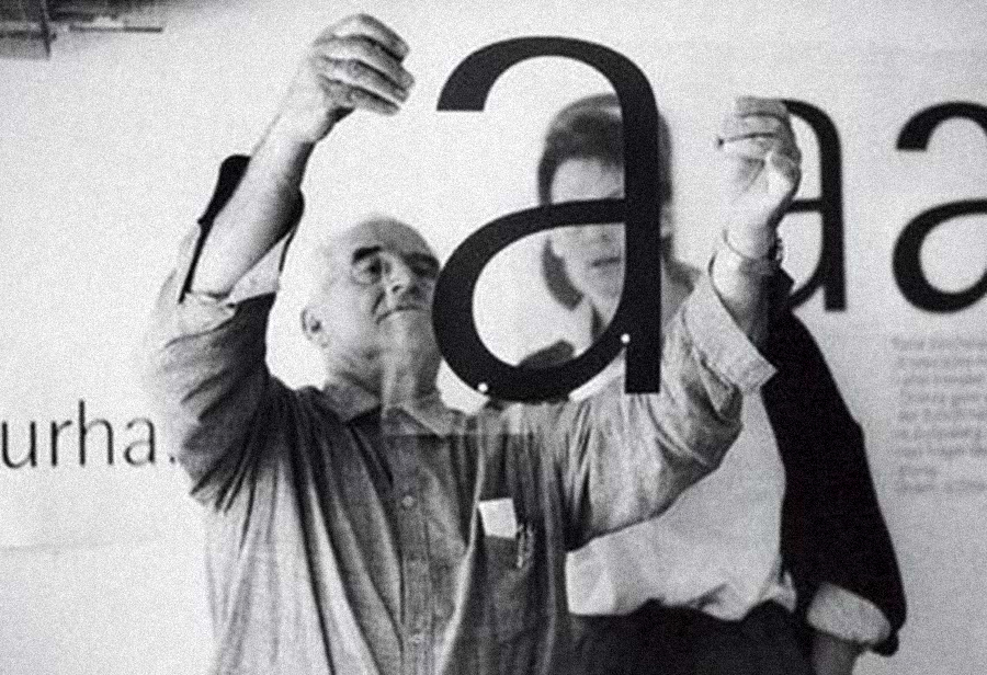 Otl Aicher analyzing a draft letter of Rotis Grotesk, i.e. Rotis Sans Serif, 1988.
A typeface.
Otl Aicher analyzing a draft letter of Rotis Grotesk, i.e. Rotis Sans Serif, 1988.
A typeface.
Since five years I use almost always Rotis Sans Serif, because it guarantees a perfect elegance and legibility in both an editorial and a signage project. I can’t stand Helvetica and even less the 99% of new unuseful typefaces designed in these last years.
Without considering technology, what are the differences between the design from the past and the current one?
As I said, the graphic designer evolved becoming a consultant for visual identity. From designers we became directors. We need culture more than ever. We are no more involved only with images, but also with sounds, movements, time…
Has the way people perceive the design changed?
I have only the perception of how the clients perceive our job. I think that there is a huge imbalance between the ones who perfectly understand the role of the graphic designer and the ones who incredibly hold contests without meet the designers. These ones should be ignored.
What would you recommend to a young designer?
I have always preached the past to my students, because you can’t propose anything new if you don’t know something past. We should start from the past, even to reach opposite results.
How would you define a good design?
A good design is the one that still excite after thirty years.
How would you describe your design?
Sophisticated, maybe too much. I always try to express the content through visual metaphors rather than limit myself to conventional forms. We should think to the users who receive the message. We must stimulate their curiosity. This is the only way to imprint in their mind our design, that is our aim. But is easier to be remembered using a vulgar and loud visual language rather than a delicate, creative, and intelligent one. It is the difference between the punch and the stroke.
Thank you very much.
Thank you.
© 2013-16 Maurizio Milani, Nicola-Matteo Munari. All rights reserved.
TO THE TOP ↑

Archivio Grafica Italiana is the first digital resource to the Italian graphic design heritage. Founded by Nicola Munari in 2015.

Design consultancy based in Piacenza, Italy. Founded by Nicola Munari in 2015, it operates in the whole field of design.
TO THE TOP ↑


