Armando Milani
Milan, Italy, 1940
Who’s Who
Armando Milani is an internationally acclaimed Italian graphic designer, the elder brother of
Maurizio Milani.
From 1959 to 1963 he studied at the Umanitaria School in Milan—then the most famous graphic design school in Italy—under Albe Steiner, a pioneer of Italian graphic design. In 1965 he started working with Giulio Confalonieri—a prominent graphic designer—and since 1967 he collaborated with Antonio Boggeri, the founder of the pioneering Studio Boggeri.
The same year he opened his own studio in Milan focusing on corporate graphics, marks, and posters. In 1976 his brother
Maurizio joined him and the year later he moved to New York City to work with
Massimo Vignelli at Vignelli Associates, where he worked major projects including the corporate identity programs of Lancia Automobiles and Ciga Hotels.
In 1980 he opened another Milani Deisgn’s office in New York City.
During his career, he served prestigious clients including DePadova, Montecatini Edison, Roche, Touring Club of Italy, and the United Nations designing many beautiful announcements, books, marks, and posters.
From the beginning of the 21st century he started to focus more and more on social communication, dedicating himself to the illustration of posters aimed to direct the attention of the public on social themes with an international impact. In 2003 he dedicated to the United Nations a poster for the world peace, that has already become a world classic.
He taught and lectured at The Cooper Union and the Art Directors Club in New York, the Santo Domingo School of Design, the University of Beijing, the IED (European Institute of Design) and the Politecnico University in Milan. During the past years he also gave a series of workshops at his olive mill in Le Rouret, south of France.
Member of AGI (Alliance Graphique Internationale) since 1983. Honorary member of AIAP (the Italian Association of Communication Design) since 2014. His work has been published on some of the most important design magazines including Abitare, Domus, Linea Grafica, Novum Gebrauchsgraphik, and Print. He exhibited in Brazil, France, Germany, Italy, Japan, Mexico, Spain, and the U.S.A. In 2004 a poster he designed was awarded a Compasso d’Oro Honorary Mention.
He published several books including “A double life of 80 AGI designers” (Burgo, 1996), “50 Poems by Lawrence Ferlinghetti. 50 Images by Armando Milani” (GAM, 2010), and “No Words Posters” (RIT Press, 2015) that collects a series of two hundreds posters by over one hundred designers from all around the world.
Enjoy your reading,
 TO THE TOP ↑
Quotations
“I think that a graphic designer has the obligation to design posters with a cultural and social scope.”
“We don’t have the power of politicians to change things, but we can stimulate people through images and push them to reflect.”
TO THE TOP ↑
Q&A
Published Dec 30, 2013
Recorded July 15, 2013
What did you want to do when you were growing up?
The astronomer.
What was your educational path?
During the early 1960s I attended the Umanitaria School in Milan under Albe Steiner. Later, I started to collaborate with Giulio Confalonieri in 1965 and with Antonio Boggeri in 1967. While in 1977-78 I have worked with
Massimo Vignelli in New York City.
When and how did your career start?
It started in 1967 when I have opened my own design studio in Milan. And again in 1980 when I have opened a new office in New York City.
How has your design evolved since that time?
Initially, I was really interested in Russian Constructivism and Swiss typography. Later, I started to being more interested in a less conventional design, voted to a typical British sense of humor which I think is a fundamental component of visual communication. While the American experience lead me to a more pragmatical attitude towards the solution of design problems. Probably today my work is a global expression of all these experiences.
What is the project that you remember with more pleasure and interest?
I designed many books, marks, and posters that have been published on many international magazines, but the work that I prefer is a poster designed ten years ago for the United Nations which is still exhibited today all over the world. During a design meeting in New York City I have showed this poster and five hundred people stood up for a one minute standing ovation. It was unforgettable!
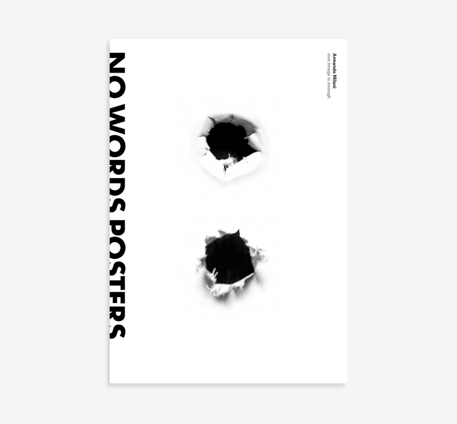 Armando Milani, No Words Posters, 2015, RIT Press.
A project you would like to design.
Armando Milani, No Words Posters, 2015, RIT Press.
A project you would like to design.
A book about social posters without words (“No Words Posters,” RIT Press, 2015), where symbolic images don’t need any word to convey a meaning. A collection of messages that could be understood by any culture in the world. A book dedicated to humanity.
A designer whose work you admire.
The work of the prestigious german designer Pierre Mendell.
A piece of architecture.
The Parthenon.
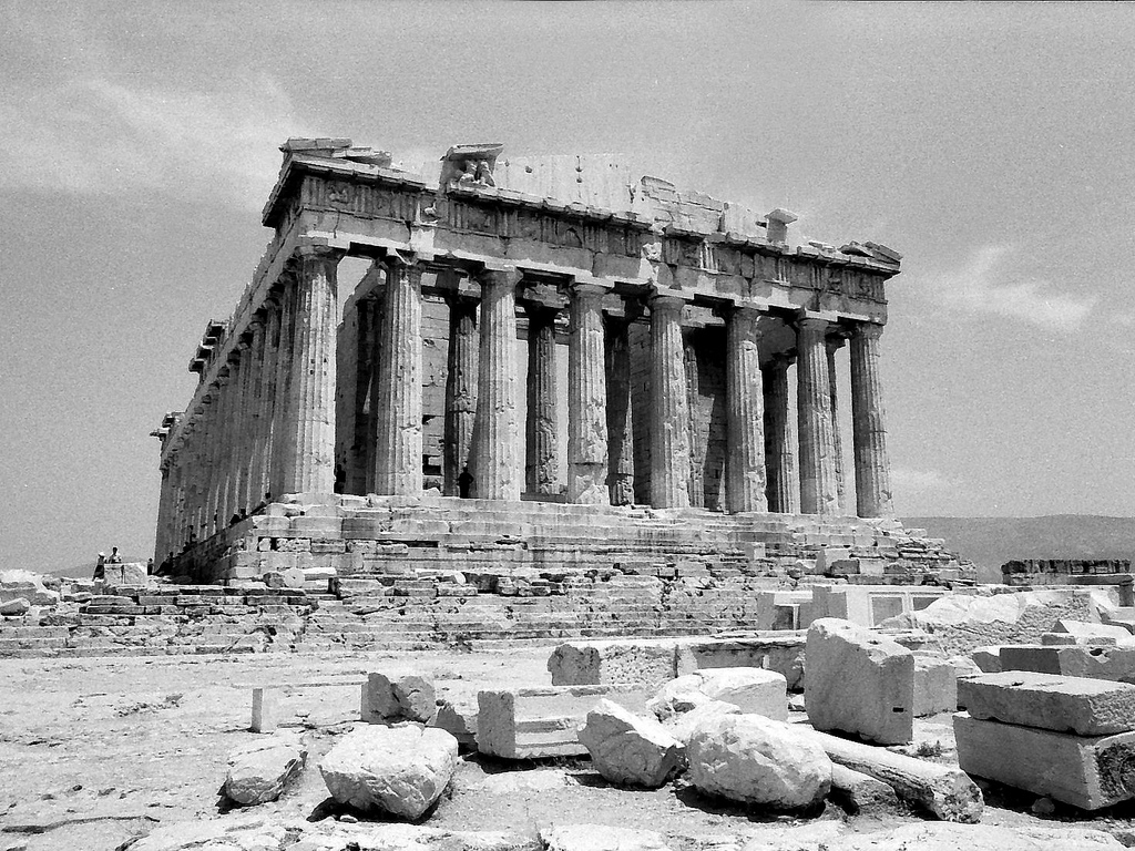 Iktinos and Kallikrates, Parthenon, 447-432 B.C. Athens. Photographed in 1968.
A piece of design.
Iktinos and Kallikrates, Parthenon, 447-432 B.C. Athens. Photographed in 1968.
A piece of design.
Arco lamp by
Achille and
Pier Giacomo Castiglioni.
A typeface.
Bodoni.
Without considering technology, what are the differences between the design from the past and the current one?
It is difficult not to consider technology given its impact on generations of young designers. When I was at school and we drew by hand a Bodoni capital ‘S’ we practice to develop a sensibility, a sense of proportion, that is impossible to achieve by pressing a key on the board and choosing among thousands of fonts of which 99% are horrible and unuseful. Considering this, it is clear that the current approach to design is mostly based on intuition rather that reflection, thus implying ephemeral results. Good design does not follow any trend, but it is based on intelligence. Good design is timeless.
Has the way people perceive the design changed?
I think that today’s designers are more interested in the form than in the content. The advent of computers has entailed the wrong belief that anyone familiar with technology could be able to design a mark or a magazine page without any advice from a professional designer.
What would you recommend to a young designer?
Start with training periods with great designers, especially abroad. Read and discover everything about the history of graphic design. To understand where we want to go we need to know where we come from. And to break the rules—if we want to be original—first we need to know them. I like to think of evolution not revolution of graphic design.
How would you define a good design?
It immeditaly communicates messages that are socially correct, with synthesis and elegance, and if possible without any word. A balanced mix of ethics and aesthetics.
How would you describe your design?
Exactly like this.
Which was your favourite game when you were a child?
Soccer.
Thank you very much.
Thank you.
 © 2013-16 Armando Milani, Nicola-Matteo Munari. All rights reserved.
TO THE TOP ↑
Portfolio
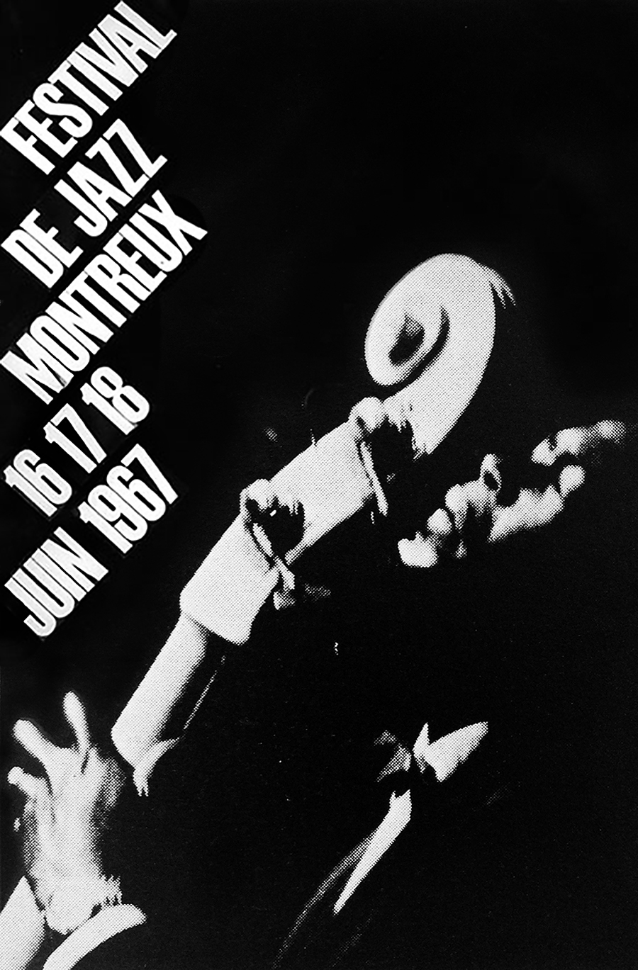
Festival de Jazz Montreaux
Poster, c.60×40 cm
1967
A beautiful poster from a series of three. It was designed for the Montreaux Jazz Festival. Typography is inclined according to the photograph, so that each line of text seems to spread from the cello. The legible but strong typeface is Schmalfette Grotesk that Milani masterly used during his whole career. Black and white help to communicate the essence of the music to which the poster refers, and produce a delicate image immersed in a noir, nocturnal atmosphere. Previously unseen on the internet.
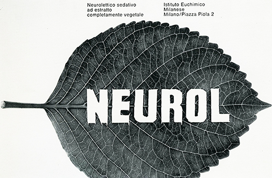
Neurol
Advertisement, approx.10×15 cm
c.1970
Advertisement for a vegetable sedative produced by the Istituto Euchimico Milanese (Milan Chemical Institute). Again, a delicate image that perfectly communicates the vegetable origin of the sedative. Originally printed in colors. Previously unseen on the internet.
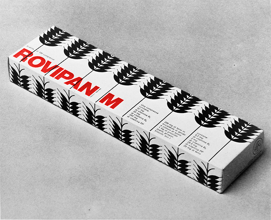
Rovipan M
Animal feed pack
1971
Pack for animal feed by Istituto delle Vitamine—Roche (Vitamin Institute, Milan). The schematic layout produces a clear communication and a rhythmic pattern. The image has been recolored. Previously unseen on the internet.
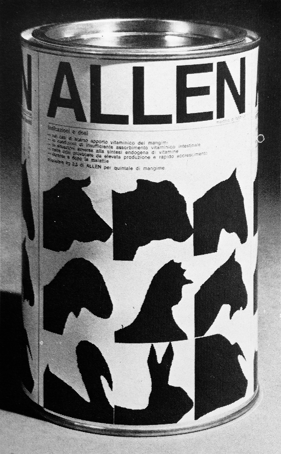
Allen
Label for animal feed tin
1972
Label for animal feed by Istituto delle Vitamine—Roche (Vitamin Institute, Milan). It features legible typography, and stylized animal silhouettes that produce an appealing pattern. Previously unseen on the internet.
Euromar
Trademark
1972
An excellent mark for an import-export company based in Italy. It perfectly communicates the idea of in-out movement simply shaping the company’s initial. The year of design is uncertain. It is also credited to have been designed in 1963, as the first mark designed by Milani.
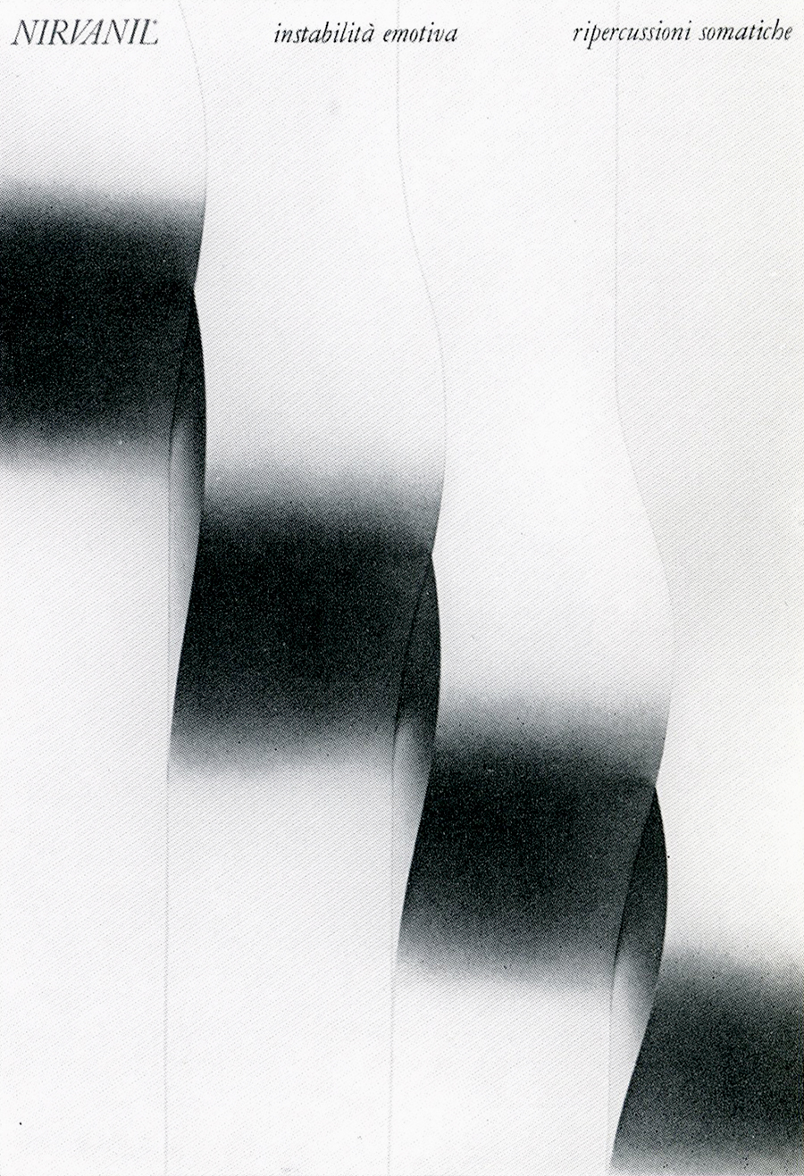
Nirvanil
Brochure, approx. 29.7×21 cm
c.1972
Brochure cover for Midy pharmaceutical company. The text reads: “Emotional instability. Somatic effects.” The idea of instability is perfectly communicated through a series of warped strips of paper, producing a meaningful and delicate image. Previously unseen on the internet.
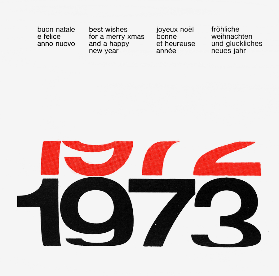
Roche
Flyer, approx.15×15 cm
1972
New year’s greetings designed for the Roche pharmaceutical group. The warped figures produce the perception of spinning, letting the new year to substitute the previous one. The image has been recolored and redrawn. Previously unseen on the internet.
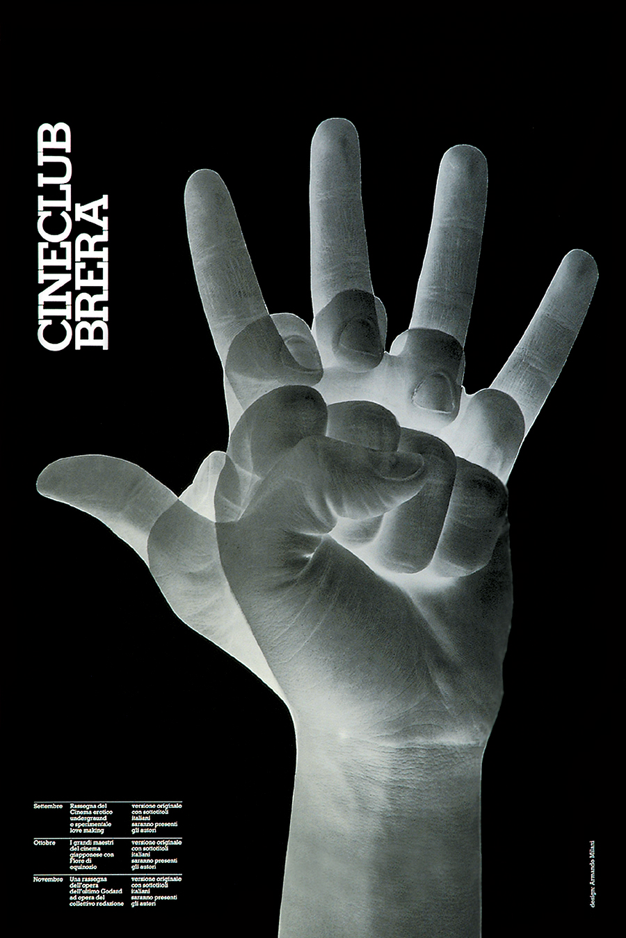
Cineclub Brera
Poster, c.60×40 cm
1975
Designed for a film club based in Milan. It communicates the idea of motion picture by carefully overlapping three photographs of an opening hand. The same photograph has been used by Milani in another poster he designed in 2007 titled “The Rights of Man.”
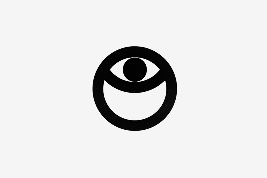
Costa dei Ciclopi
Tourism Mark
1973
Designed to promote a seaside village called Costa dei Ciclopi (Coast of Cylcops), Sicily. The eye immediately recalls Poliphemus and his one-eyed companions.
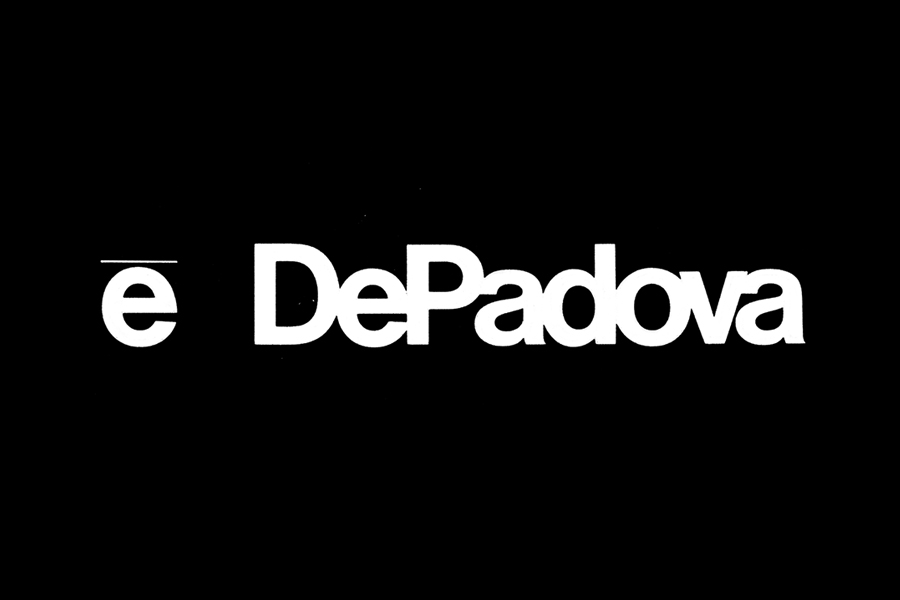
Edizioni DePadova
Logotype
1973
Logotype for the famous Italian furniture brand DePadova, Milan. The historic showroom of DePadova featured a modular glass façade with black iron frames displaying the company’s logotype all over it. It was a major modern design landmark. Sometimes the logo is credited to have been designed in collaboration with hungarian born designer Tomás Gonda.
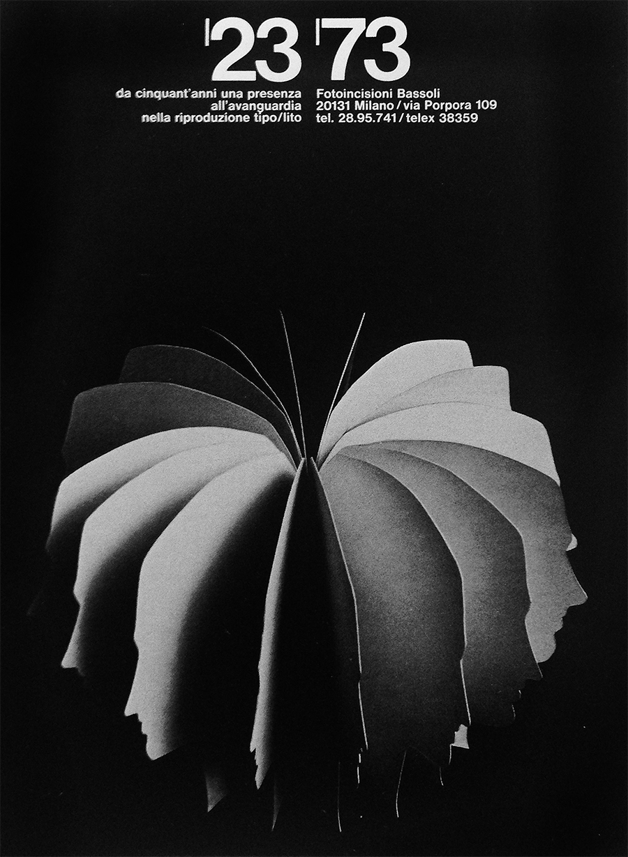
Fotoincisioni Bassoli
Poster, c.70×50 cm
1973
A promotional poster for the 50th anniversary of a photogravure company based in Milan. The text reads: “Since fifty years we are an avant-garde presence in typographic and lithographic reproduction.” The idea of reproduction is clearly represented by the spinning head silhouettes, that also communicate the idea of team and vision. Previously unseen on the internet.
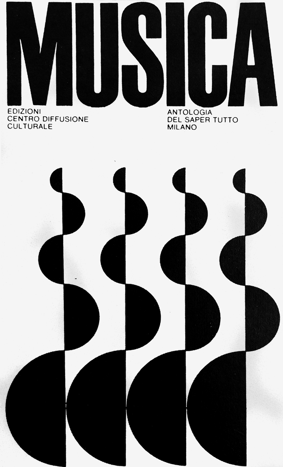
Musica
Book Cover, c.20×12 cm
c.1973
Published by Centro Diffusione Culturale (Cultural Diffusion Center), Milan. Previously unseen on the internet.
Auditorium Midy
Mark
1974
Designed for the auditorium of the pharmaceutical company Midy. It elegantly joins the two initials in a single monogram.
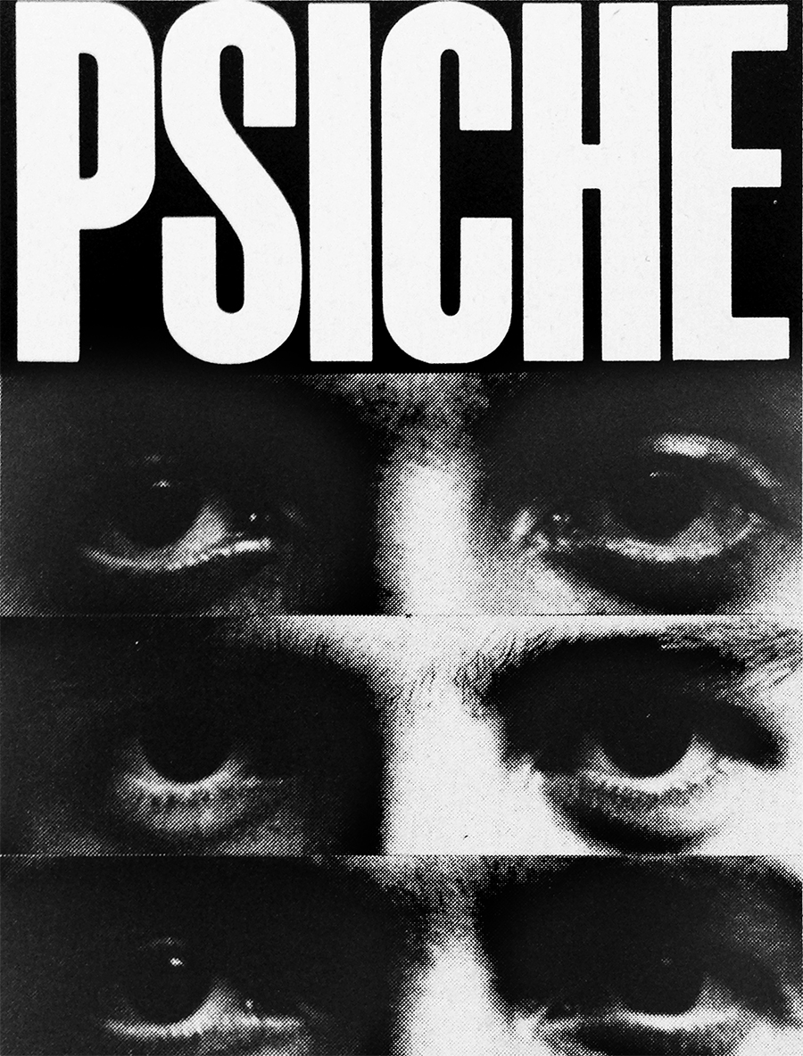
Psiche
Book, c.20×15 cm
c.1973
Book cover for Centro Diffusione Culturale (Cultural Diffusion Center), Milan. The close-up on the eyes while making different expressions is an effective way to communicate the reader what the book concerns. Previously unseen on the internet.
ZerowattTrademark
1979
Designed for a household appliances manufacturer, it shows the great talent of Milani in mark design: he used the same shape repeated twice to obtain a synthetic but dynamic sign. His brother
Maurizio also designed for the same company.
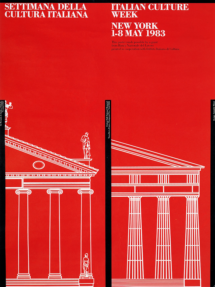
Italian Culture WeekPoster, c.60×45 cm
1983
Promotional poster for the Italian Cultural Institute of New York. An elegant and timeless graphic layout. This is the first project in this portfolio designed after the collaboration with
Massimo Vignelli (1978-79) and his influence is quite clear, not only because of typography, colors, and black rules but mostly because of the rigourous and quiet layout.
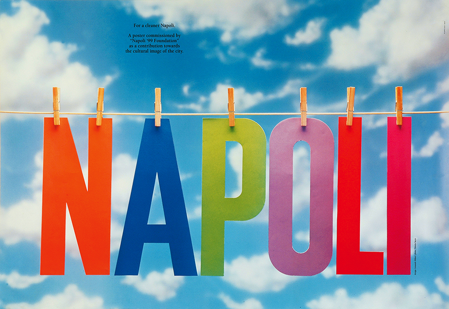
For a cleaner Napoli
Poster, 70×100 cm
1985
Designed for Napoli ’99 Foundation “as a contribution towards the cultural image of the city.” Milani ‘literaly’ cleans up the city by putting his name out to dry. It is part of a series of twenty-four posters designed by some of the most-known graphic designers of the 1980s.
Brookehill Equities, Inc.
Trademark
1986
Mark designed for an investment firm based in New York City. A beautiful and effective synthesis of both letters in a single shape.
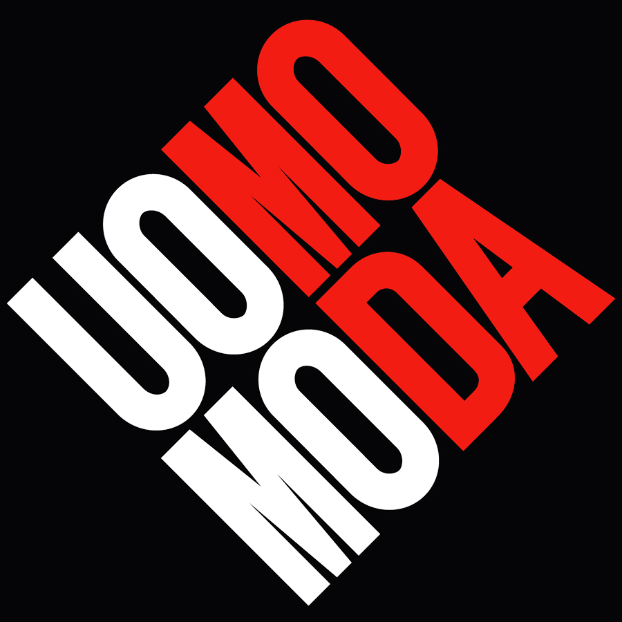
Uomo Moda
Logotype
1990
Designed for a fashion event based in New York City. It could be both read horizontally or vertically, according to the colored columns.
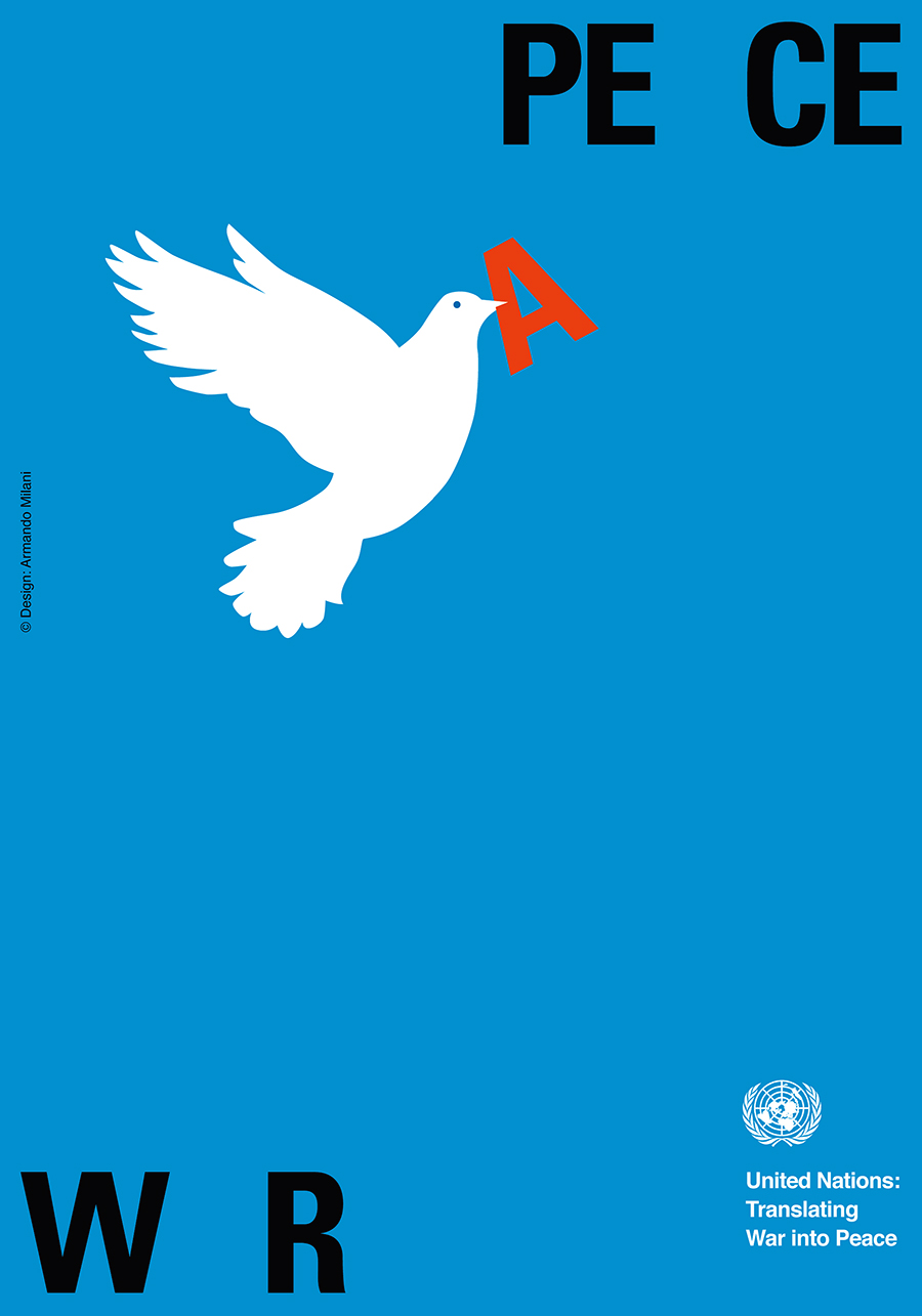
Translating War into Peace
Poster, 100×70 cm
2003
Designed for the United Nations. This beautiful poster has already become a classic icon worldwide.
Although Milani produced many other beautiful posters, I have decided to stop the portfolio to this work because it symbolizes the beginning of a new attitude in his career which is oriented towards symbolic illustration—thus resuming the artistic tradition of the ‘affiche’—rather than systematic design, that is the core focus of Designculture.
TO THE TOP ↑Links & Docs
Articles
GAM 50 Poems 50 Images
Corriere della Sera Poeta e Designer
RIT Press No Words Posters
Profiles
AGI Profile
Facebook Armando Milani
Wikipedia Armando Milani
Projects
Milani Design Official Website
Parentesi Grafica Armando Milani
Videos
Escuela de Chavón From the Archives
Italian Poster Biennal Armando Milani
Museo Luzzati Armando Milani
SUPSI Conferenza
TO THE TOP ↑
Comments
If you wish to add a comment please feel free to write at
info@designculture.it
TO THE TOP ↑
Follow on Facebook
Partnerships

Archivio Grafica Italiana is the first digital resource to the Italian graphic design heritage. Founded by Nicola Munari in 2015.

Design consultancy based in Piacenza, Italy. Founded by Nicola Munari in 2015, it operates in the whole field of design.
TO THE TOP ↑
© 2013-16 Nicola-Matteo Munari. All rights reserved.